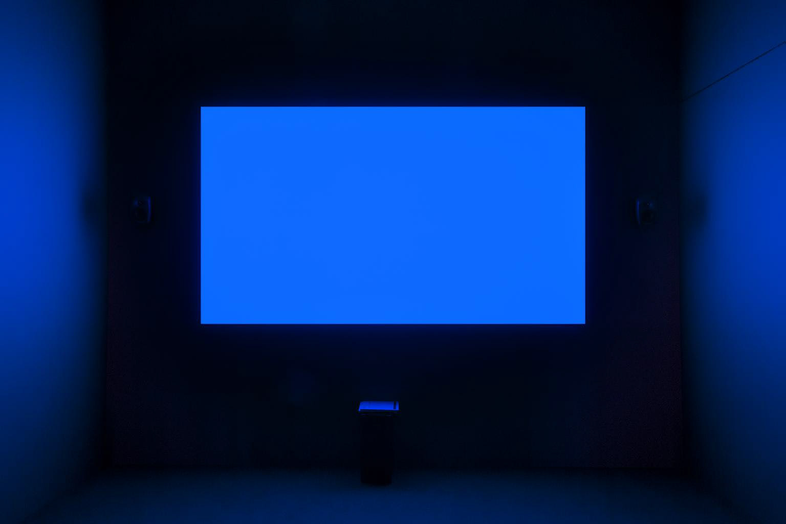
Derek Jarman's Blue (1993) is a film which features a single static shot of the colour blue with a voiceover and soundtrack. The dialect consists of poetic text documenting his experience with his AIDS related illness and coming to terms with impending death. The film is Jarman’s last work and was completed only months before he passed from his illness. The piece was always intended to be an imageless projected screen of blue paired with an audio piece. Devoid of imagery to conceive ‘the admirable austerity of the void’. It’s perceived as a meditation on colour, the void and disease.
The space Jarman creates in this space is initially peaceful and upon reflection becomes a haunting symbolism of HIV related illness.
I’ve mentioned Jarman’s book Chroma before in my learning journal and I admire his analysis of colour immensely. Applying his theories and interpretation of colour really allowed me to open myself up to appreciating colour in film and consider it on a deeper level. I began to understand the importance colour plays in film and how by viewing just the colour of a frame can alter our interpretation of how we view these narratives.
Terence Broad’s (un)stable equilibrium is a series of work that deal with colour and are developed around the training of generative neural networks without training data. For the work we have two generators that try to have their output passed as the other’s network creating a constant competition to have the most diversity of colours.
I discuss the importance of colour in detail in semester_1 and have continued to explore these ideas and the weight of this information being void of image. To experience colour itself is entirely different.
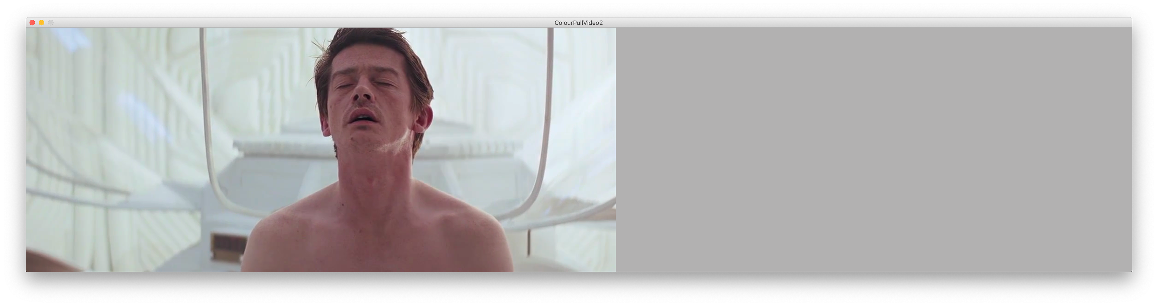
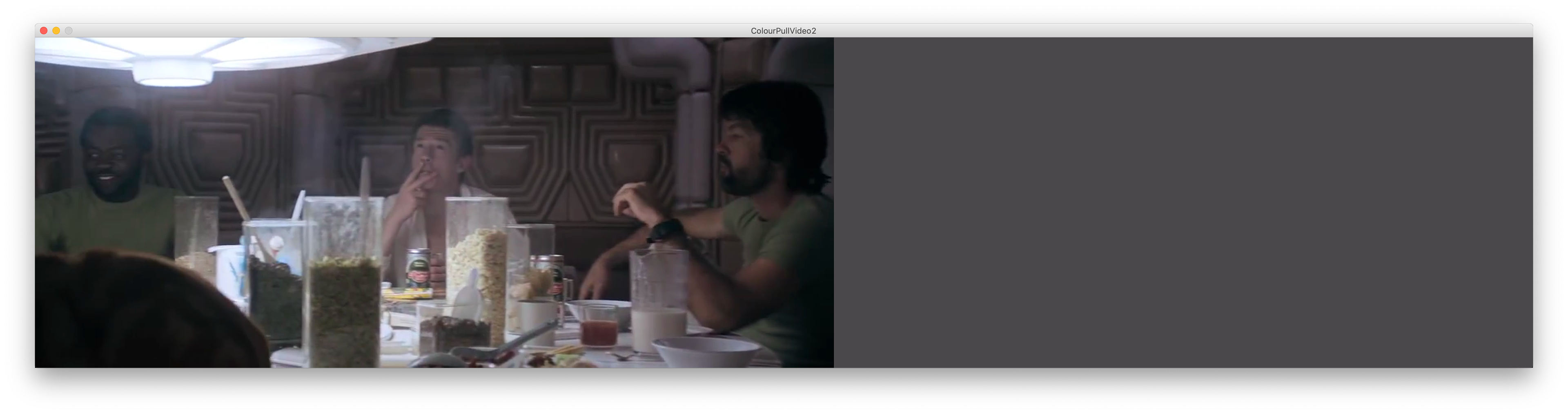
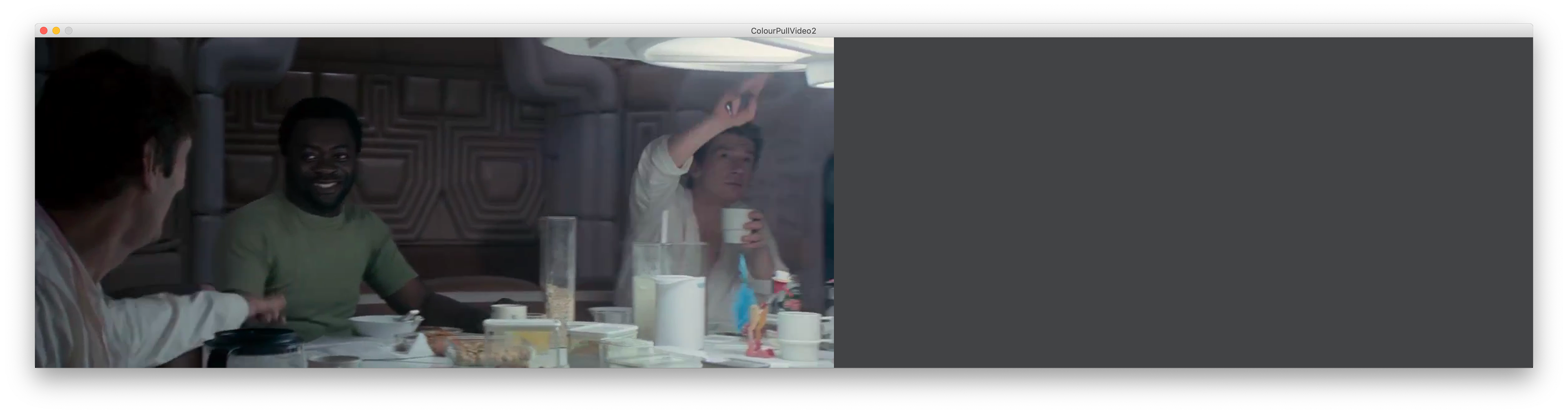
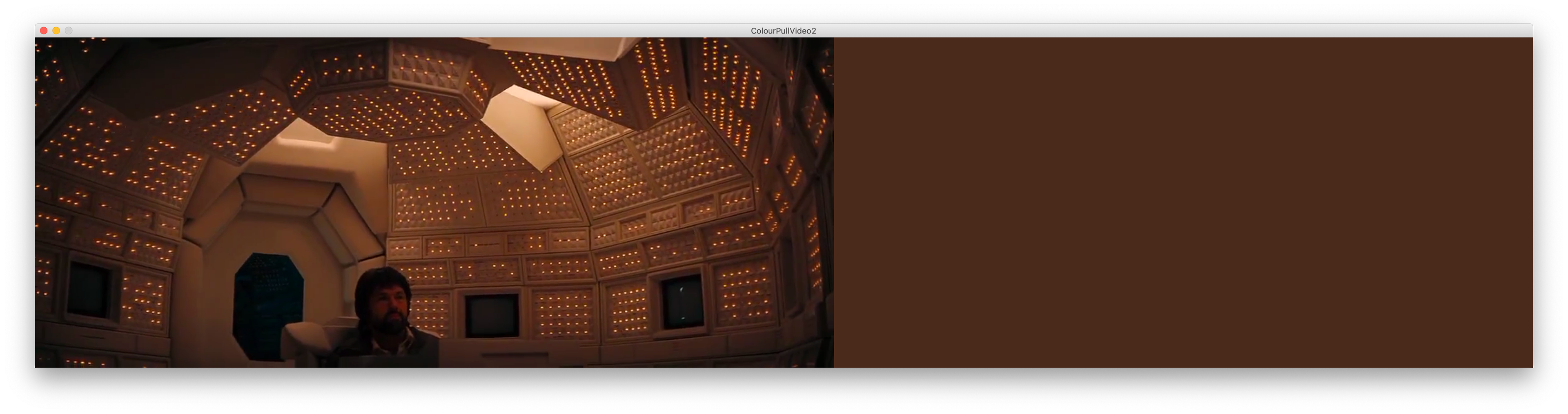
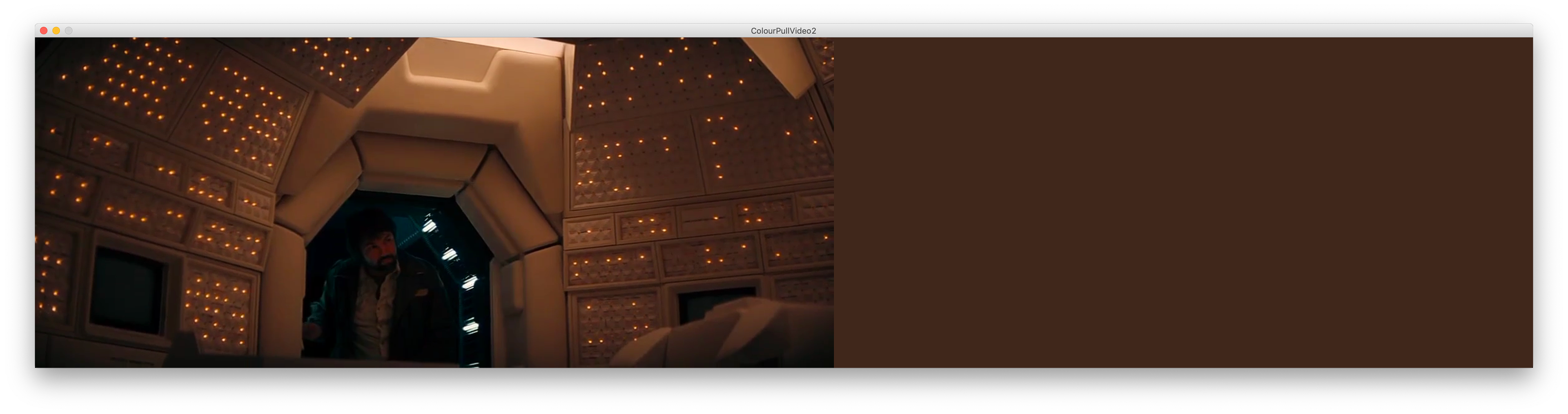
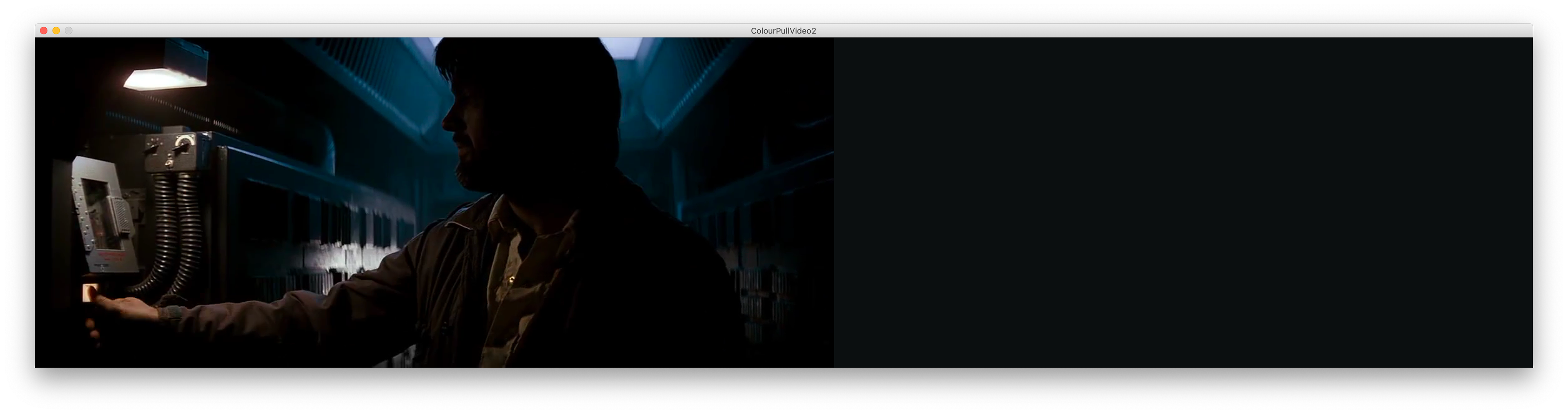
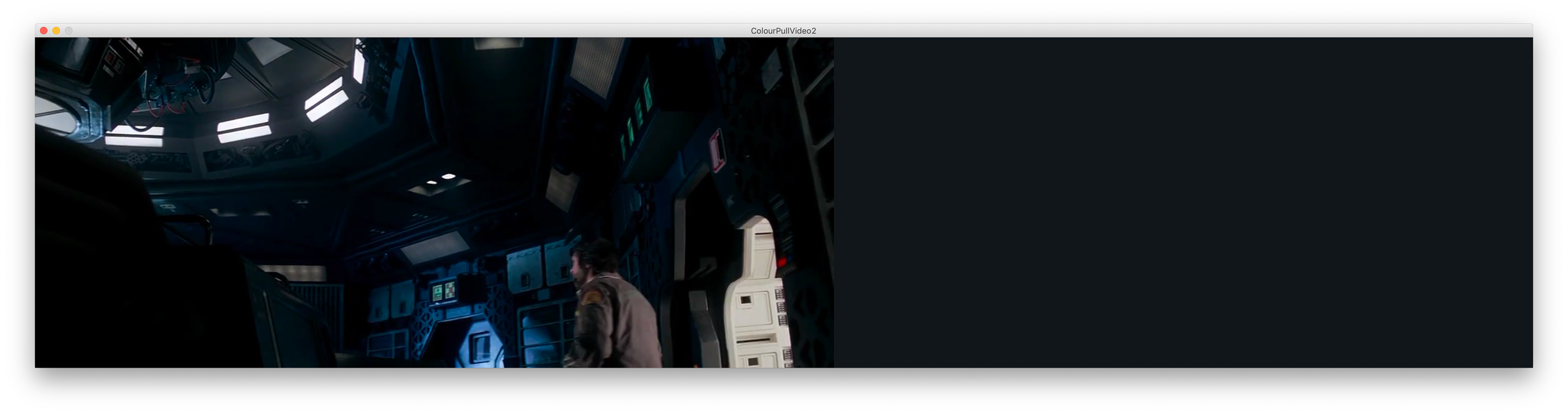
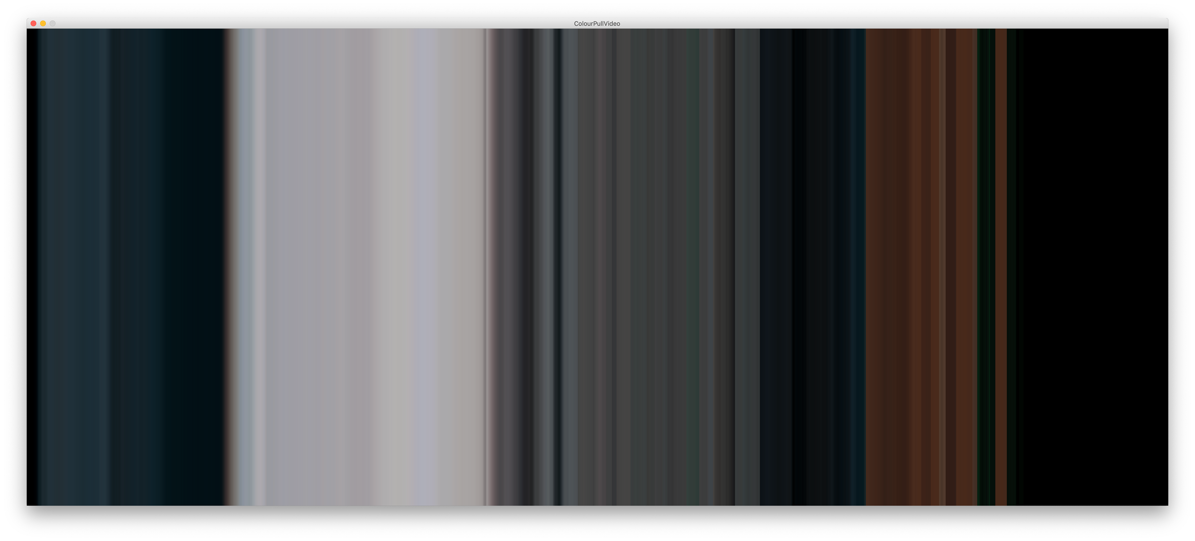
Alien is a film so beautiful in colour grading and contains a lot of contrast and these soft tones that scream "Ridley Scott made this!!"
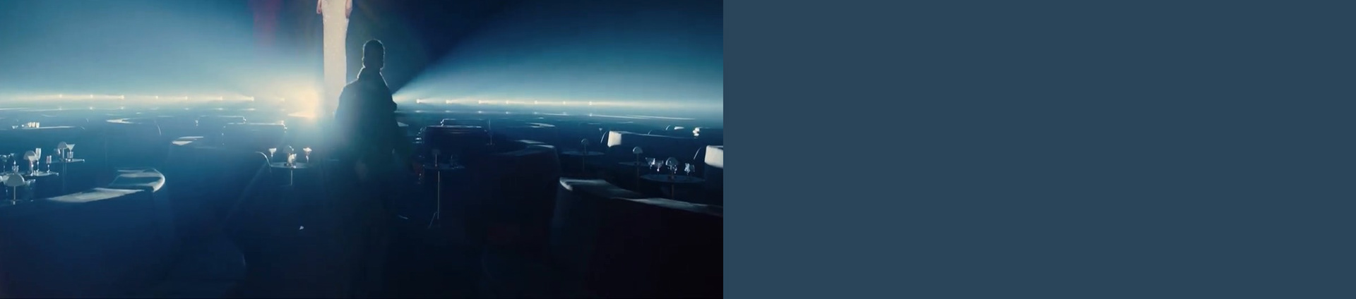
As I discussed in the previous blog post covering colour the importance it plays in Blade Runner 2049. Its vital to the narrative and flow of the story itself - we are on a journey with our protagonist and once we notice these colour symbolisms its hard not to.

I began to consider if these scenes have as much weight displayed as coloured projections and if they communicate the same ideas or something completely different - Thinking of colour as data and how we disseminate that data is vital to an audiences understanding of these ideas.
I really liked these snippets of projections I took throughout 2049 and knowing there importance I was very intrigued how others would view the same piece and the difference playing the audio with it makes.
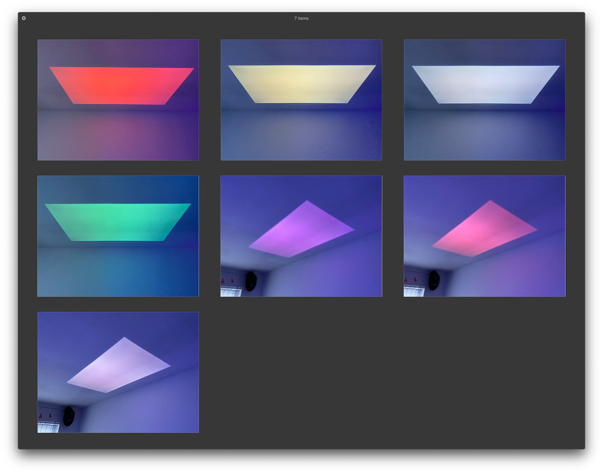
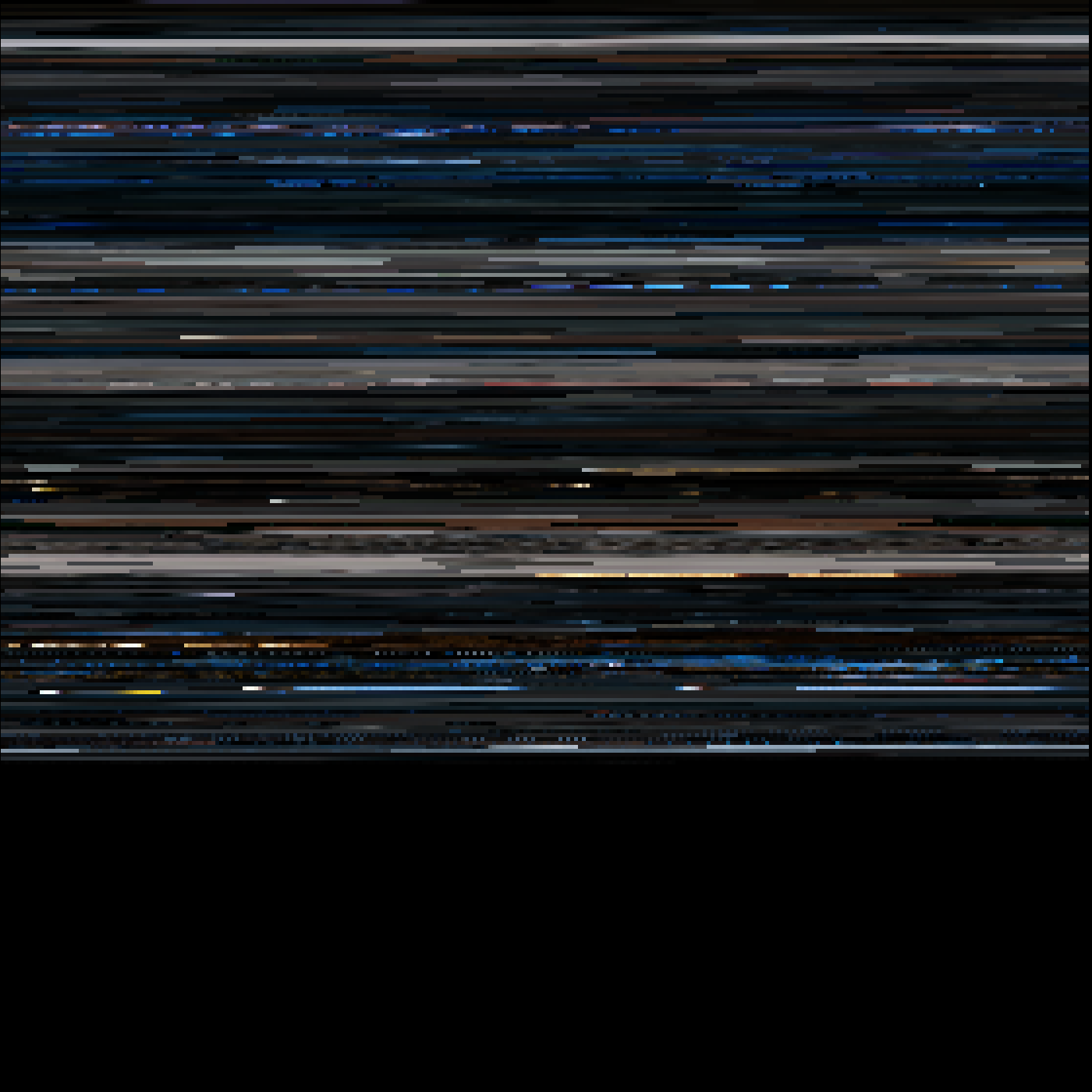
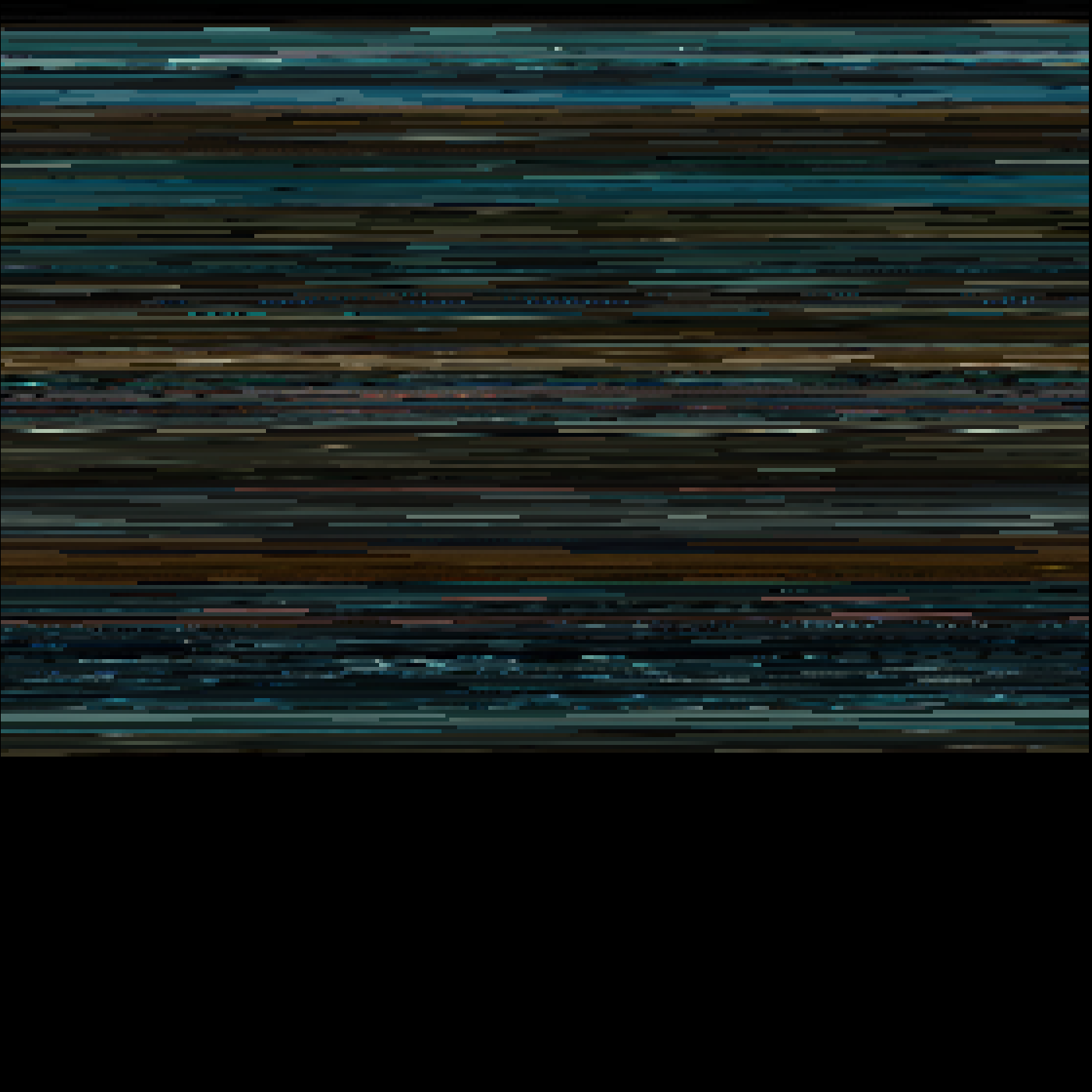
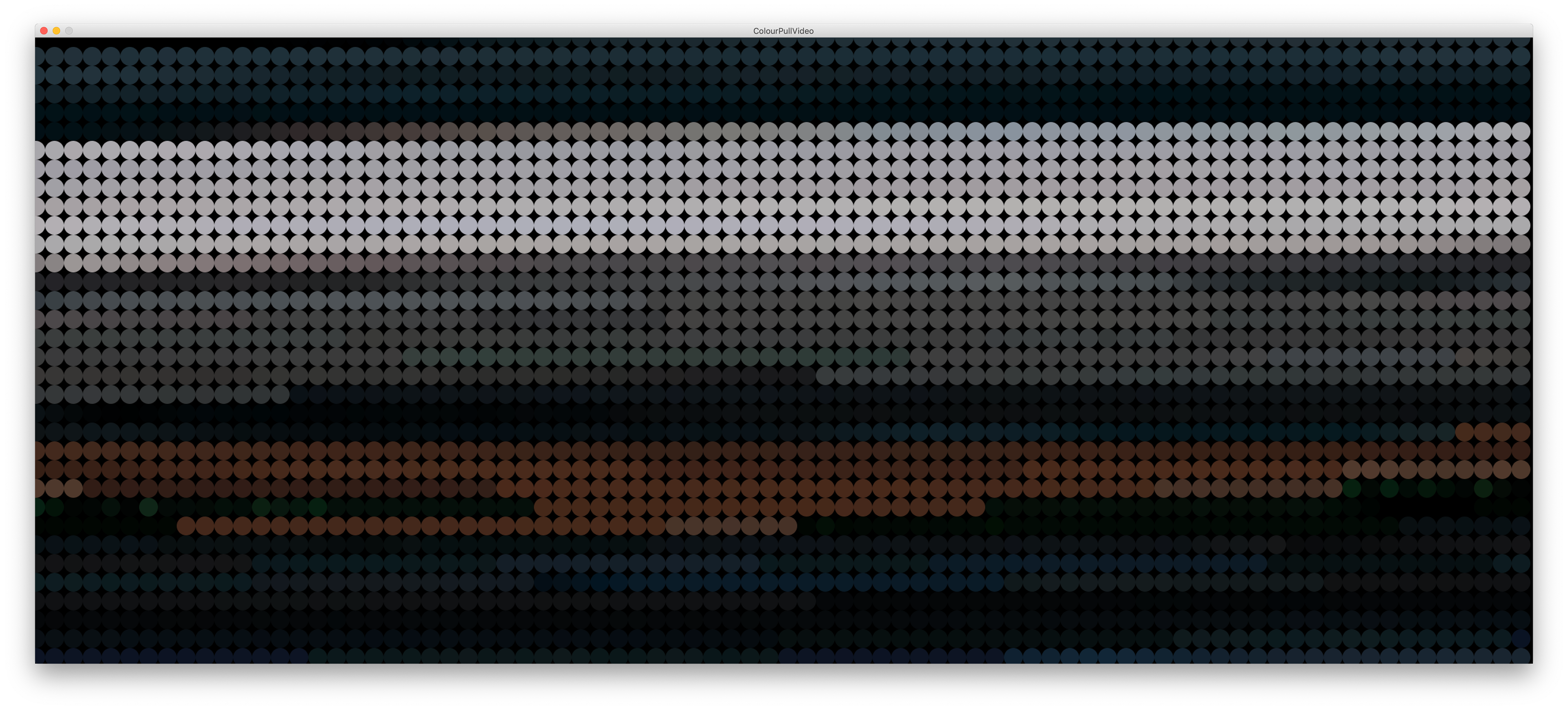
However considering these colours in the moment and experiencing them at the same time as they are occurring on the screen makes sense. Its an instant reaction and there isn't much information to gain from these blocks of colour altogether. So I began to consider how we can view these colours as a series or in a linear format.
Thinking about colour trails and this idea of a footprint of colour left from a film.
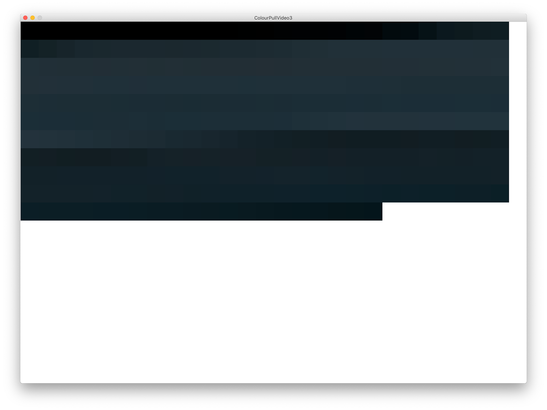
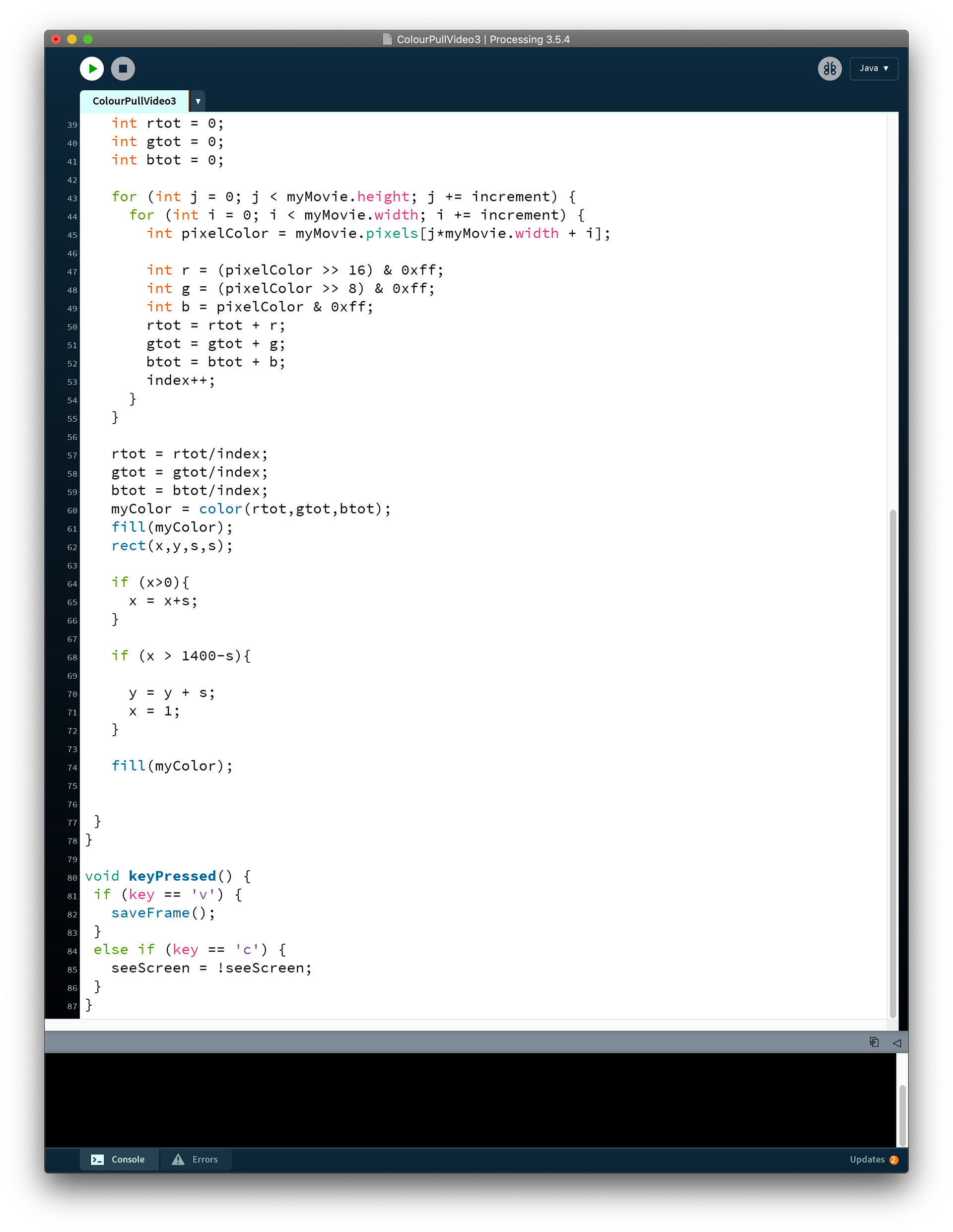
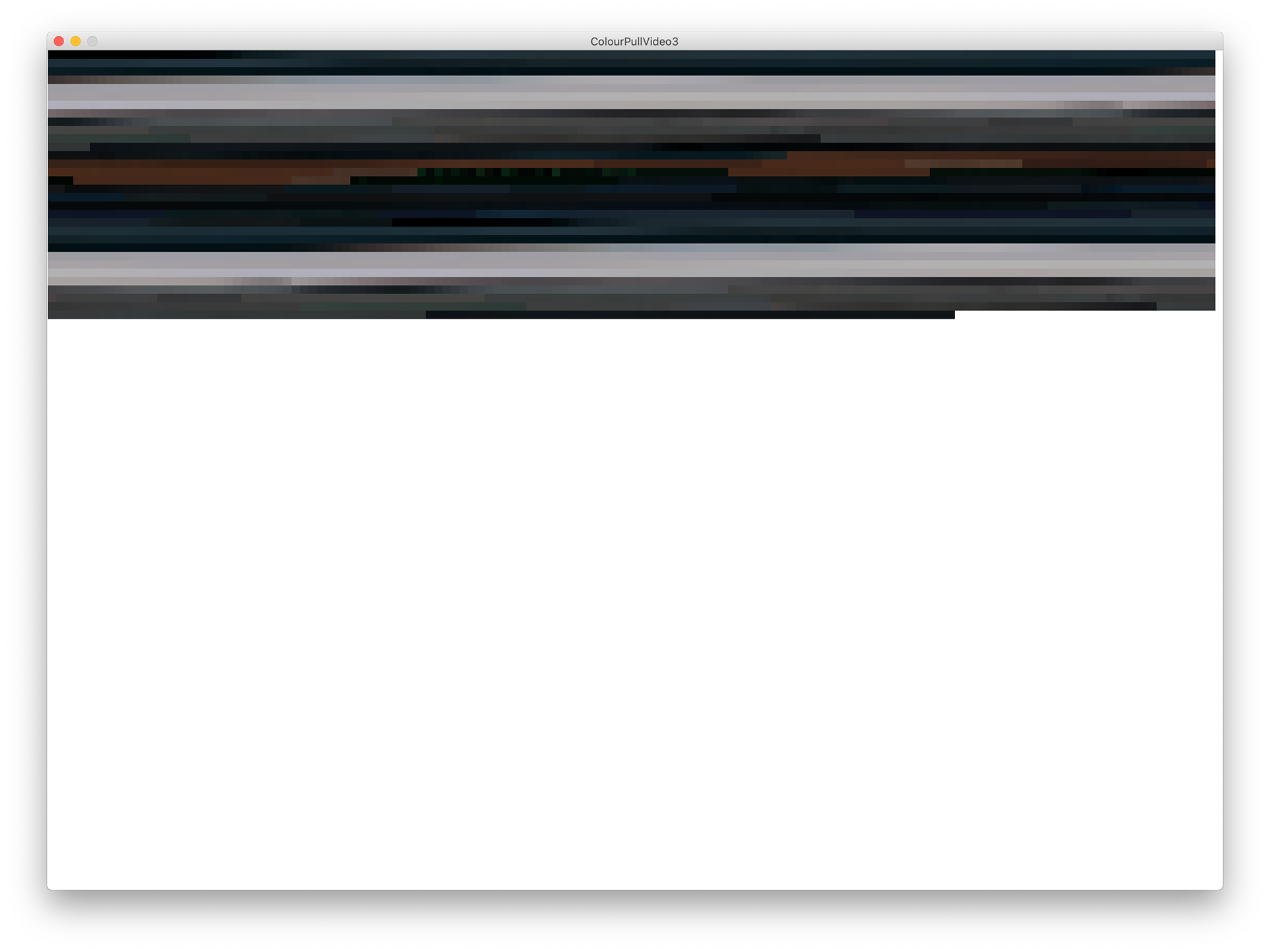
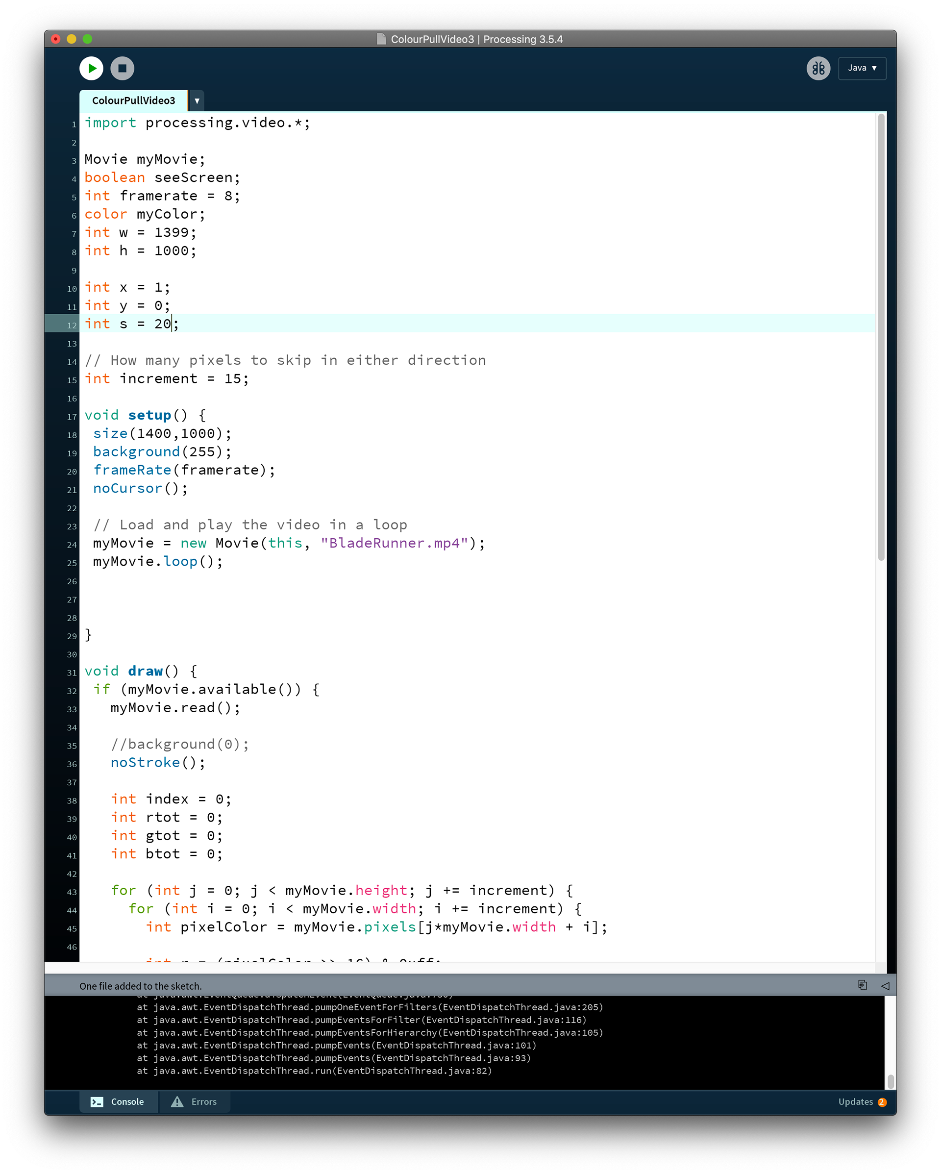
I developed my code to a really interesting place where these sketches drew whilst the film was playing square by square of colour. This got me considering the symbolism of time and how these colours act as markers of a point within that films timeline.
Alien
Blade Runner
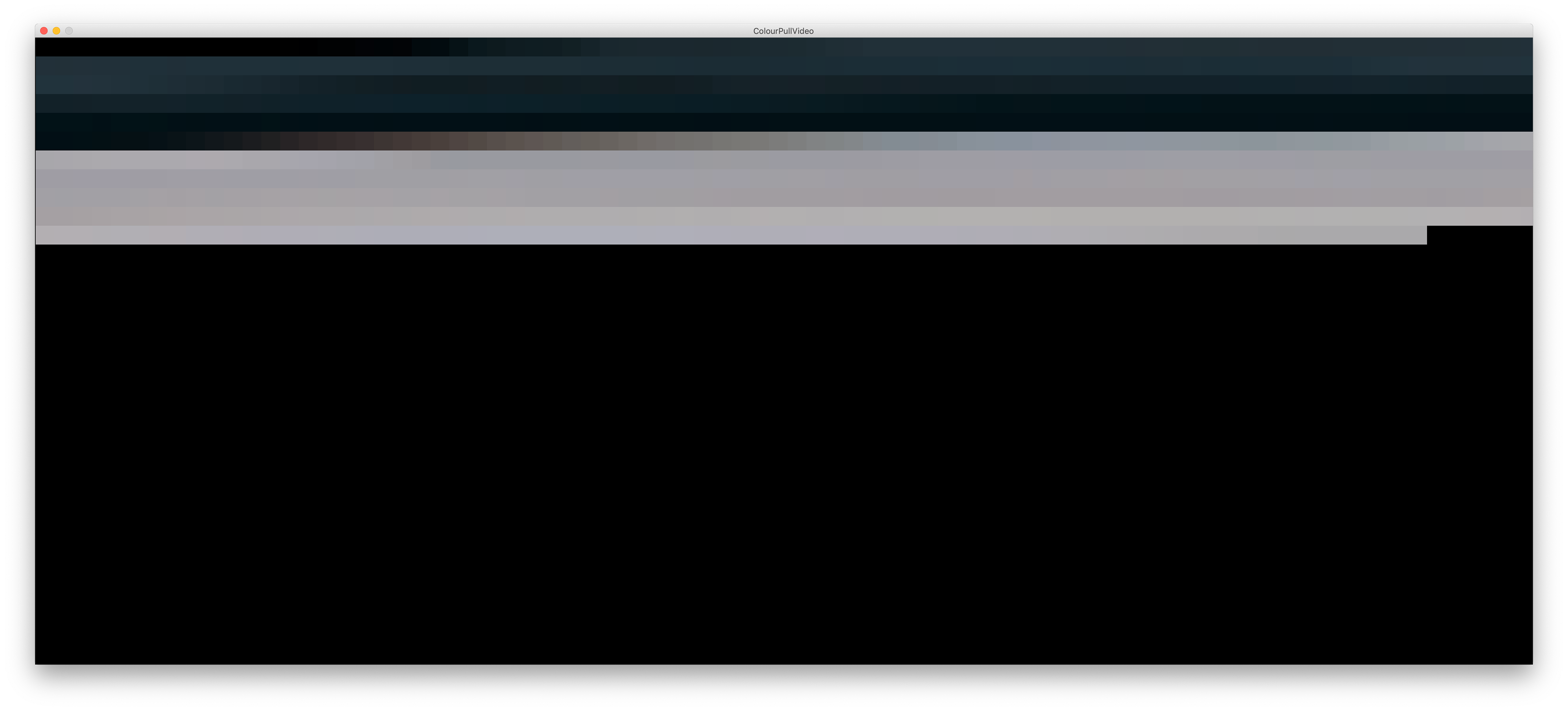
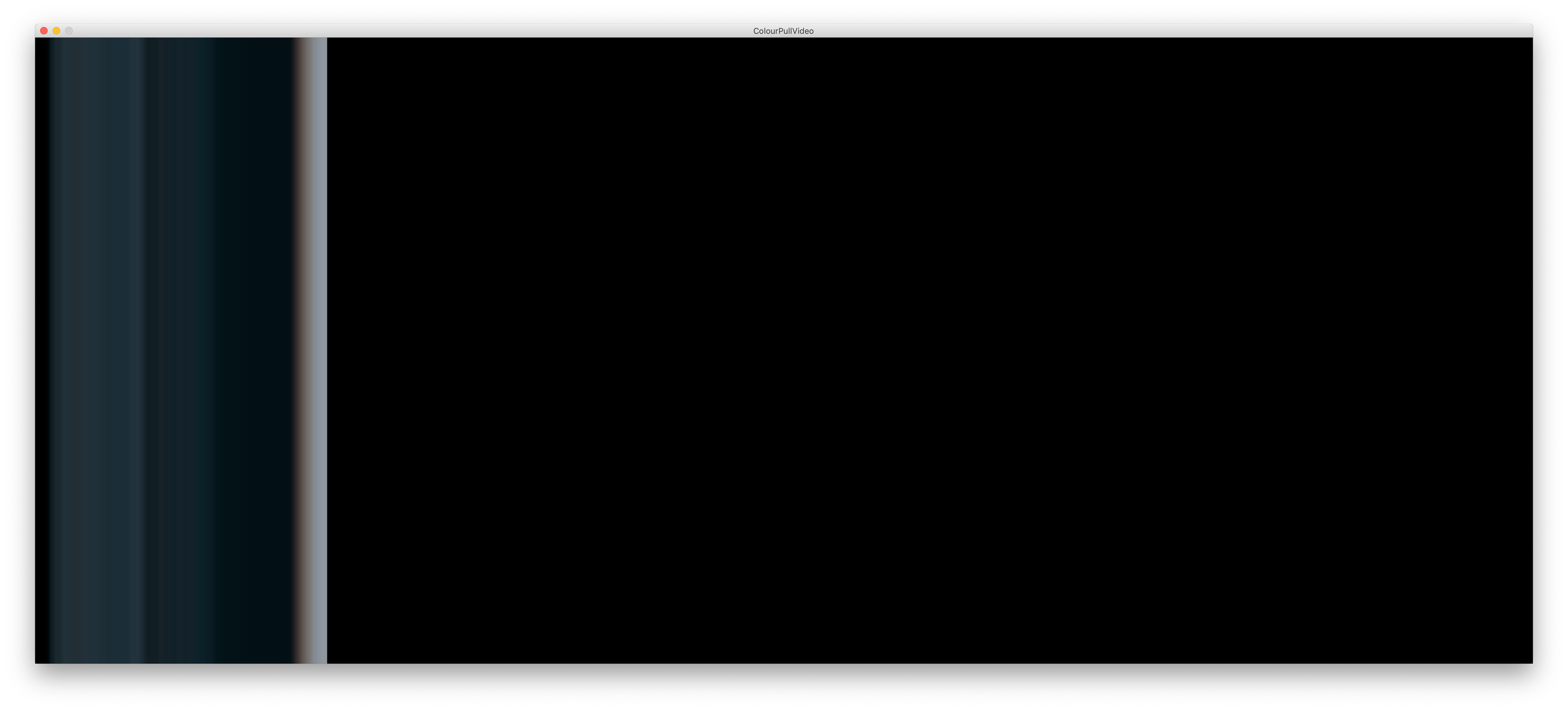
I'm overall very pleased with these studies I've produced, and working with processing to display these ideas has been very rewarding. The Alien example was a accurate representation of the films overall ambience - I discussed during a 1:1 tutorial the core palette and gradients being monochromatic with an over all cool tint which when compared to the impactful scenes which tend to contain hot colours displaying fire/blood makes for very interesting points throughout. I liked these pieces as they allow us to reflect on the production of the films colour grading and narrative.
I think continuing it would be an interesting outcome to run this framework with films from different genres/production/subject/era and compare them with one another.
Looking at furthering my framework to begin a different approach to displaying and visualising this data could maybe give my work the distance it needs from Dawes' Cinema Redux as they are very similar in format. I was ever considering printing horizontally to the films aspect ratio as a nod back to how they were created in the first place.
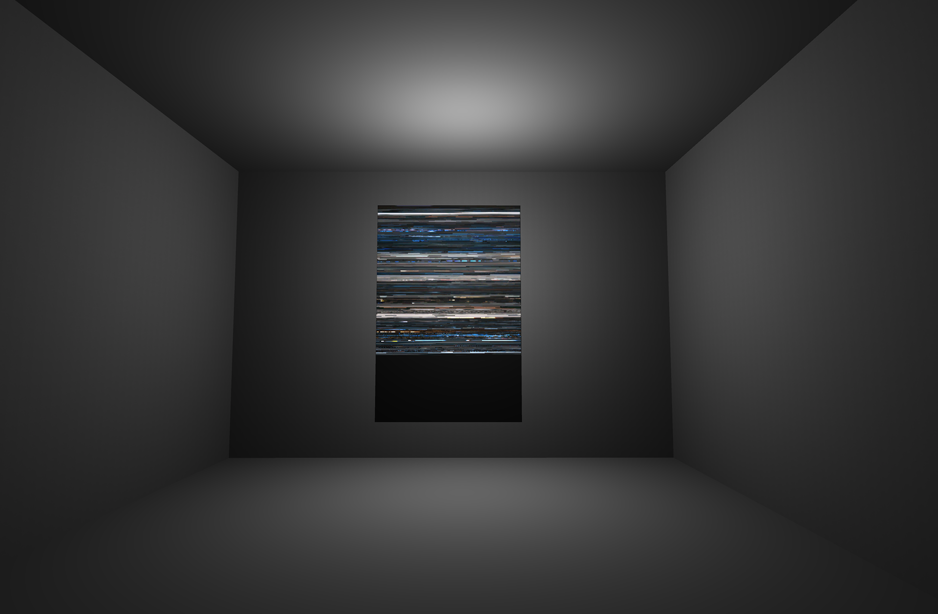
Paul suggested displaying these pieces on transparent film placed on light boxes so the images emit colour. I really liked this idea as a final rest point for this work as it almost brings the film cycle full circle and we finish where we started with transparent film and light. I also think it would also recreate a cinematic experience.
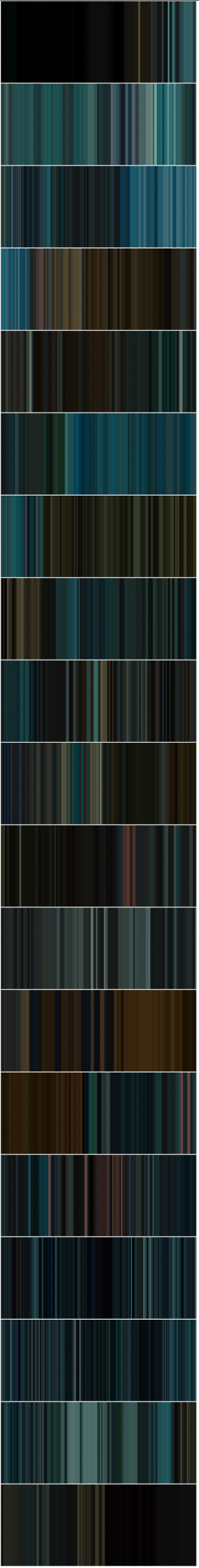
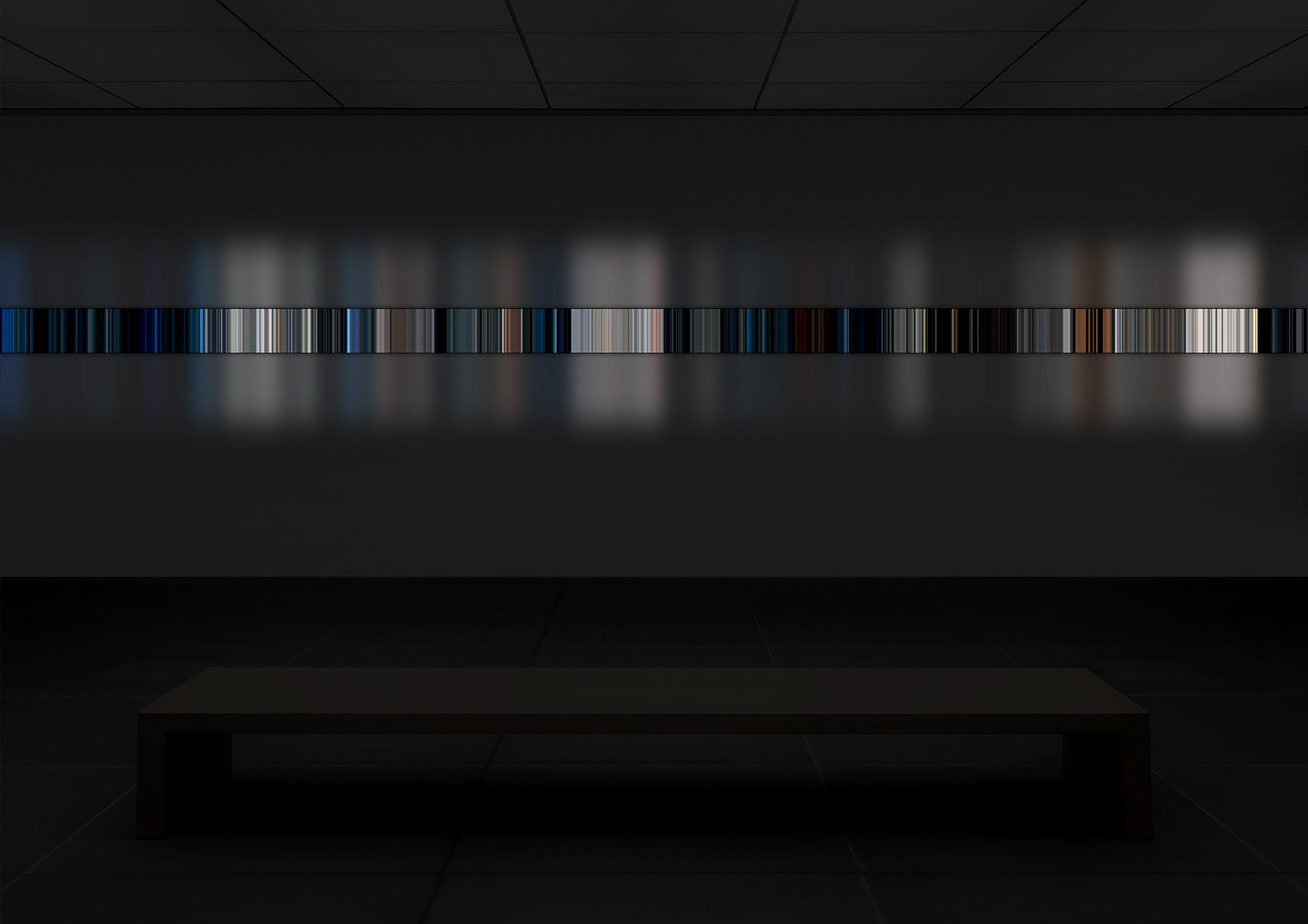
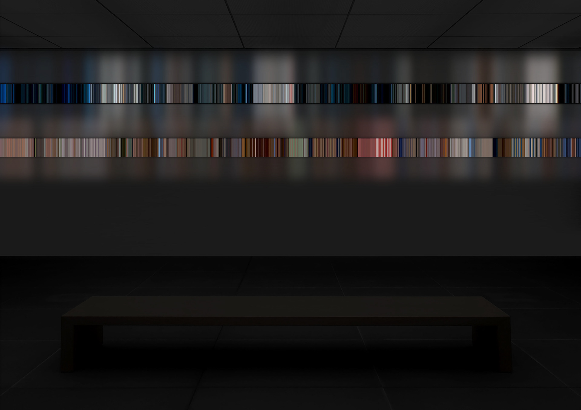
Above is the linear version of events of Blade Runner - a film with a heavy emphasis on time.
""Tears in rain" (also known as the "C-Beams Speech") is a 42-word monologue, consisting of the last words of character Roy Batty (portrayed by Rutger Hauer) in the 1982 Ridley Scott-directed film Blade Runner. Written by David Peoples and altered by Hauer, the monologue is frequently quoted. Critic Mark Rowlands described it as "perhaps the most moving death soliloquy in cinematic history", and it is commonly viewed as the defining moment of Hauer's acting career." - wikipedia/Tears in the Rain Monologue
The end of Blade Runner deals with themes of life and death and there is this importance of time emphasised. The entire duration of the film Batty is chasing down more "life" - as he's and android or a replicant he believes he can meet his maker and ask him to extend his lifespan which is is only set to be four years for his model.
This overarching theme of time running out seems very different when displayed above as we experience it all at once in this immediate linear formatting reminiscent of camera film.
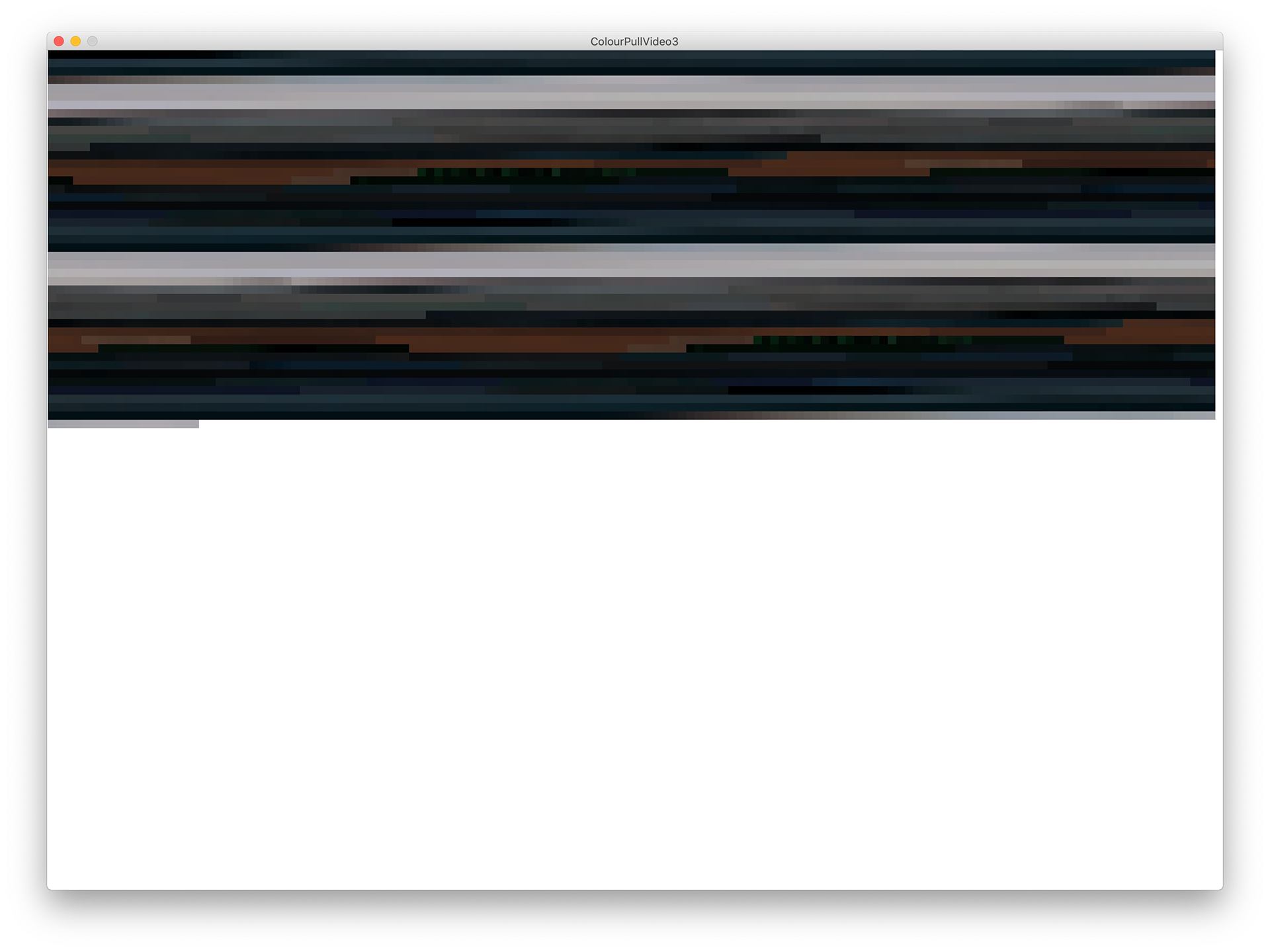
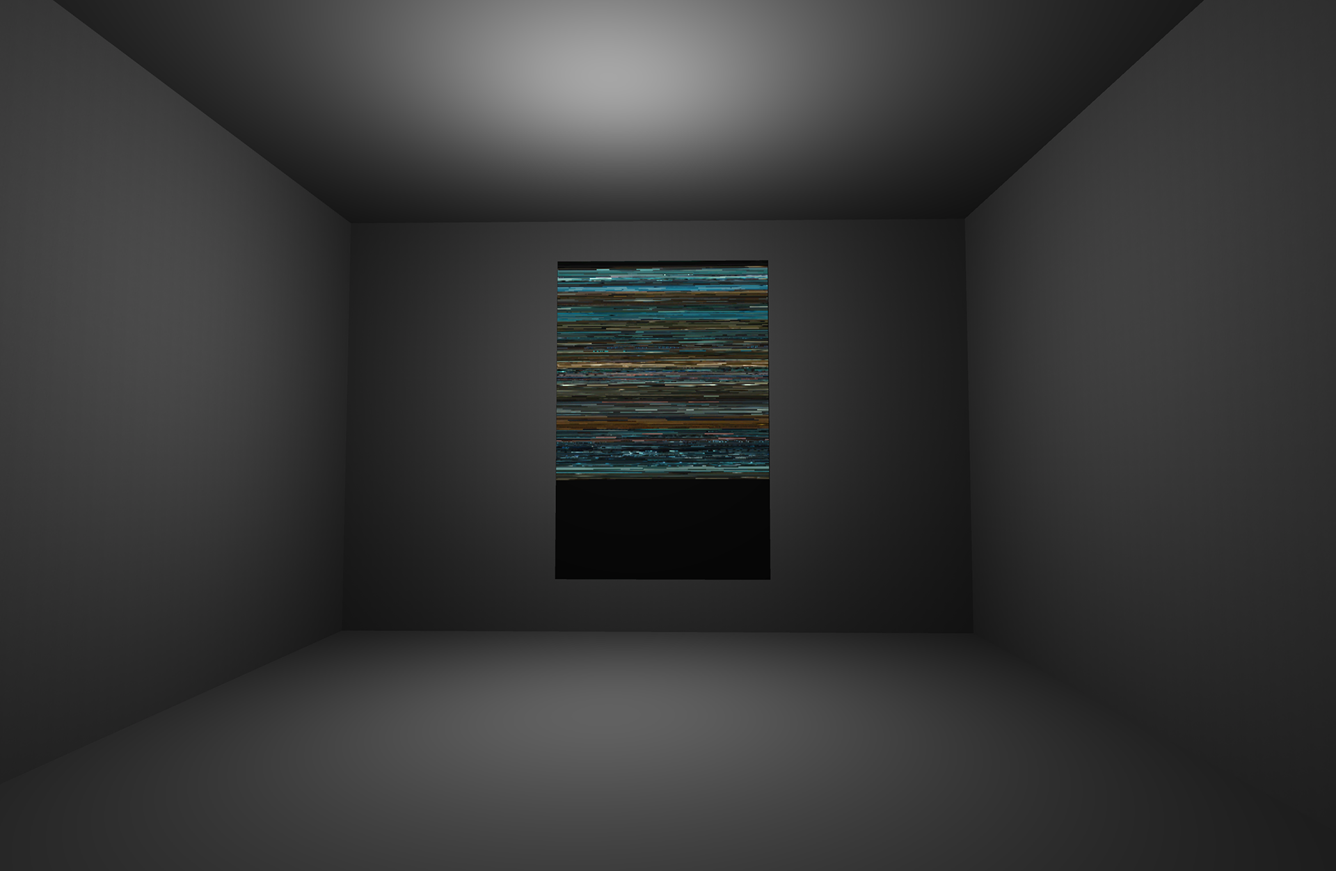
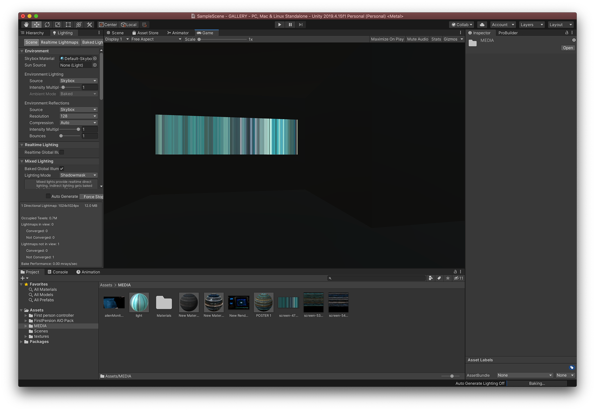
At this point I wanted to begin to stage my work and scrutinise it more. It's been strange thinking of my work as exhibition ready and for a while everything just seemed like a bunch of files on my hard drive so I felt it was important to begin to think of these things as physical artefacts so I chose unity as a platform to stage them.
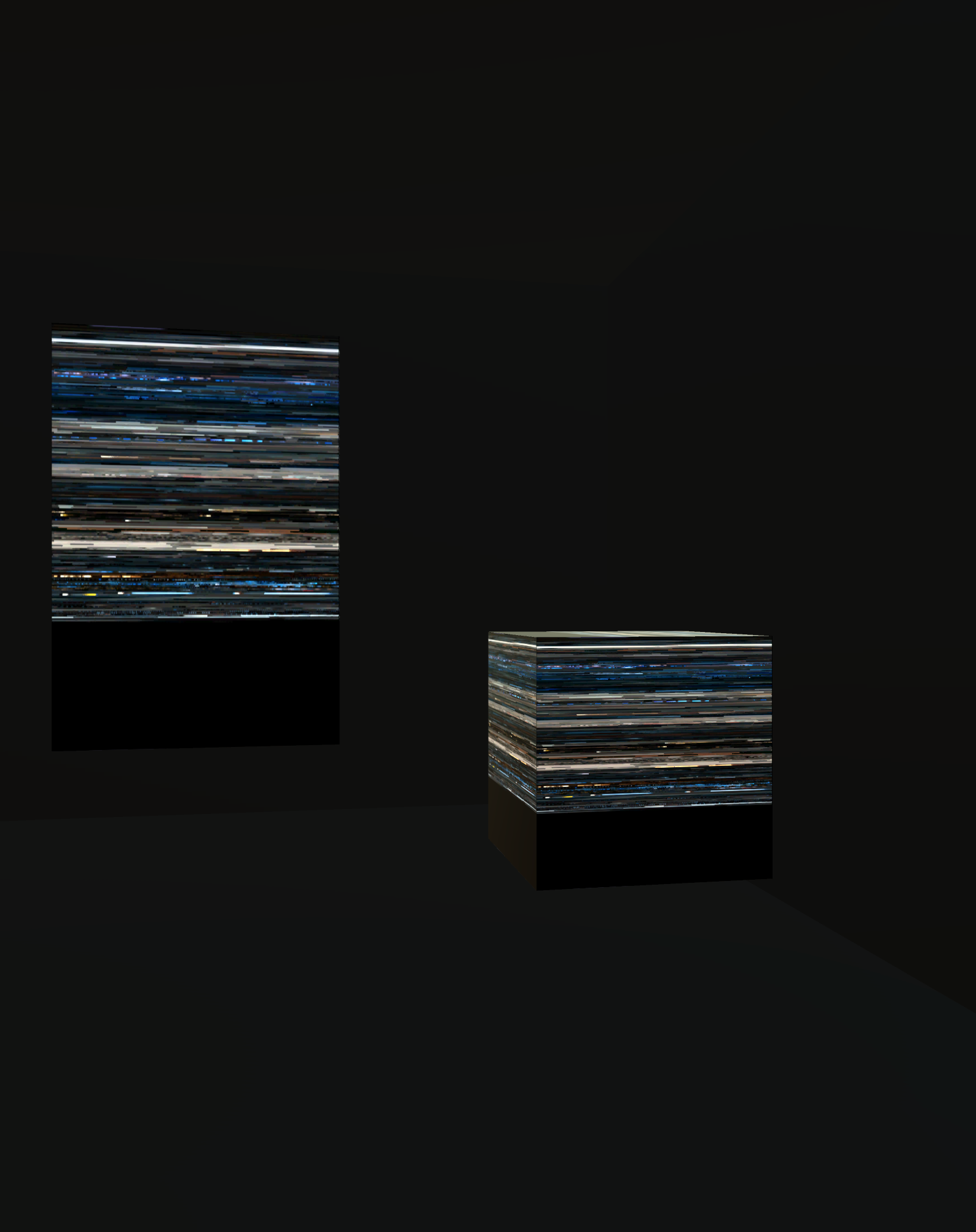
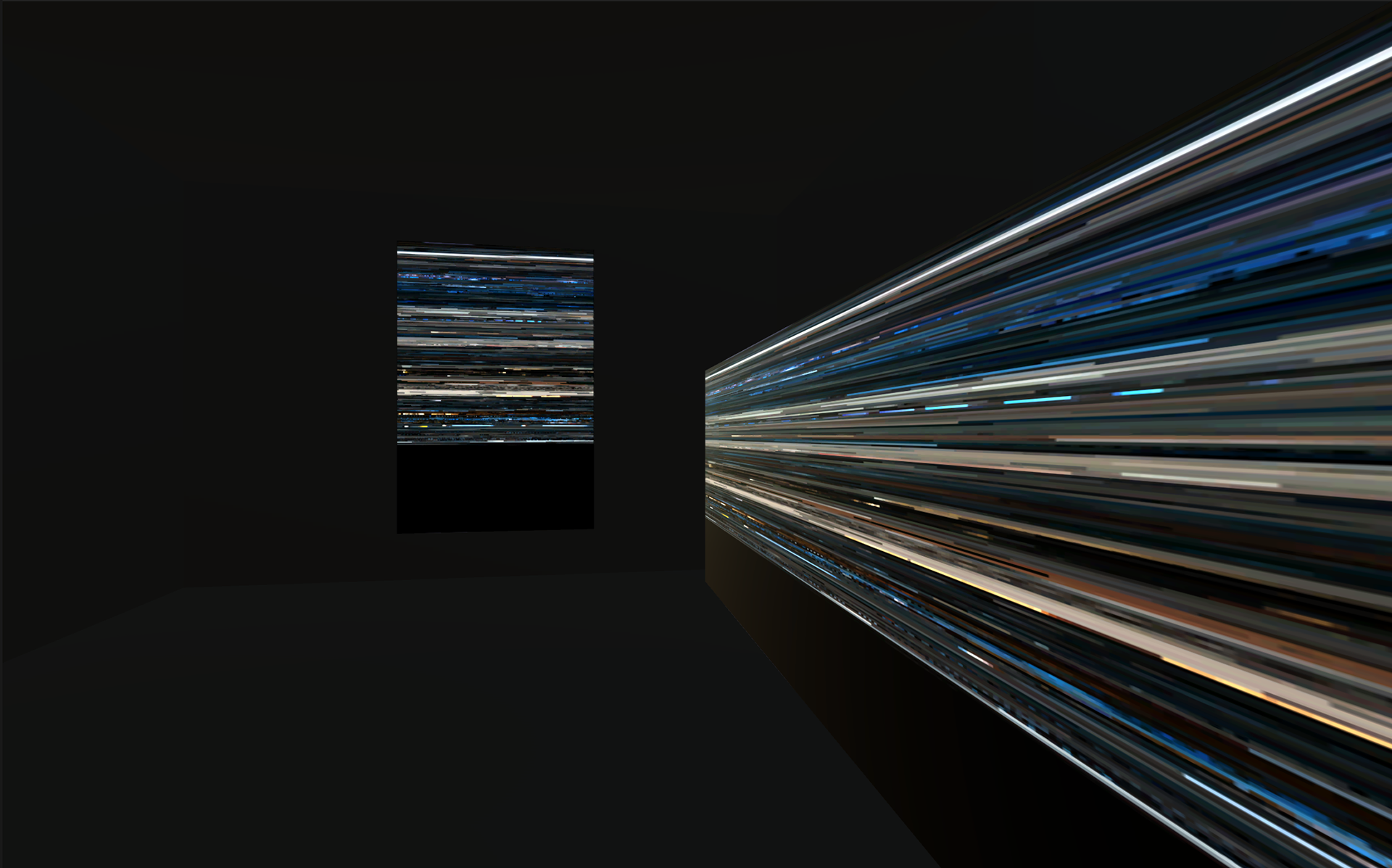
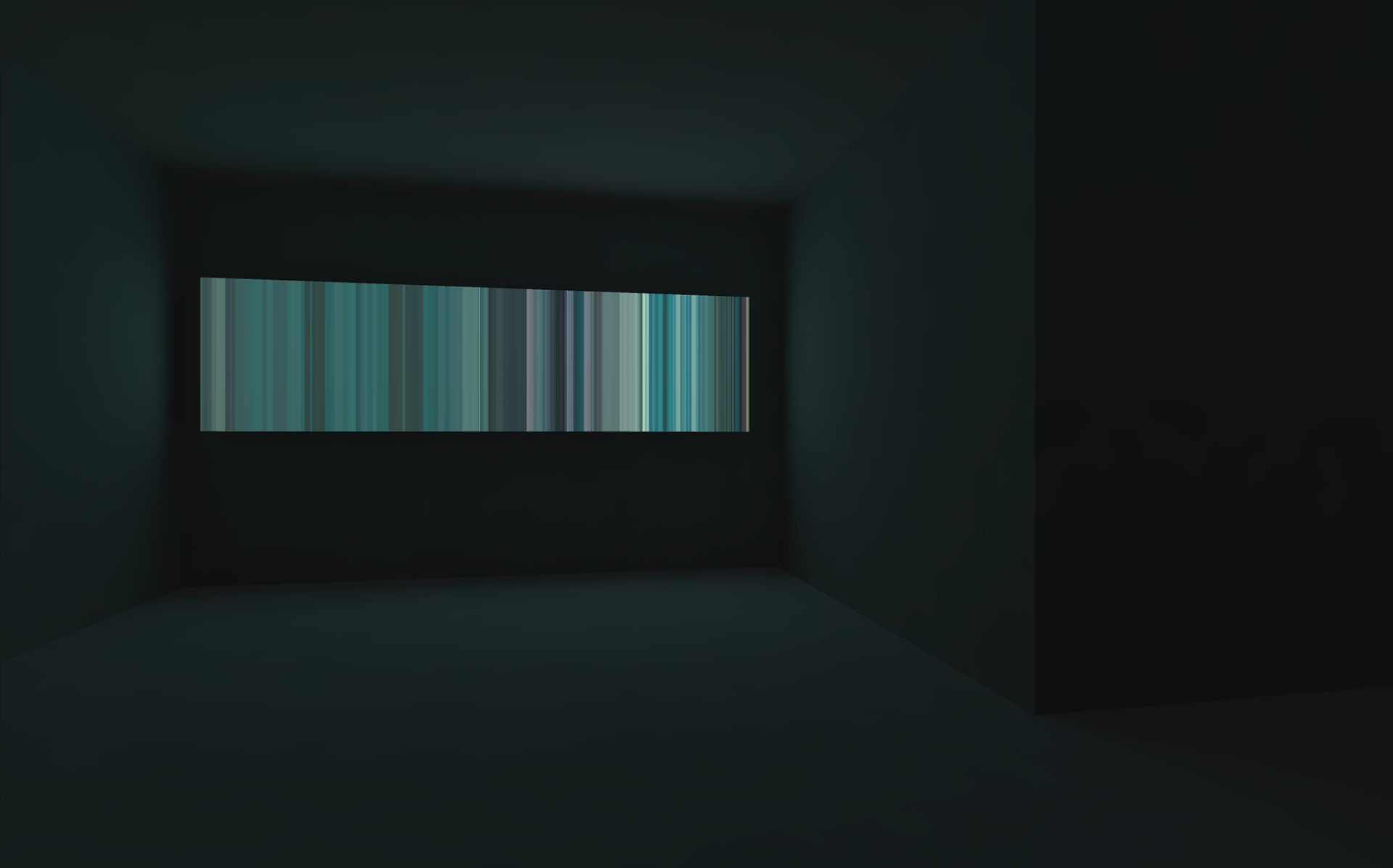
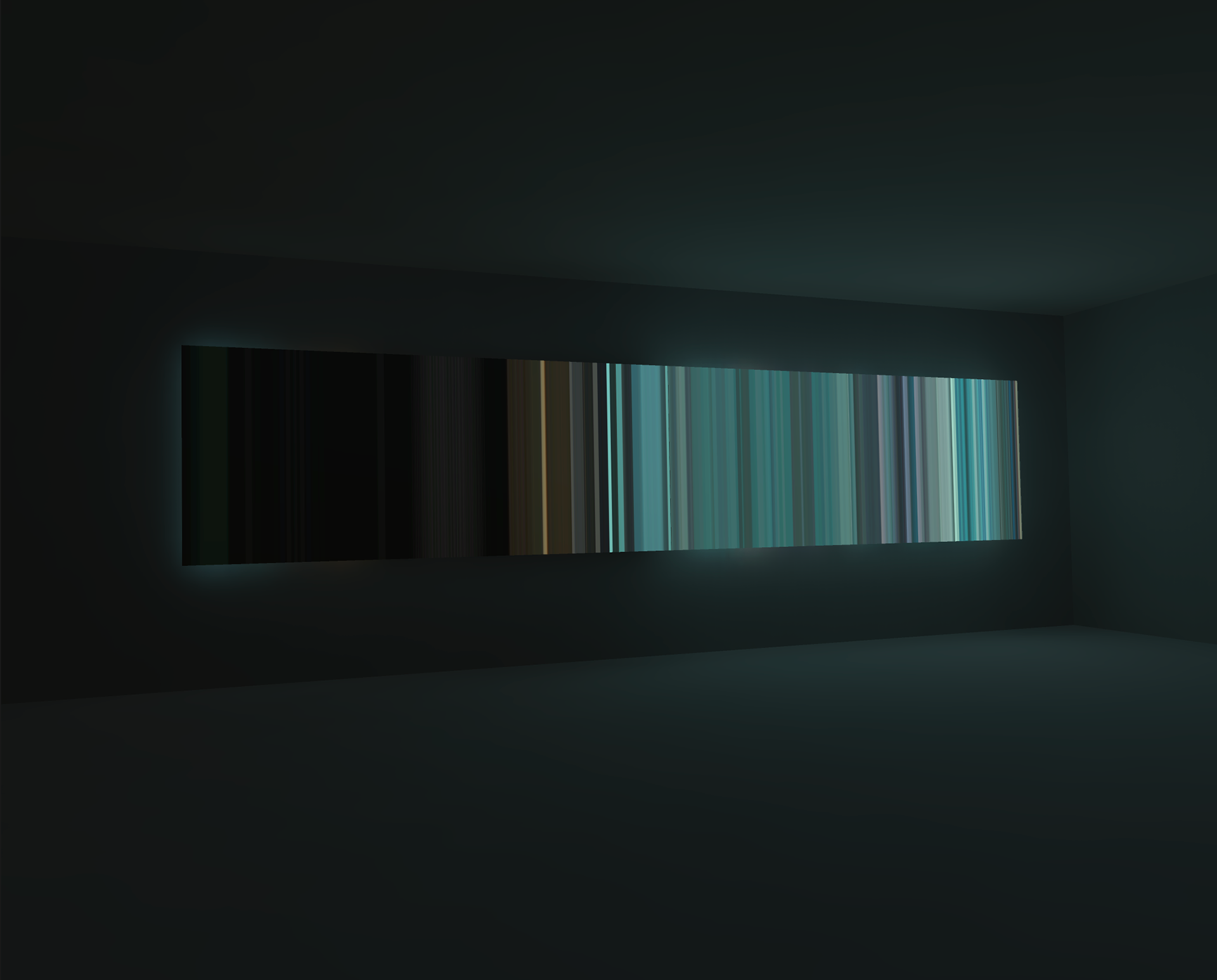
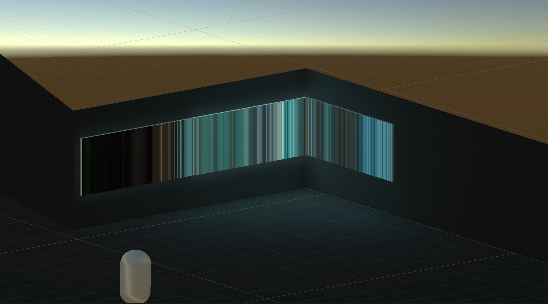
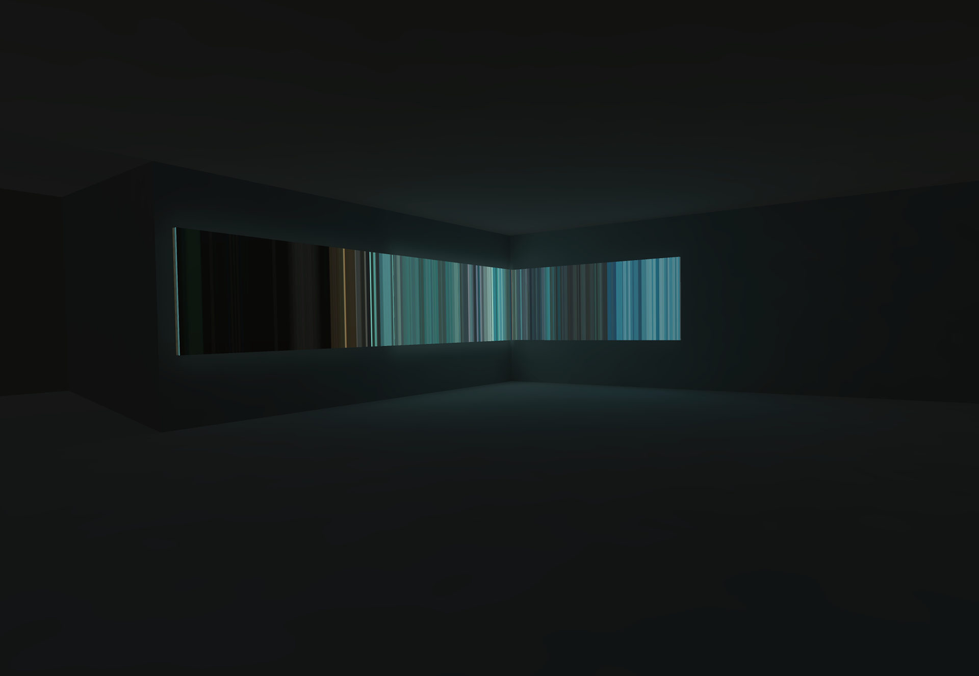
Creating this all encompassing Lightbox of colour we are allowed to experience blade runner all at once and see it as a linear flowing of the reality within the film. I feel this piece of work does the opposite of what other explorations have done this year. I feel like the experience here separates us from the film to a degree and the information being processed in not immediately recognisable. Seeing the design of these films from this angle is where my love for this project came from. Being able to spot scenes and moments within these artefacts is special.
Click the images below to take you to the P5 sketch where you can view the piece in further detail.
Just click and drag to the left.

BLADE RUNNER

THE SHINING

ALIEN

UNFORGIVEN