Beginning semester 3 I knew I had to revisit many experiments I had already created. I wanted to delve further into these experiments now that I had more time. I feel this could give more depth to my work and allow me to see more evident progression and context to what I set out to explore.
I began reflecting upon all my previous work and reviewing some documentation I gathered at our small end of year exhibition.
It was beneficial to have a physical final for our final year's work, even if it was on a small scale. Finalising something into a finished product always helps me feel I achieved what I set out to do and allows for moments of reflection regarding the work. Did it communicate what I wished effectively? Was it the final I had hoped for?
I began my project with an interest in stereotypical tropes within science fiction and how we disseminate information in film. I started focusing on typography and design within these films due to an organic interest in the genre. Throughout this progress, these idea's developed and changed and I realised my real interest was pushing the boundaries of these films and realising them in entirely new ways. When we begin to break down something artistically driven, into numbers and data, we unfold new ways of seeing these familiar pieces of media.
I find the theory of pairing two films with very similar themes conversing with one another intriguing, and I enjoy the never-ending, non-linear output we are left with. The loop and random selection of lines from each film creates an ever-changing narrative that we can draw our own interpretation from. It nods back to my initial statement of intent with dismantling film and finding new ways to observe and display the information these familiar works already give us.


I began my focus on my experiments I did with colour and its relationship with film. Colour and its relationship with story telling is a deep rooted tool used throughout the recent history of film. We struggle to describe colour and why it evokes different emotions from us. How can colour tell a story?
The visual element of film is a vital part of the story. By taking from Dawes' work with Cinema Redux and other film based works the theme of visualising and dismantling these familiar works is the focus.
I began experimenting with other ways of displaying my work I had already created. Taking these tapestries of films into a 3D setting to experiment with how these pieces are most effectively viewed.
The results were interesting and it was helpful to introduce myself to this kind of output made with Blender. Creating a more tactile experiment, but I was unsure if this was the output I wished to achieve. I was trying to branch out and consider how these pieces are displayed as it's a vital step in telling the story of the work.
These strips of colour are reminiscent of a roll of film which brings the work full circle. It returns the work to its data source in the rawest format, film. I think this is a nice alternative to the larger display of work and could even coincide with one another. The idea of reducing the scale into something we're more familiar with is a full-circle moment for the film as well.
After a few experiments, I realised this wasn't really helping forward my work the way I wished and I ended up getting too focused on this final output where I wanted to shift focus onto my experimentation of ideas and outcomes.
I think working with a 3D software is a rewarding process when finalising and polishing a final piece. I like the ability to stage works and render out these nice visualisations. However, I feel it is not as effective a practice when I'm trying to be creative and come up with new ideas.
I liked these animations but there wasn't really a reason to take these forward anymore. They were a nice output and summary to the work but it was concluded here for me for now.
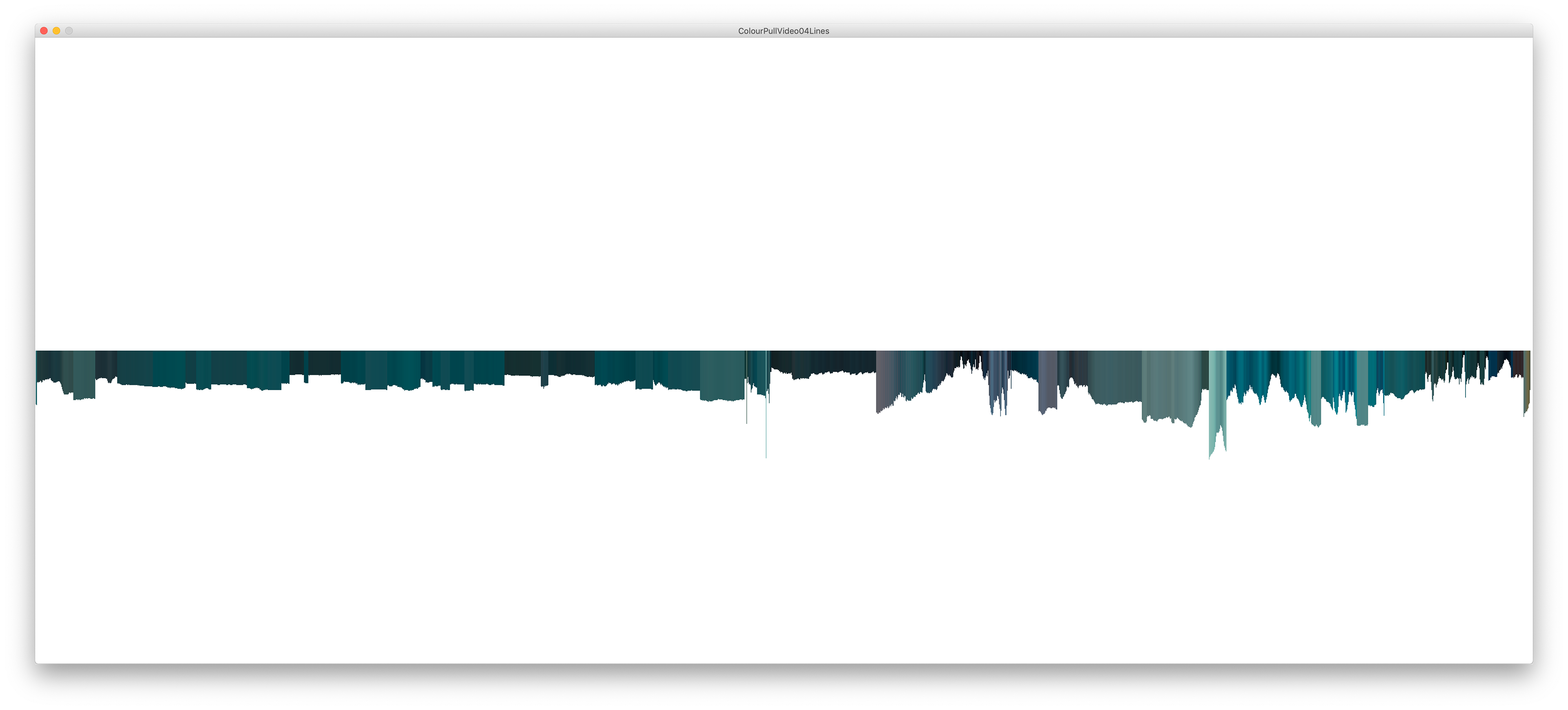
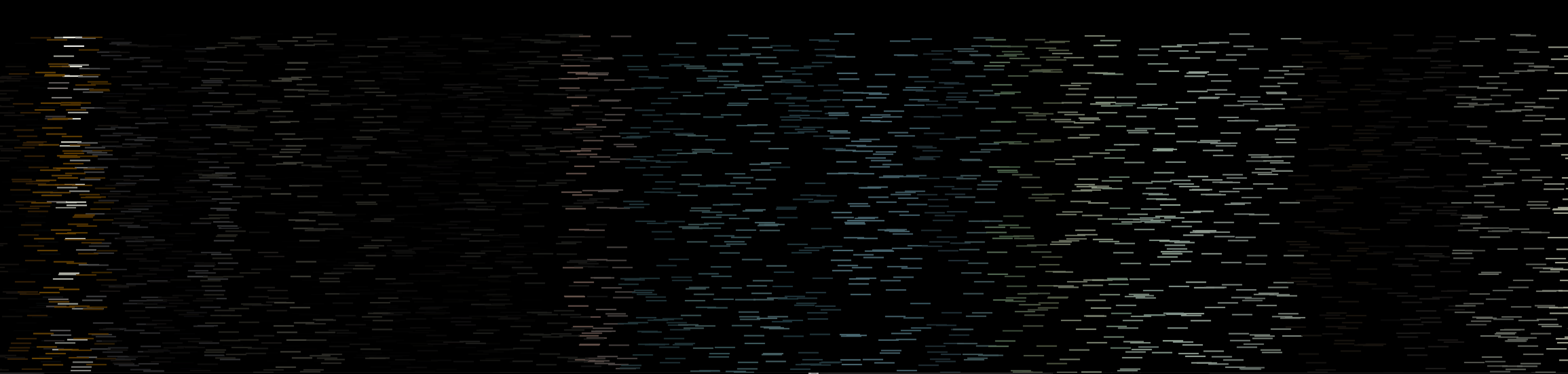
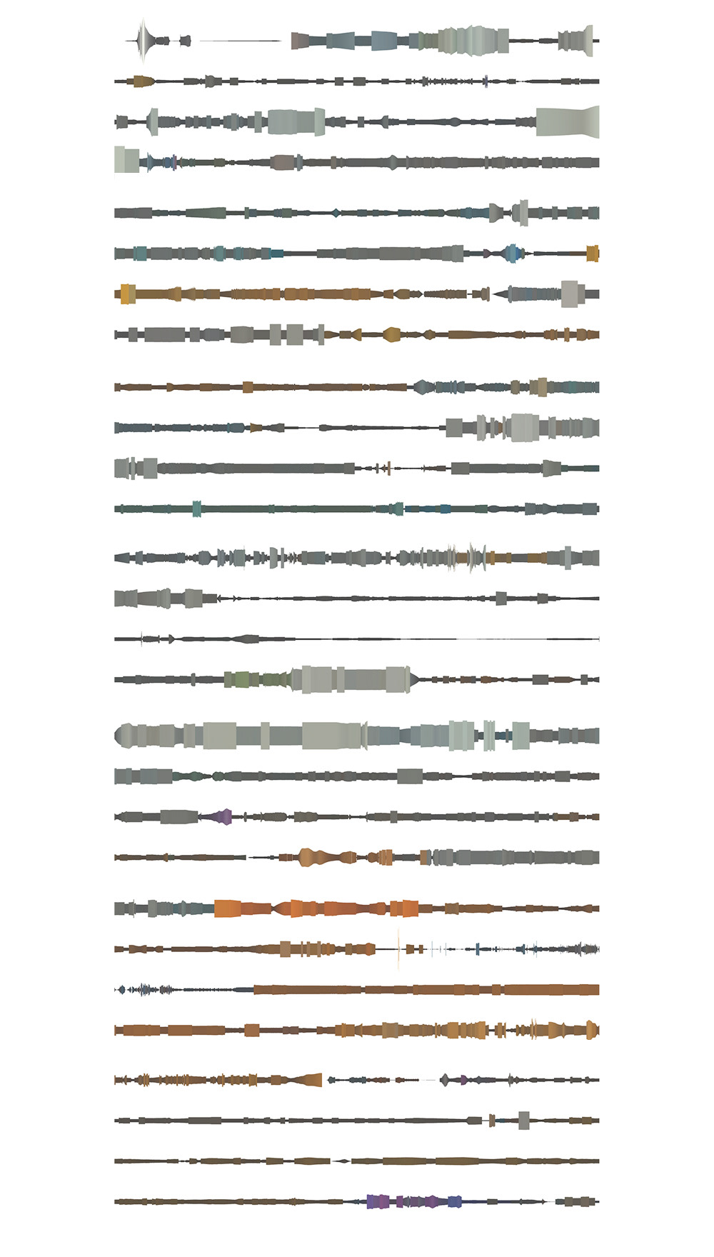
Reflecting upon previous works for me was an important step. I wanted to conclude my research and make sure these ideas and contexts were fully realised. The work I did which dealt with average colours throughout a video sequence helped me begin to understand media and data visualisation differently from previous.
I came to understand that data visualisation can be abstract and not so literal and that this can boost more questions and insight into what we are viewing. We can see clear breaks in the film, a juxtaposition of colour indicating a new chapter.
Below I began to experiment further with my previous Processing sketches to get the ball rolling. I wanted to challenge myself and see if I could bring another dimension to this work. Playing with other values and such.
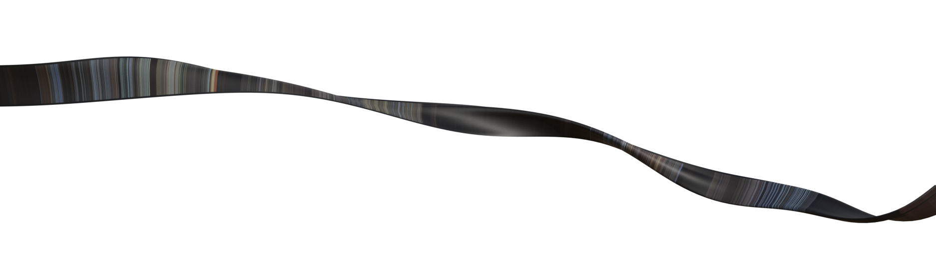
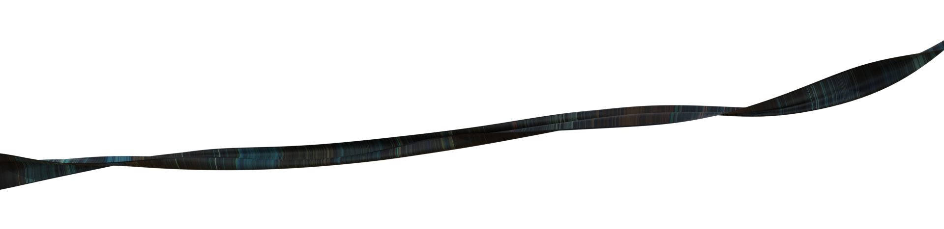
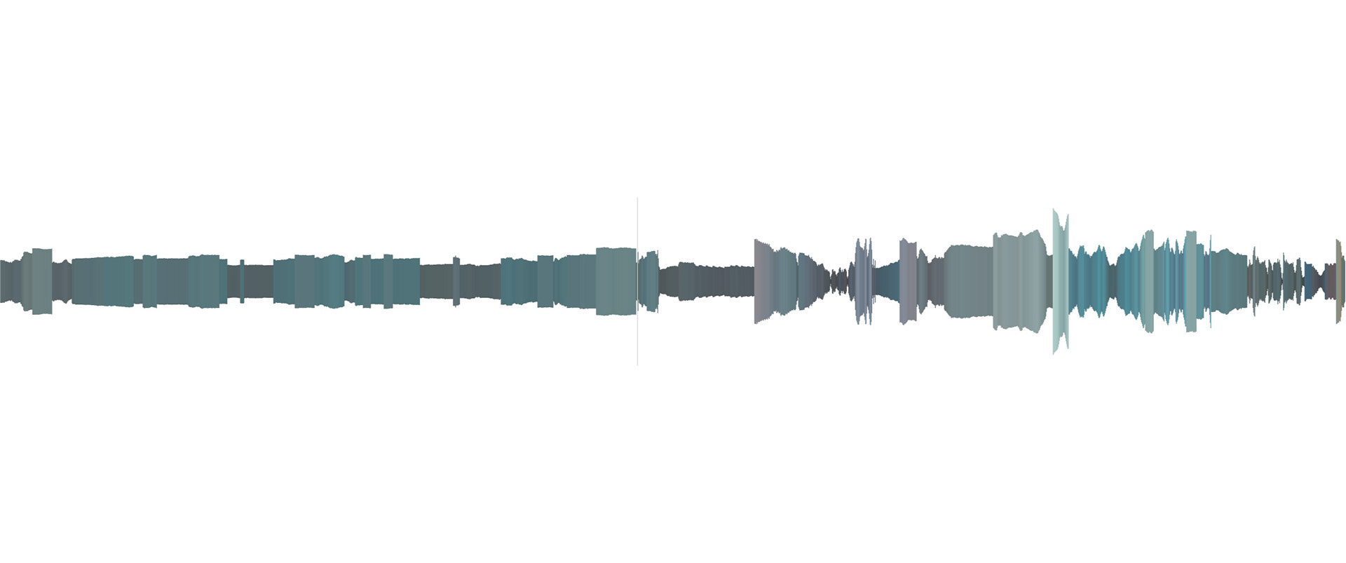
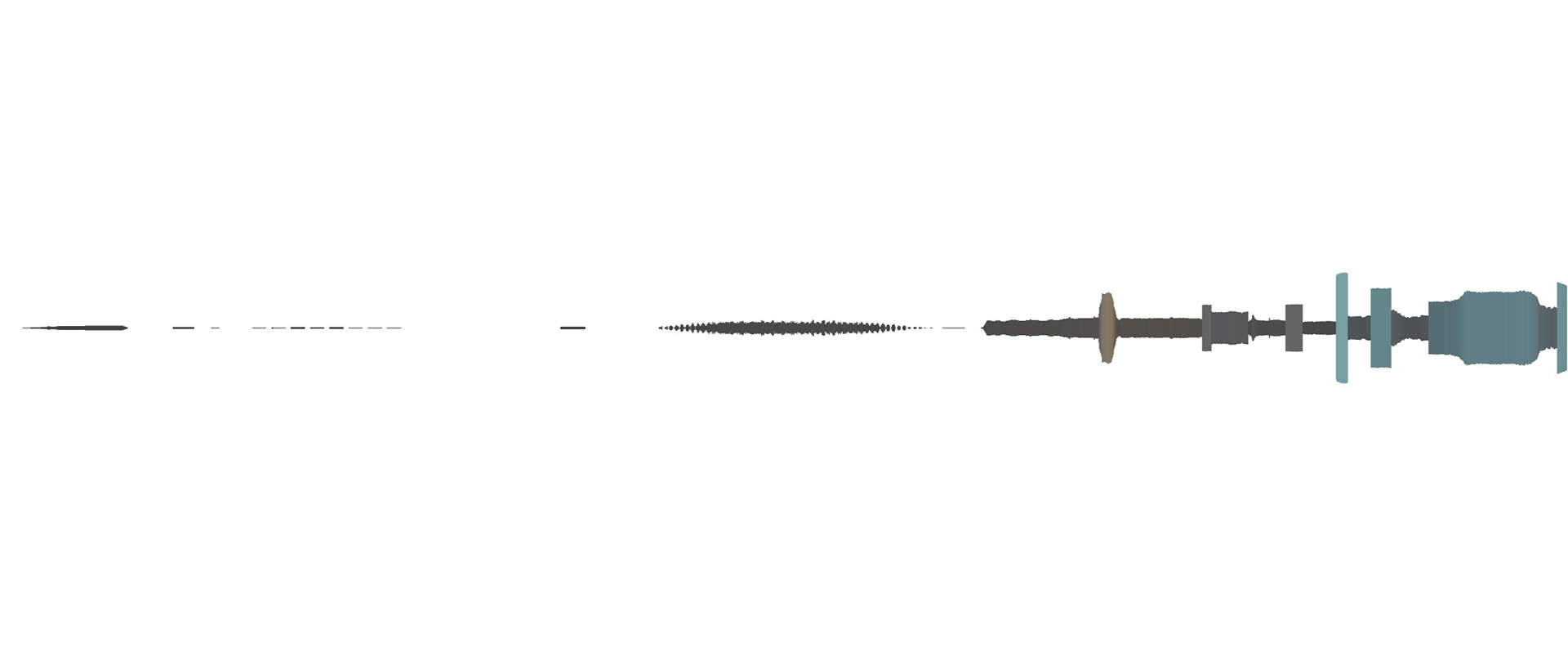
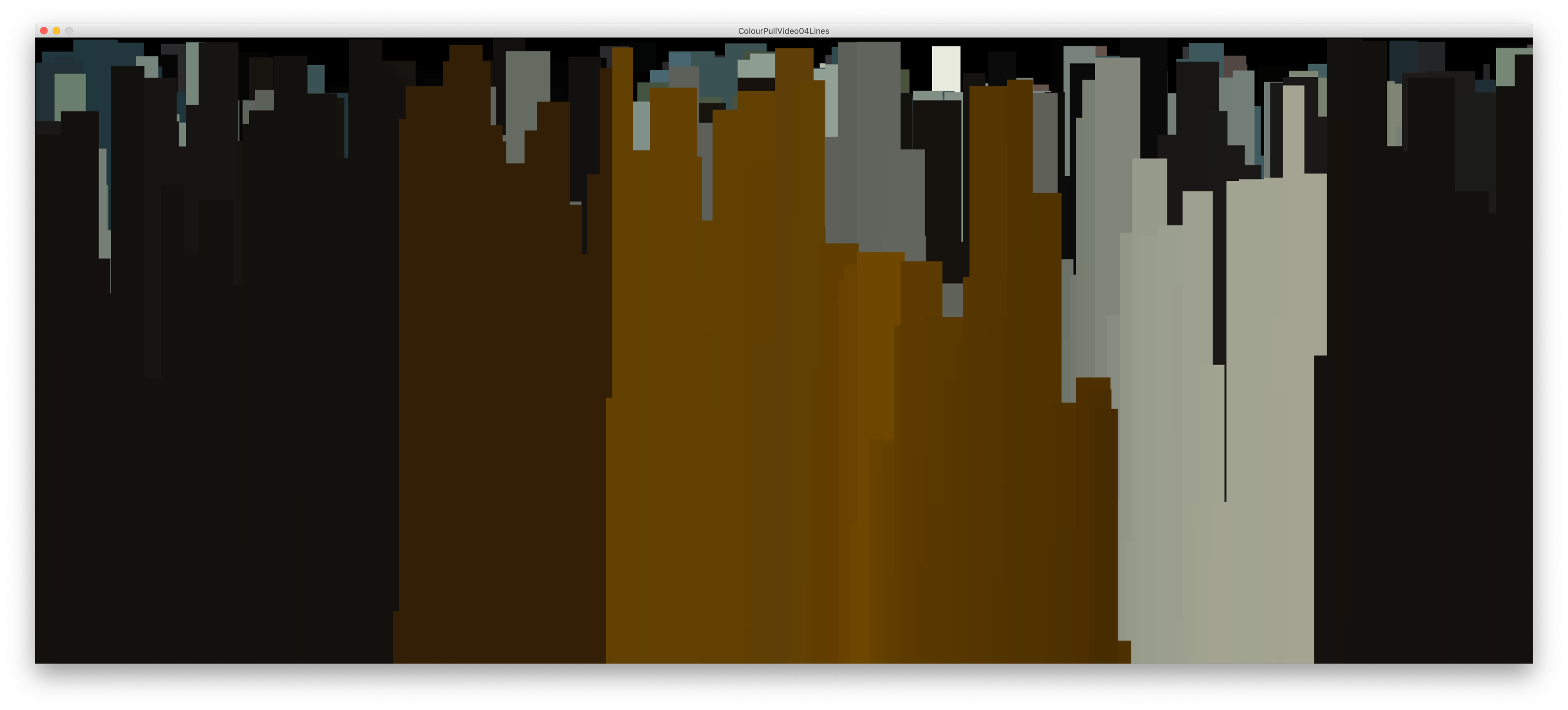
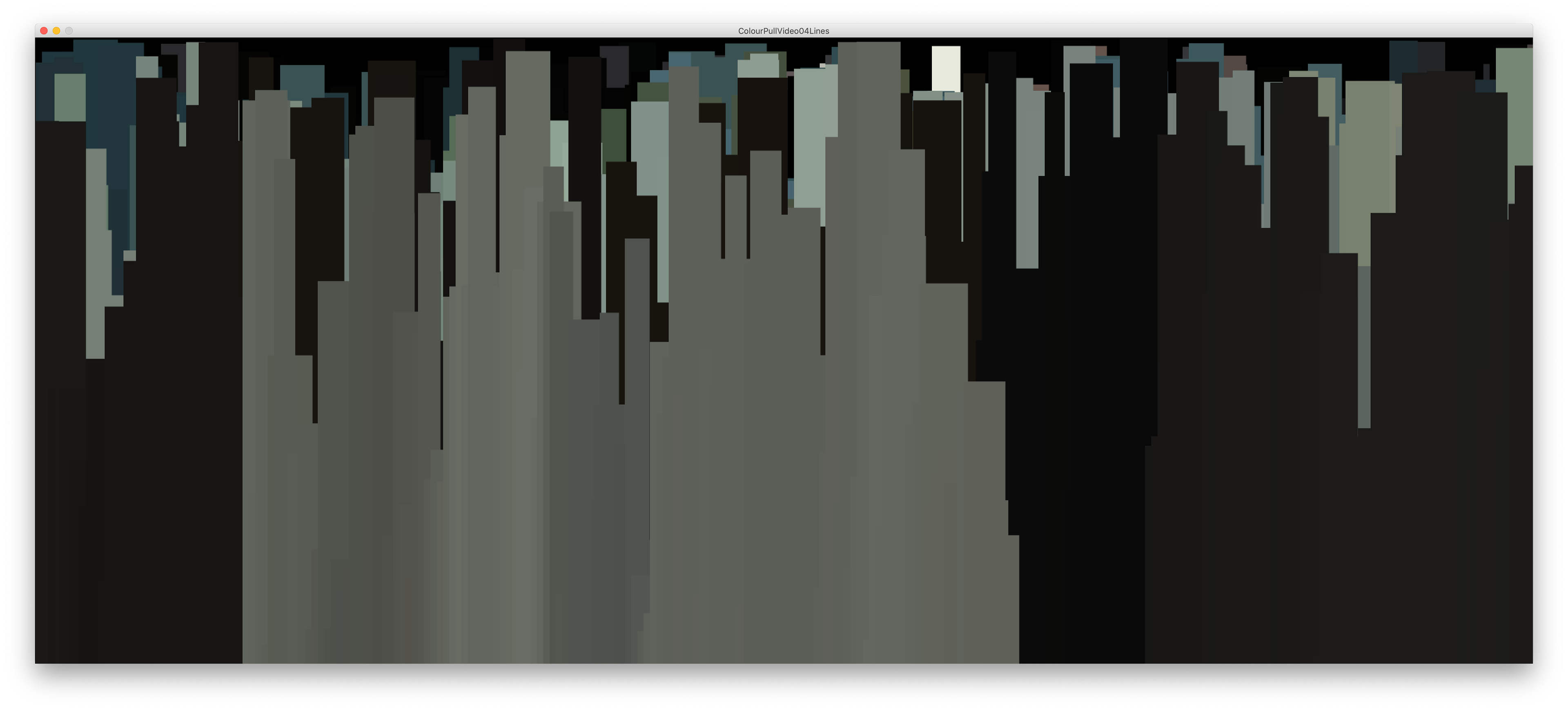
The colour value not only drives the colour now but also the length of these rectangles that begin to form a landscape of colour. This example is the opening scene from Blade Runner 2049 for reference.
What I liked more about this experiment was there was more focus on subtle changes that can be missed when each second is only given a small cube or line. The bolder shapes focus more on gradients and saturations, changing and creating something a little different.
Colour in film is an essential factor for many directors and affects how an audience feels towards certain scenes. It's something organic that we do that we don't put too much focus on in the moment. Cool tones dictate a more clinical feeling, whereas warm tones give us comfort for the most part. Although these are not concrete rules, for the most part, they are accurate.
So when we isolate only the colours and tones of these scenes, it no longer becomes a subconscious act. No longer aware or distracted by dialogue or visuals we are only left to contemplate colour which communicates a lot in itself.
Trying different outputs helped me regain some confidence again with processing and allowed me to begin a creative process again. I think we stumble upon the best outcomes when we don't have a final output in mind.
These sketch outputs were nice and I liked that my previous work was pushed somewhere else however I didn't think there was much merit in taking these much further. It was nice to revisit and reconsider what these data visualisation sketches communicate and to see the work in a different light but I think it was time to move on to something new.
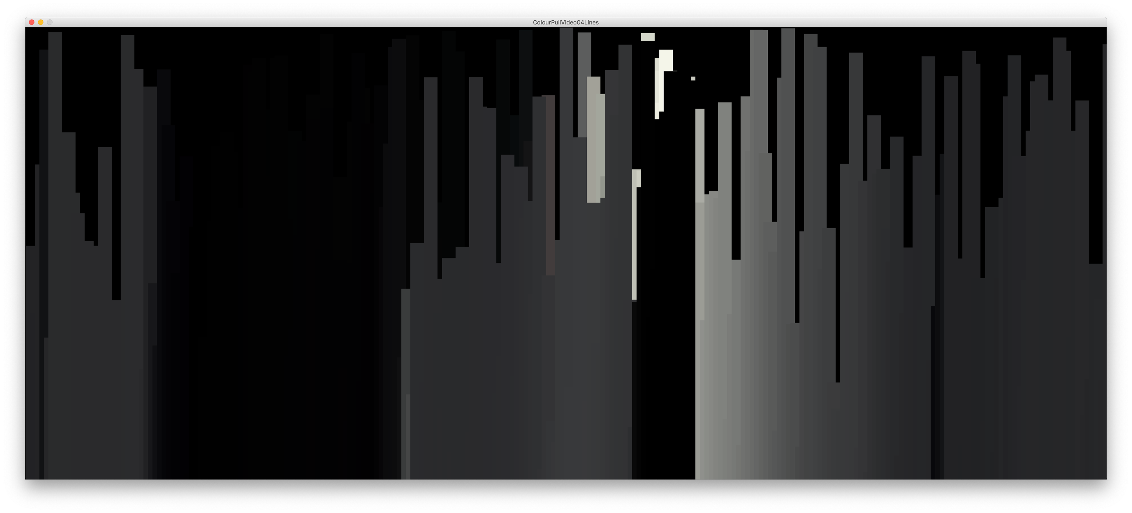
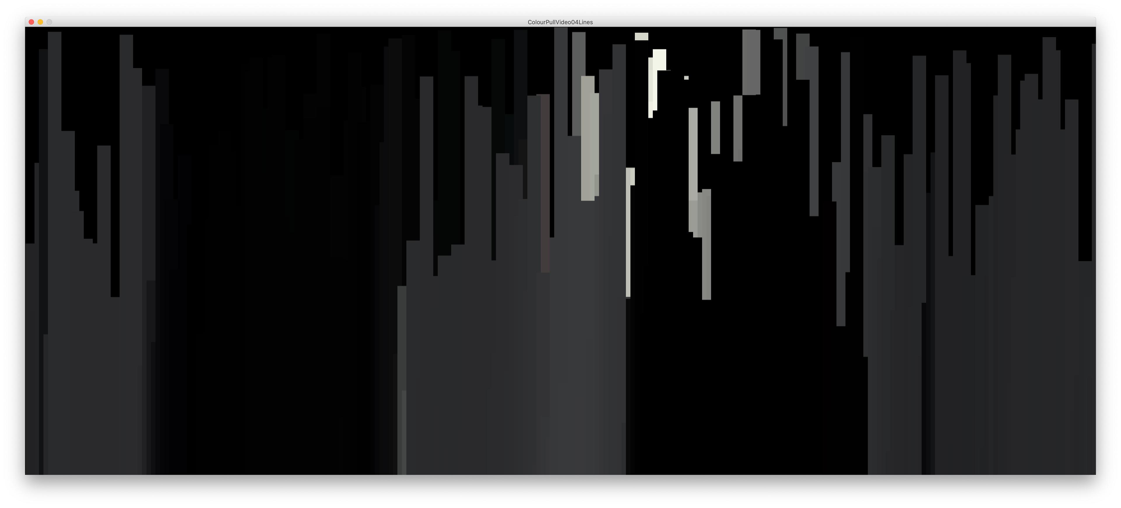
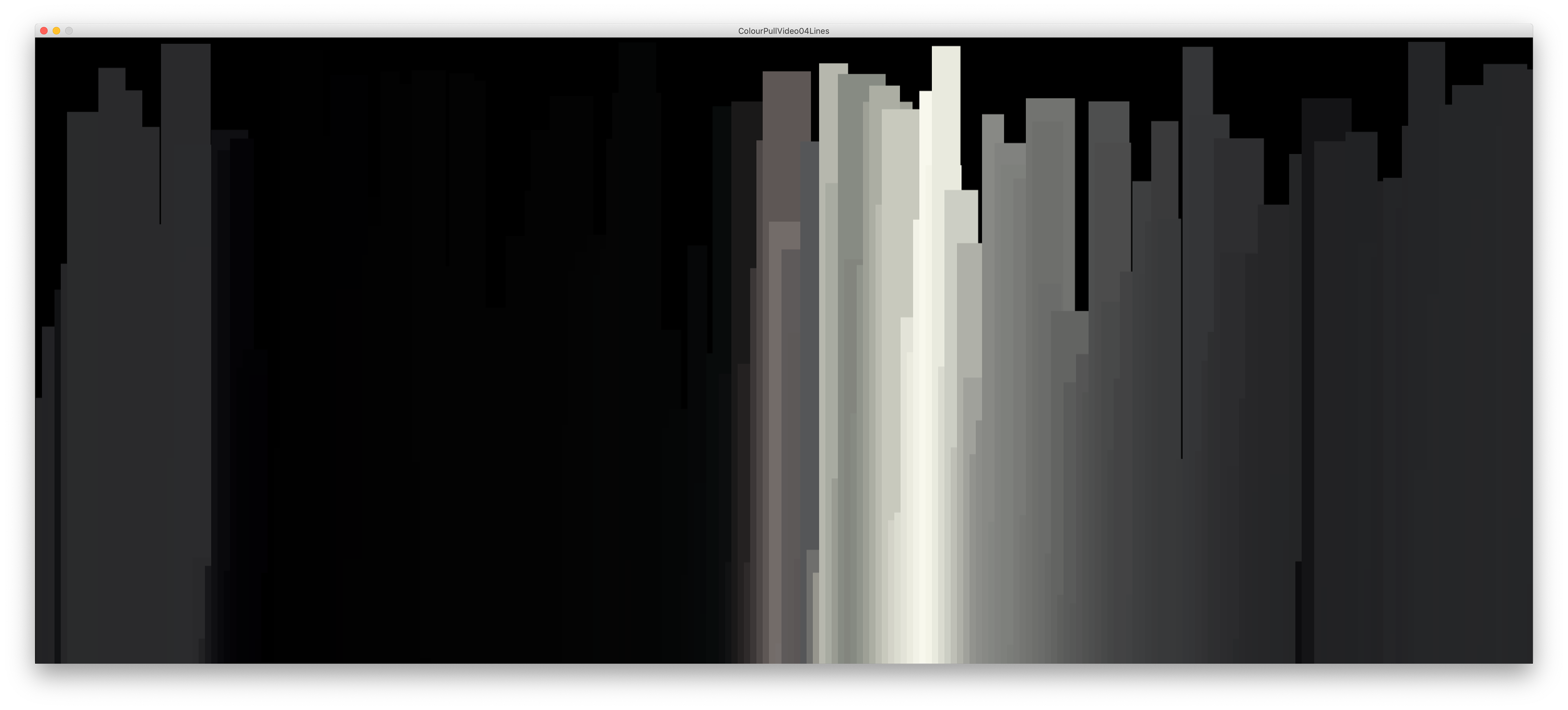
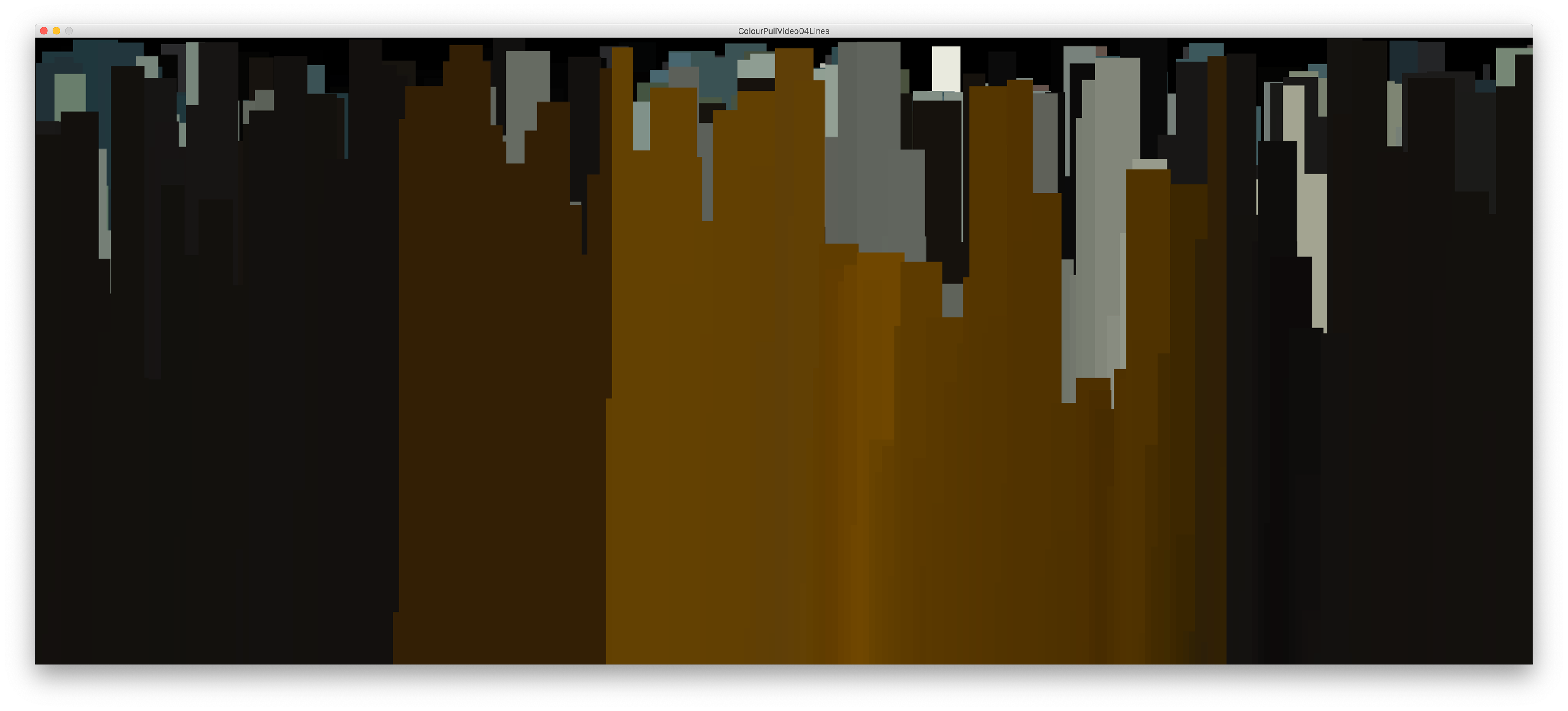
To summarise this branch of work, I created a poster below which depicts Blade Runner 2049 (2017) through a timeline made of lines that change with the colour values throughout the film. The media has a lot of contrast and changing colour schemes which can be seen in this final work.
___________
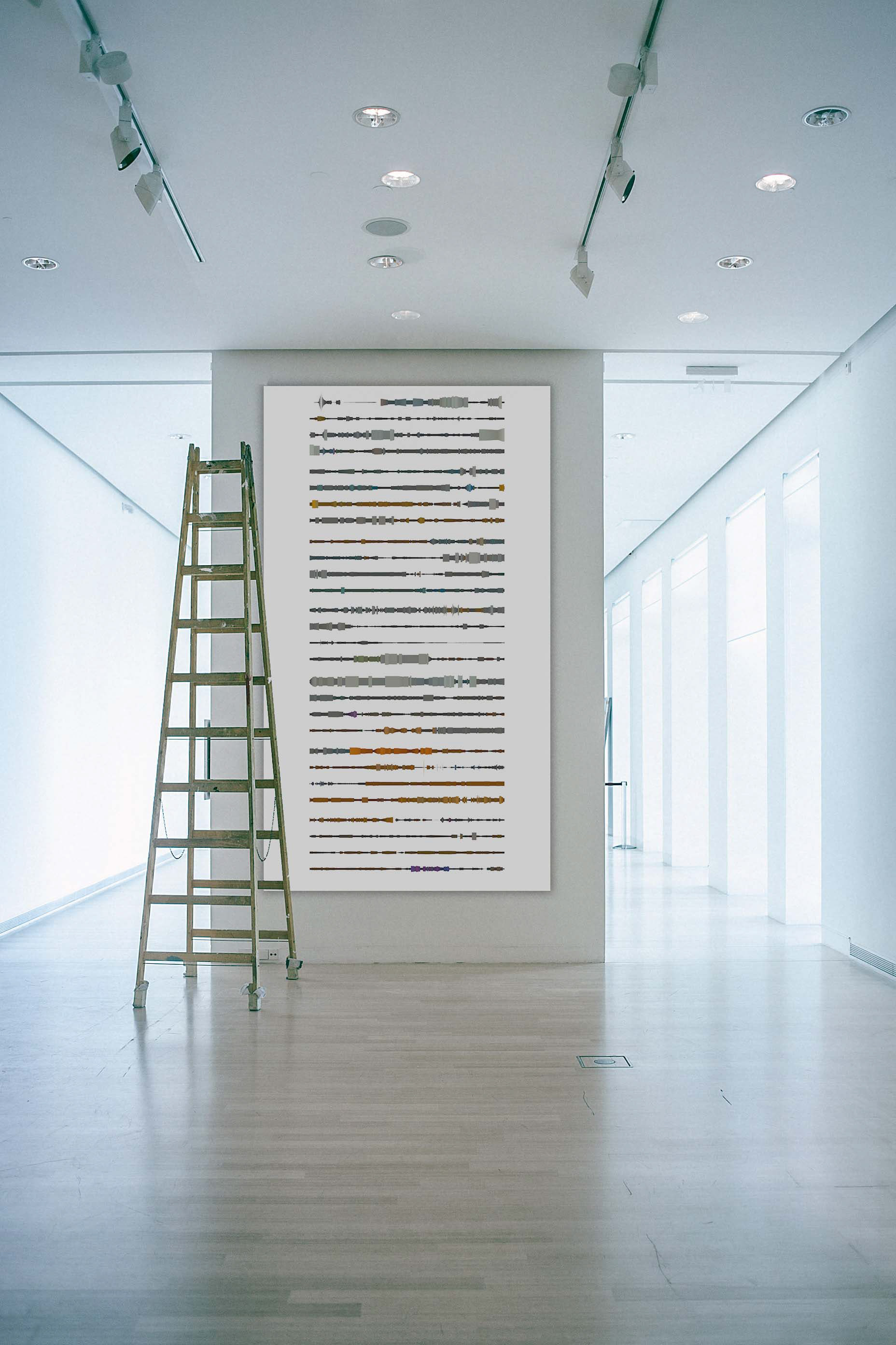
Shifting focus back to my statement of intent, I began assessing if I was achieving what I wanted to and I focussed on how to display my work. Taking work off the screen is important to my practice and it should polish the work and solidify the context.
Considering these PNGs or MP4 files in a larger physical format can often translate this imagery into something entirely different than our initial intention.
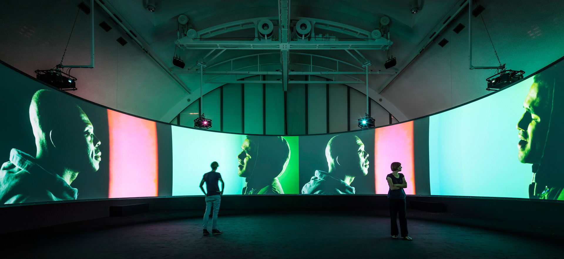
Doug Aitken
Doug Aitken, an American artist and filmmaker, is well known for his all-encompassing installation work. Aitken expands the formal boundaries of film and his work ties in the experimental practice of Expanded Cinema.
In the 1990's Aitken began integrating numerous, oversized screens into his installation work. The size of his works is dynamic and encompassing in these spaces. Along with the dimensions and shapes of his screens, his work tends to be this all-encompassing visual experience.
I thought about bringing previous works into a 3D platform to emulate something of this scale. I already did this to a degree with a 3D gallery of final work, but it would be interesting to play more with this idea and pair it with my earlier experiments.
I delved back into processing as a form of churning out ideas and getting a good workflow back. I always find processing one of the easiest ways to experiment with my ideas as it's easy to create new outputs and change parameters quickly.
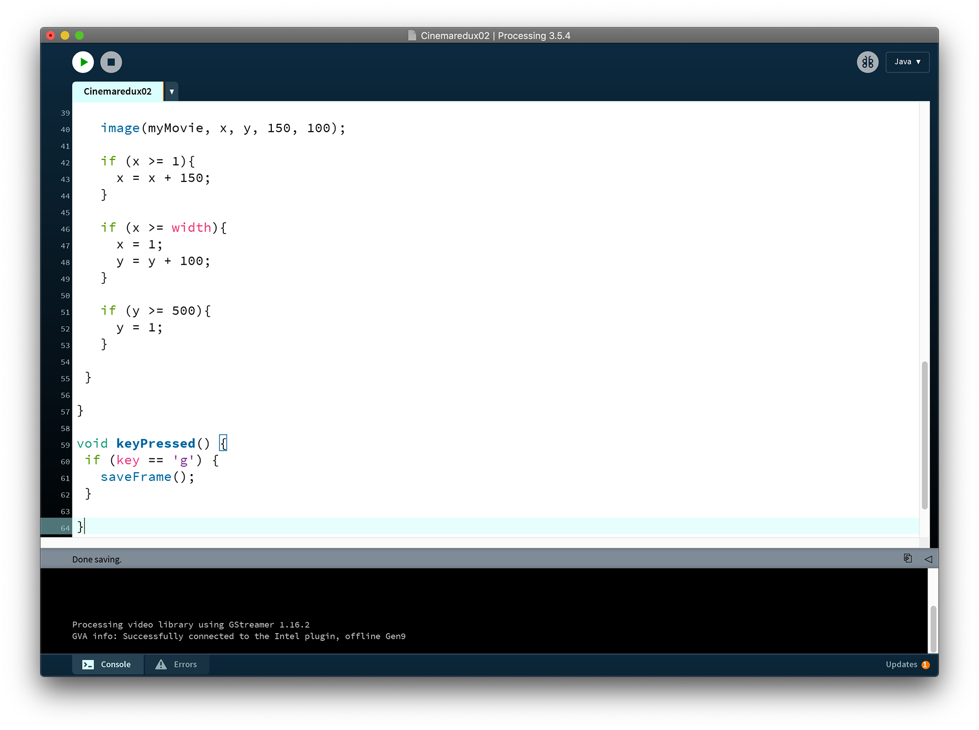
Thinking about my earlier experimentations within processing with layering frames and recreating a Cinema Redux style sketch that displays boxes of colours relevant to the average colour of each frame of a film, I thought about how to display these formats differently and experiment further with my initial idea of a film being transferred into data.
The idea of a non-linear format was something I feel I derived from which I wanted to explore again. I had previously touched upon this with a few branches of my work, in particular my work with SRT files in processing titled Interlinked, Interlinked.
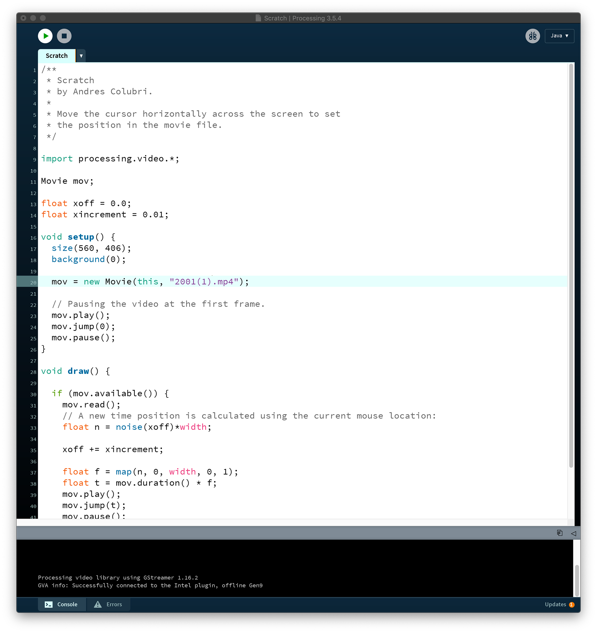
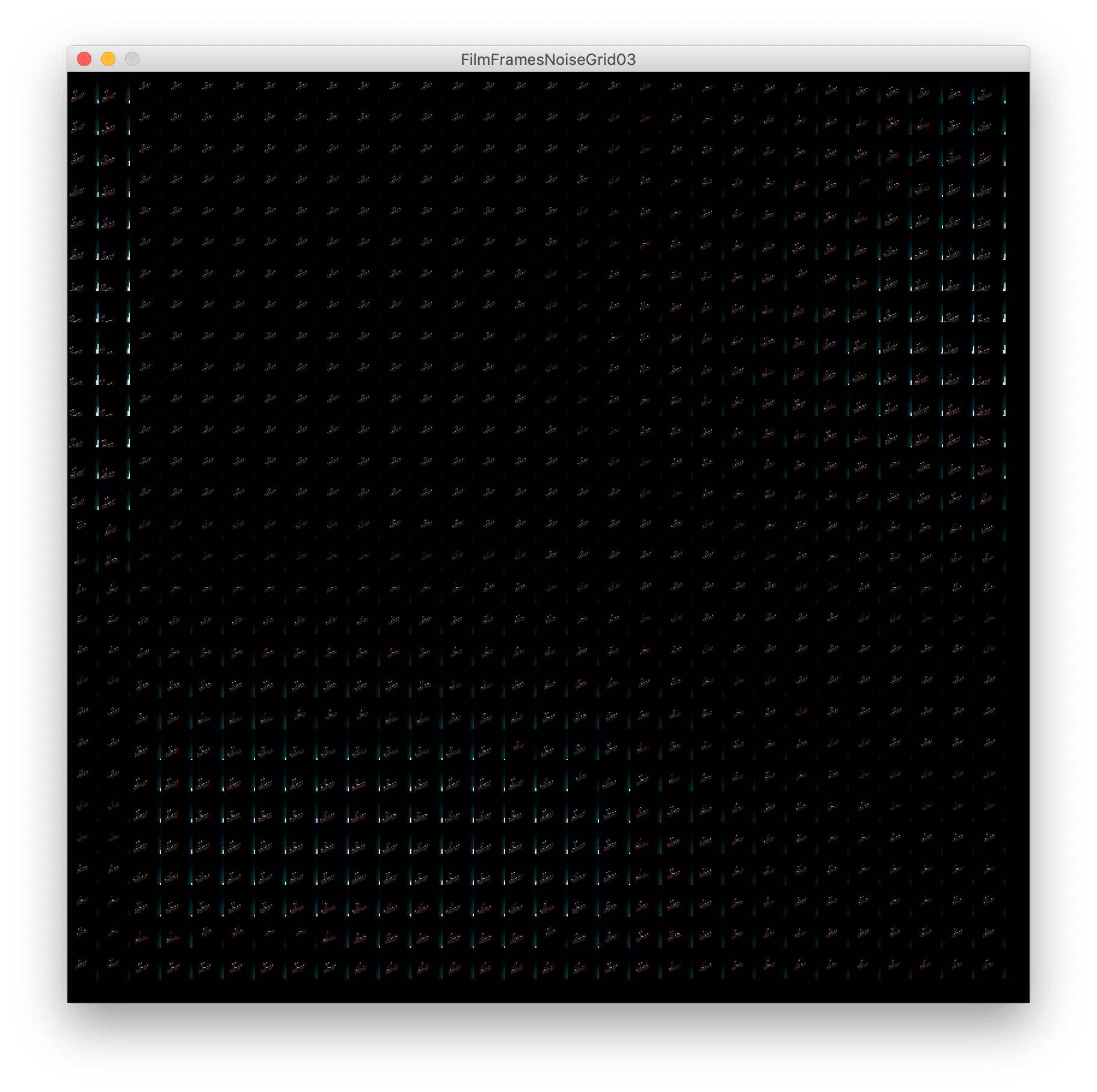
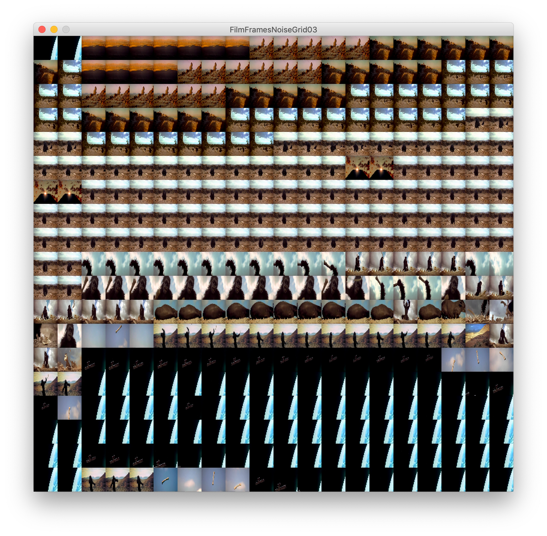
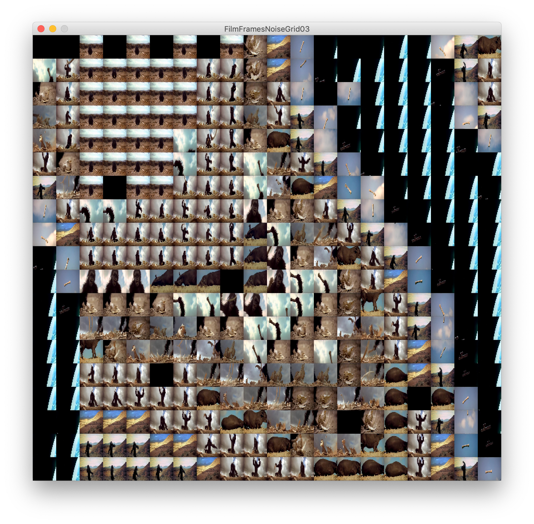
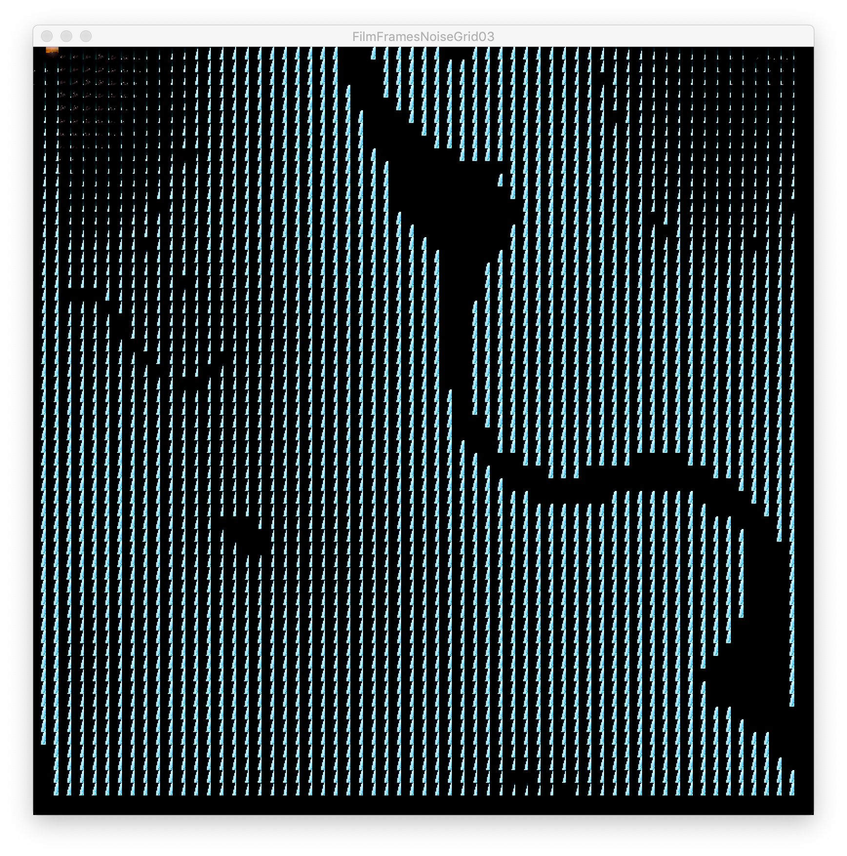
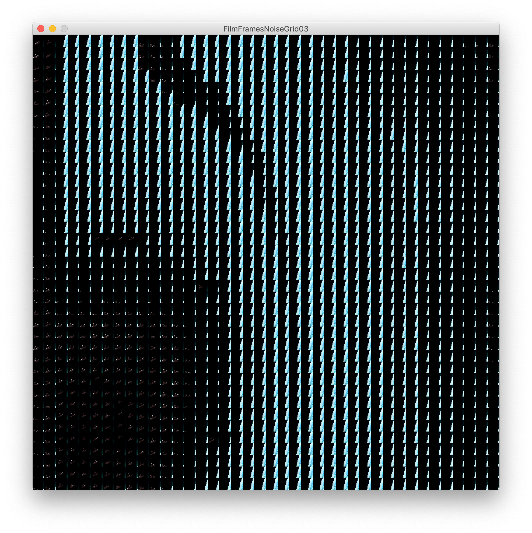
I went back to basics by looking at examples for video and noise in processing as a starting point. I had an idea of letting the noise function control which frames are displayed in the sketch. I wanted to create a generated output that showed patterns in these scenes.
Adapting these existing sketches to experiment with my idea pushed it forward into an exciting output playing with this idea of a backward and forward constant film.
Without context experiments like this can be meaningless but I found this idea to relate to what I was trying to communicate through my work. Taking a familiar piece of media and manipulating it has its benefits. When we are already familiar with the themes within these films it allows the viewer to already have prior insight into the work.
2001 A Space Odyssey, for example, is a film centred around time and mortality, so it would be interesting to take these themes and use them to drive this work.
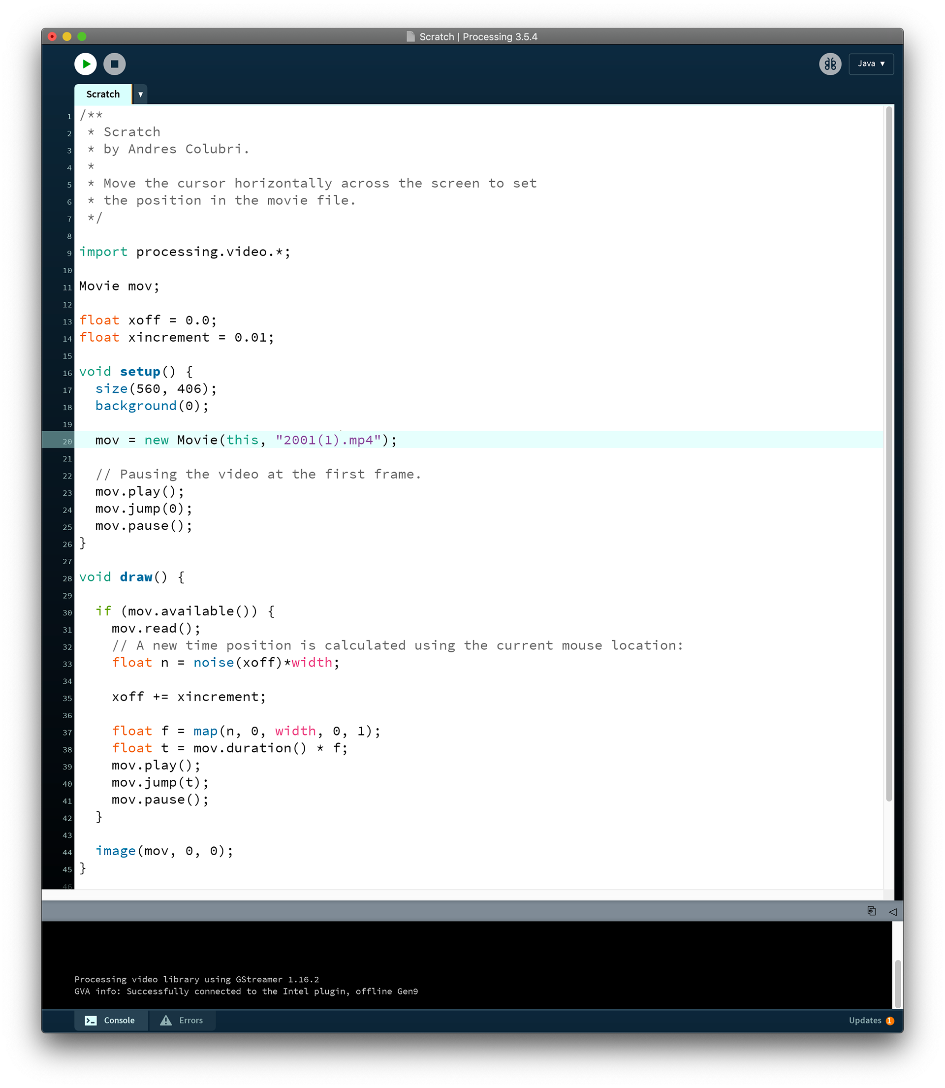

Below is just a short example of the processing sketch I wrote to emulate Brendan Dawes' Cinema Redux work. This was merely a stepping stone to refresh my processing skills and to have a starting point for this branch of work.
Reflecting again on Dawes' work helped me realise my own process better and I found myself reminded of my drive to see film presented as data along side my drive to create these non-sensical outputs of familiar media therefore altering meanings and such.

I began to change the context in which I was used to seeing Dawes' work and thinking about how could I push this into something of my own. I think I struggled with this for a while throughout my work as I was constantly comparing my own process to others which can be a difficult cycle to break. Still, I think our interpretations of every piece of art we absorb are so different that the idea of breaking these sequences down and reassembling them is valid. As long as I could stick true to my contexts and interests within these explorations.
The below sketch is a zoomed version of Dawes' Cinema Redux format that refreshes once reaching the final rectangle on the grid. Even these small changes alter the way we view certain scenes. We become focused on these frames for longer but risk missing details of the next frame. This example almost feels like it slows the film down and we're left with a temporary fingerprint of past events for a few seconds.
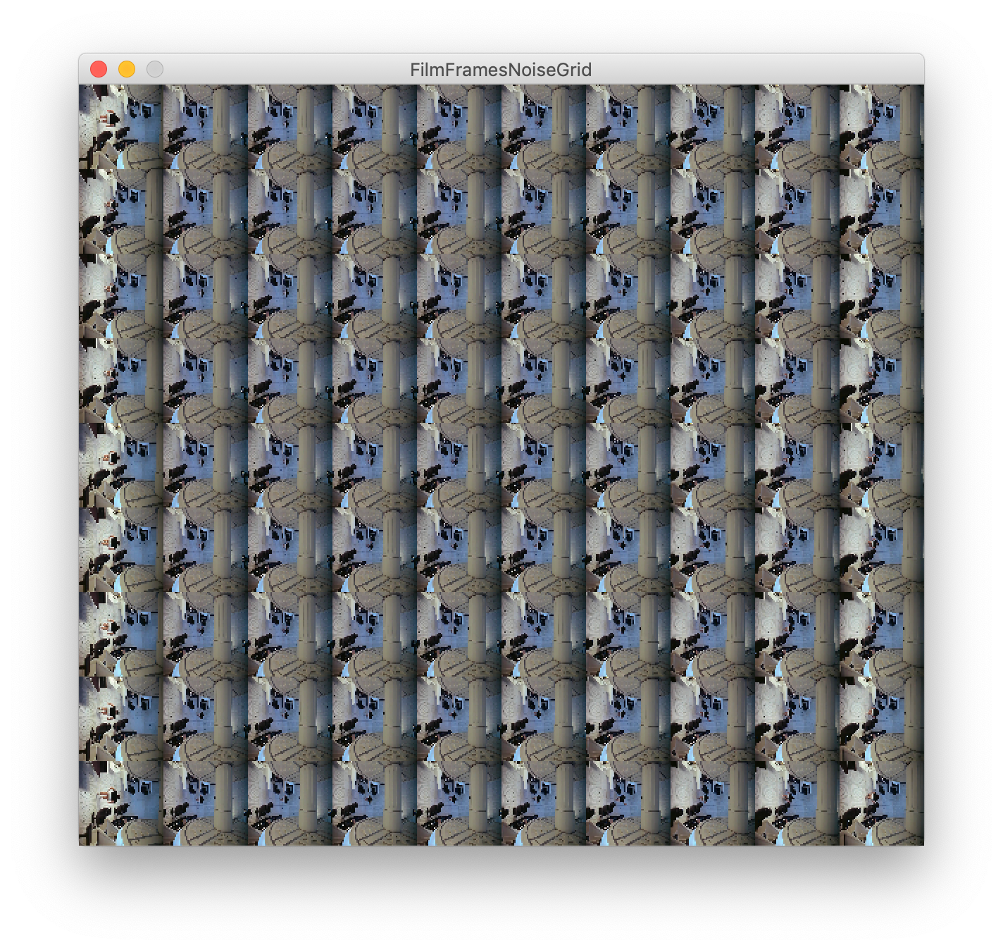
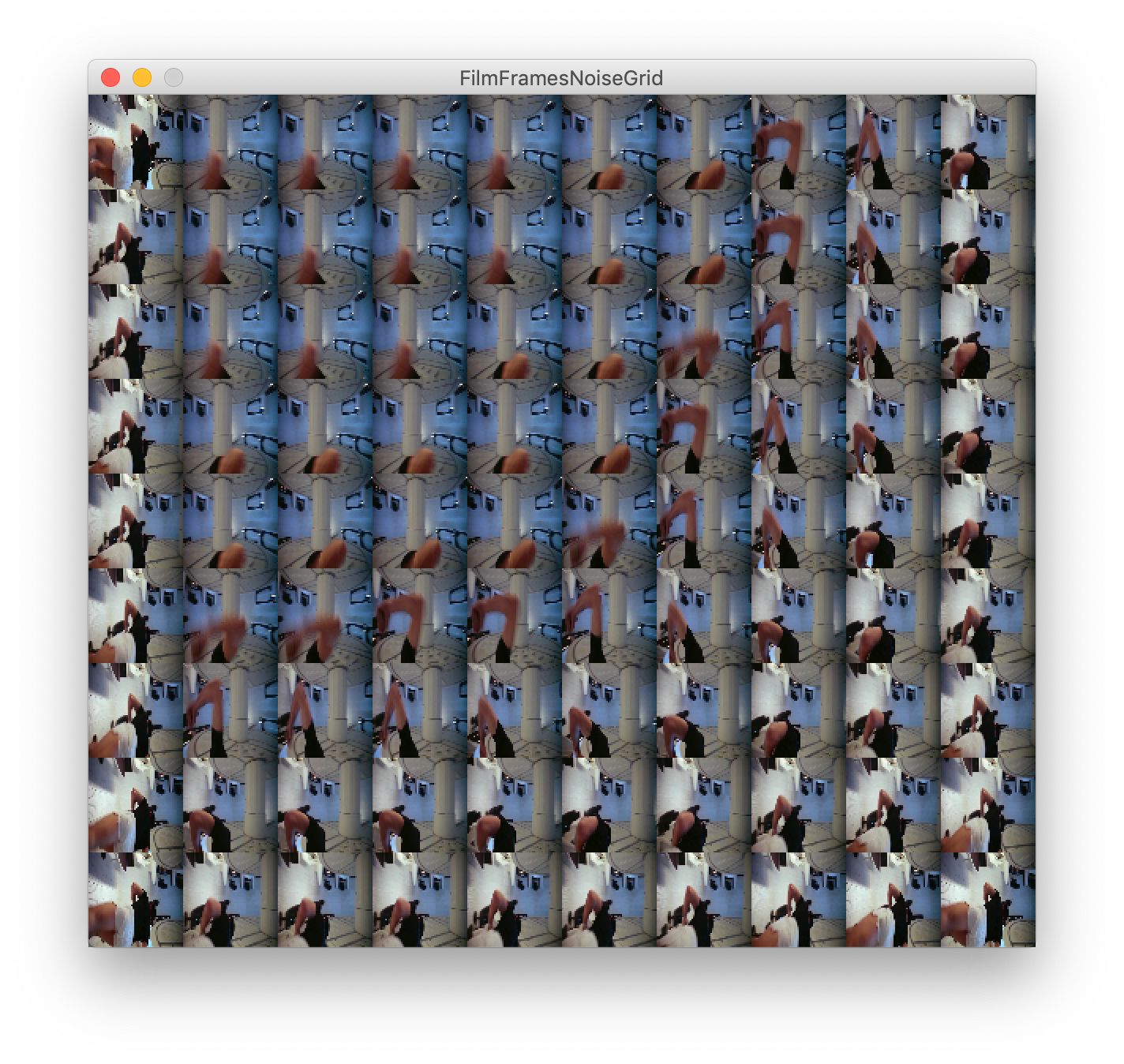
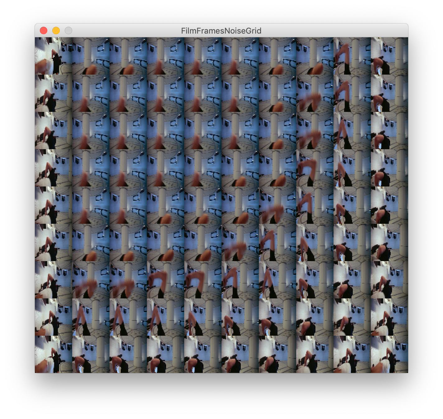
I began to consider alternative ways to drive this familiar output. Altering the linearity of Dawes' format circles back to my interest in non-linearity timelines.

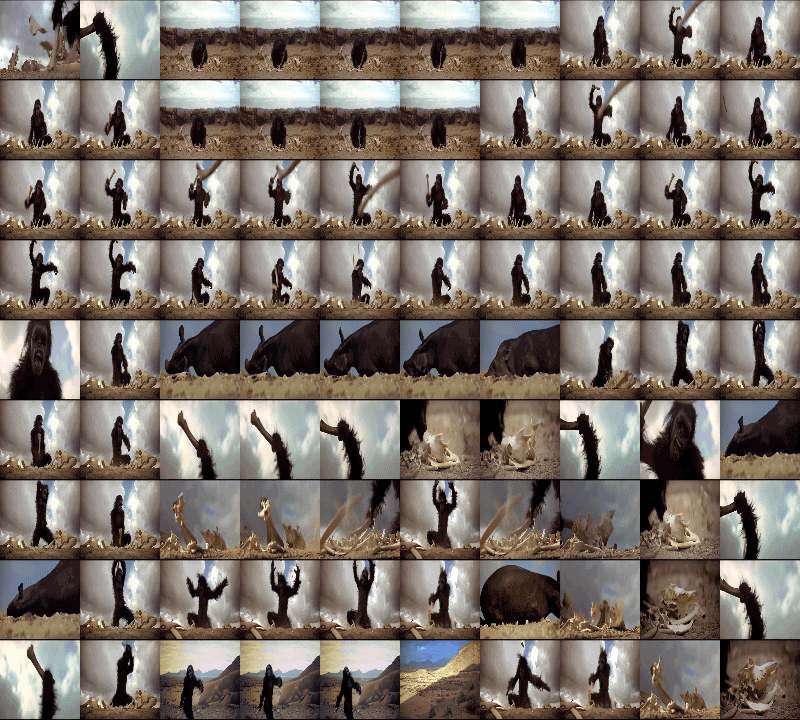
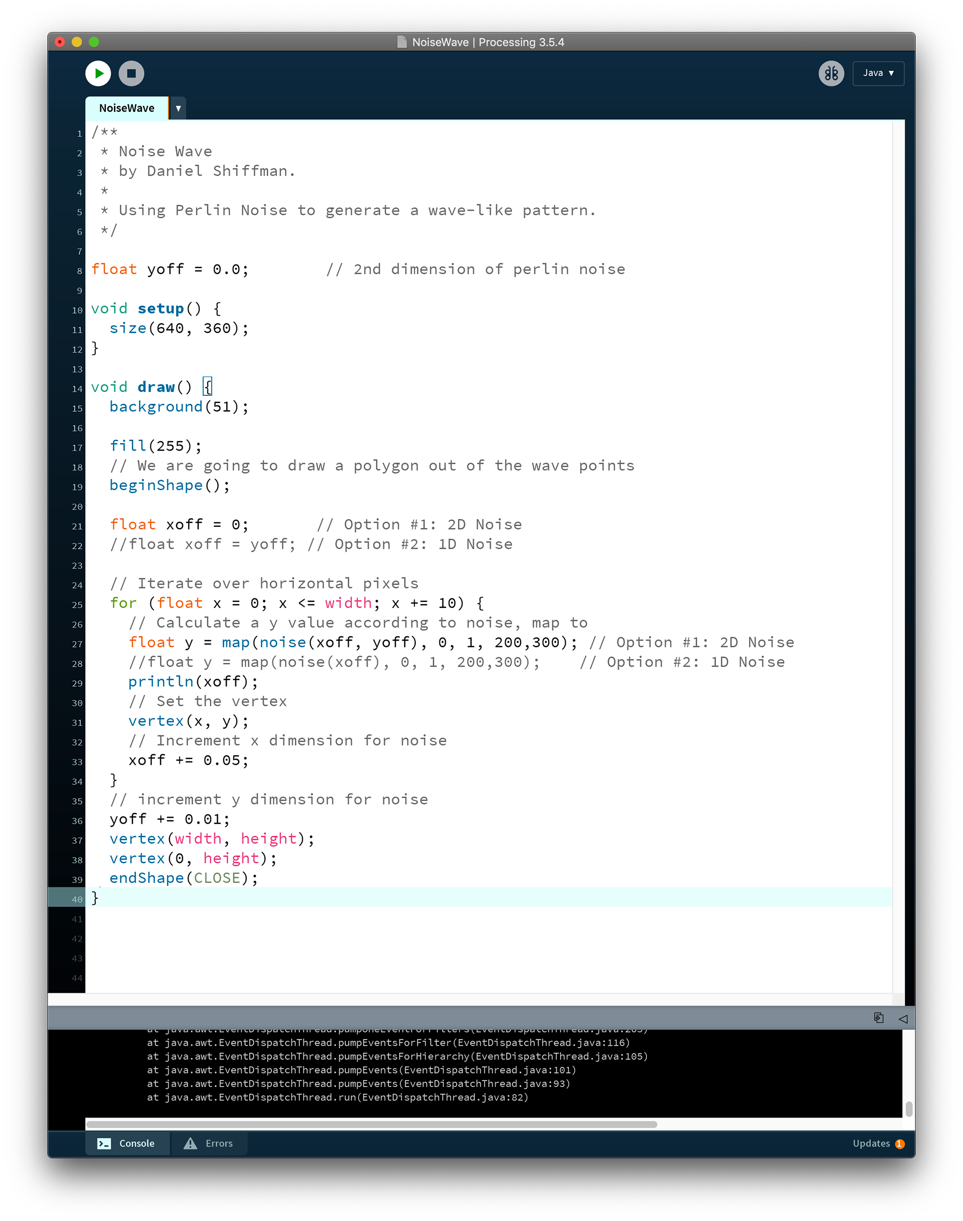
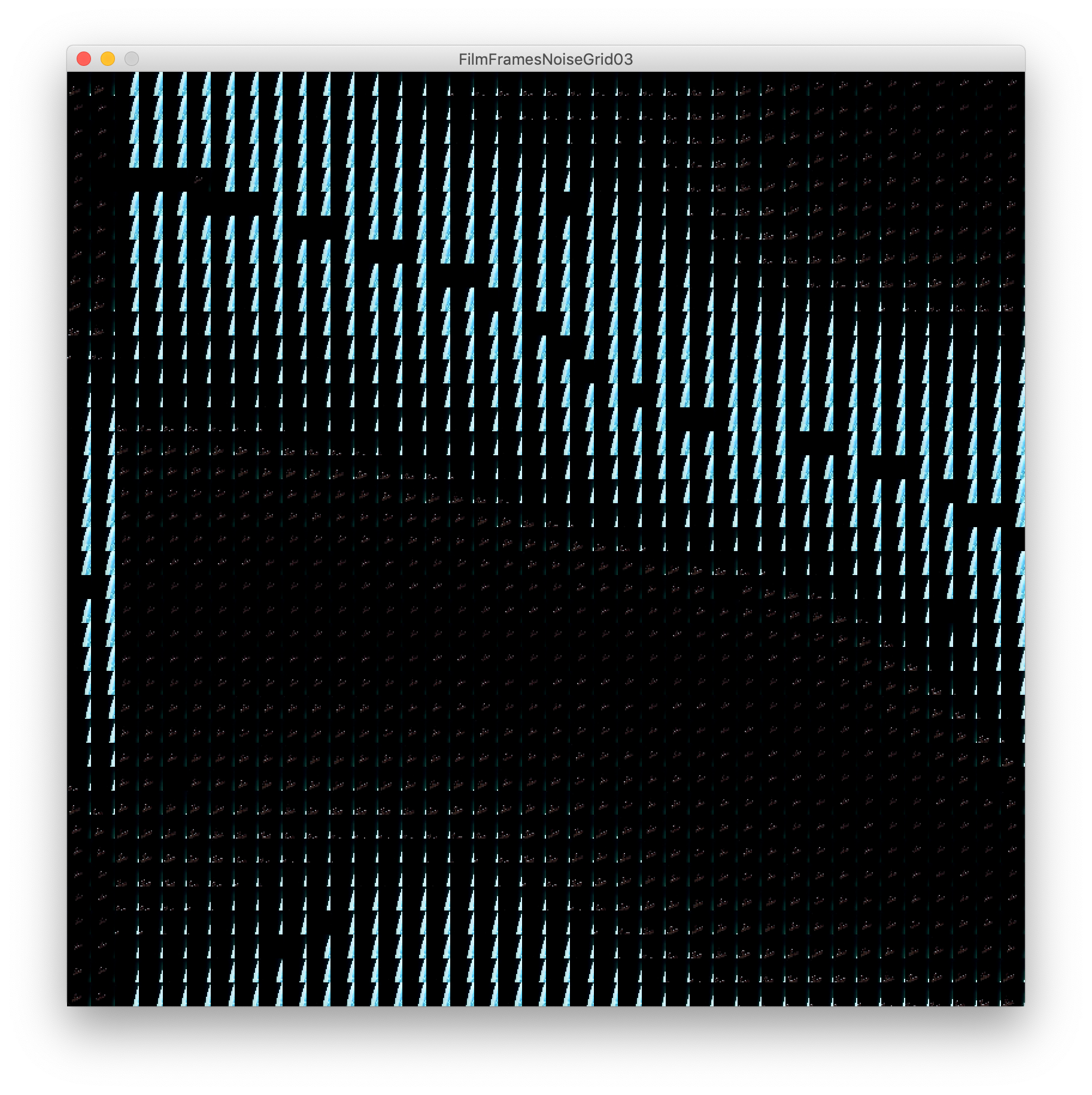
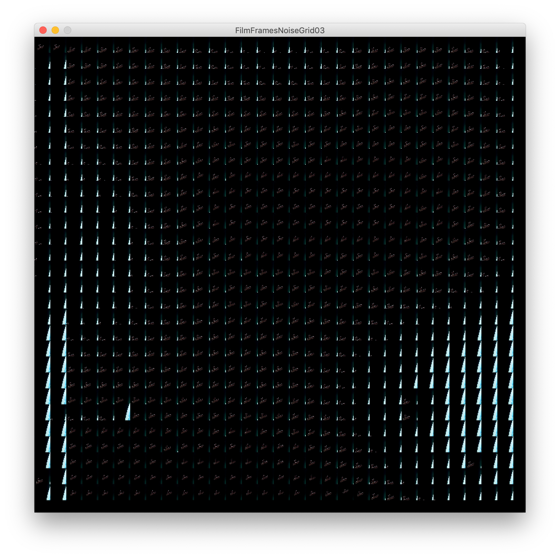
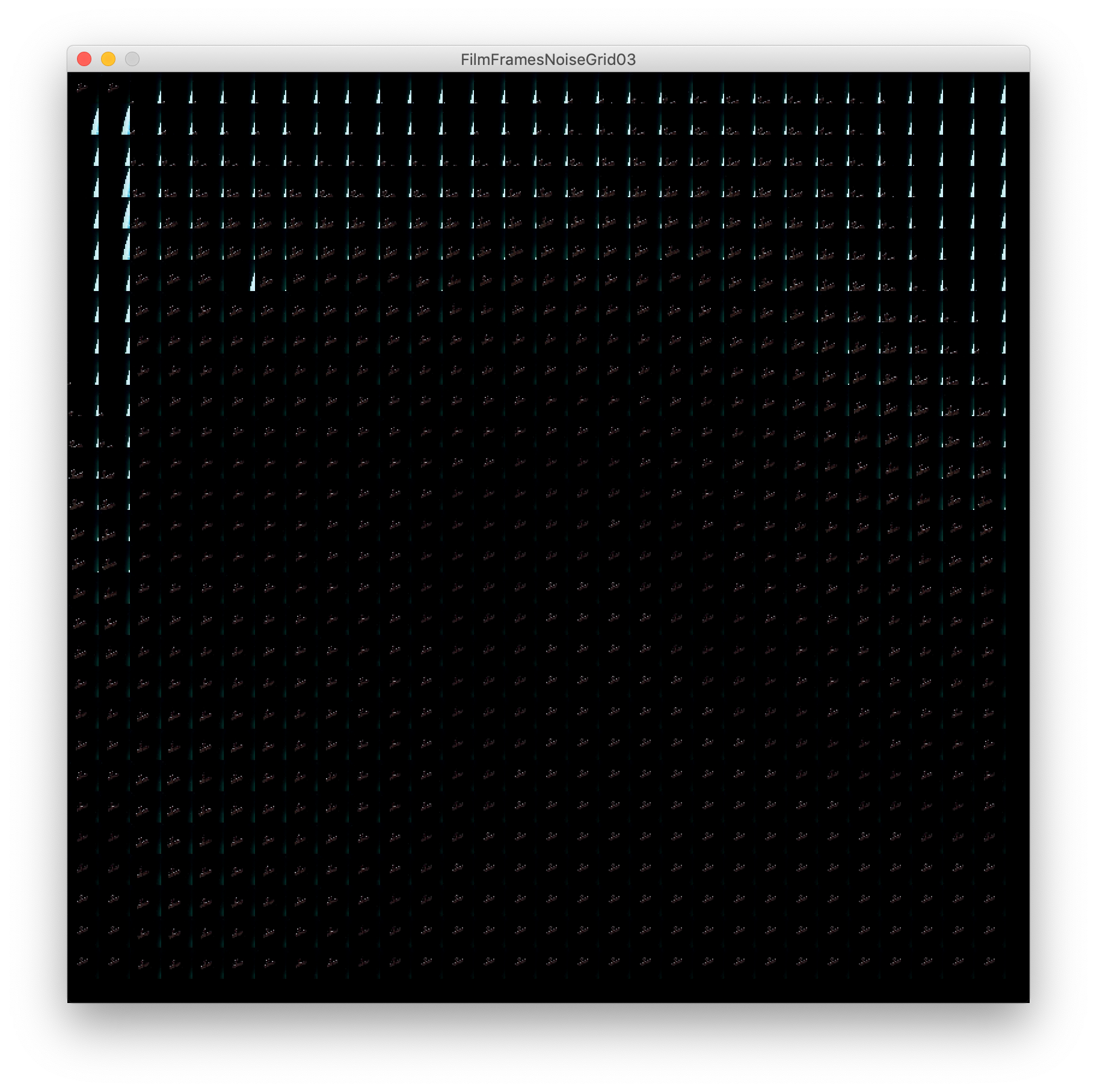
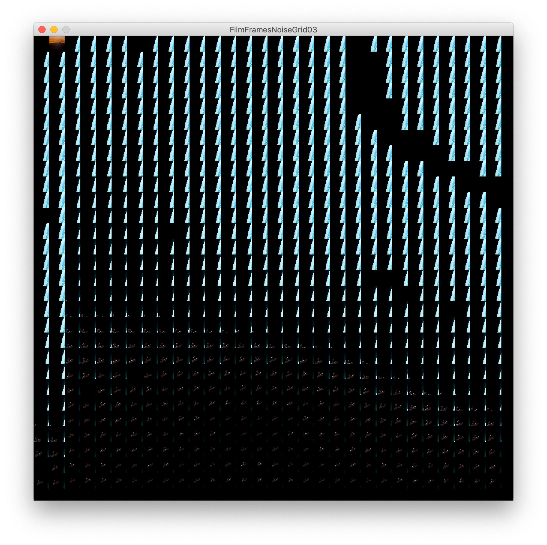
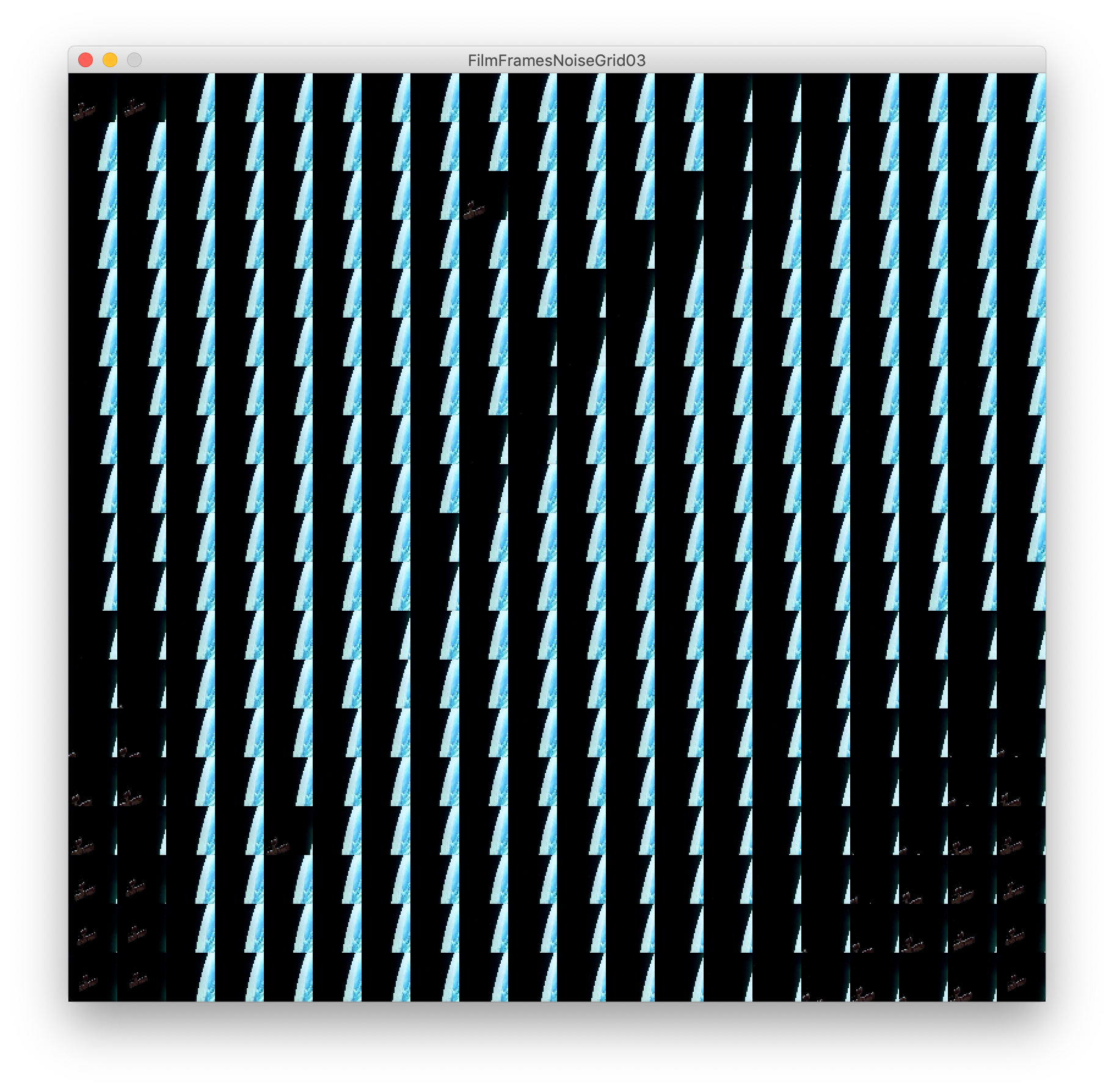
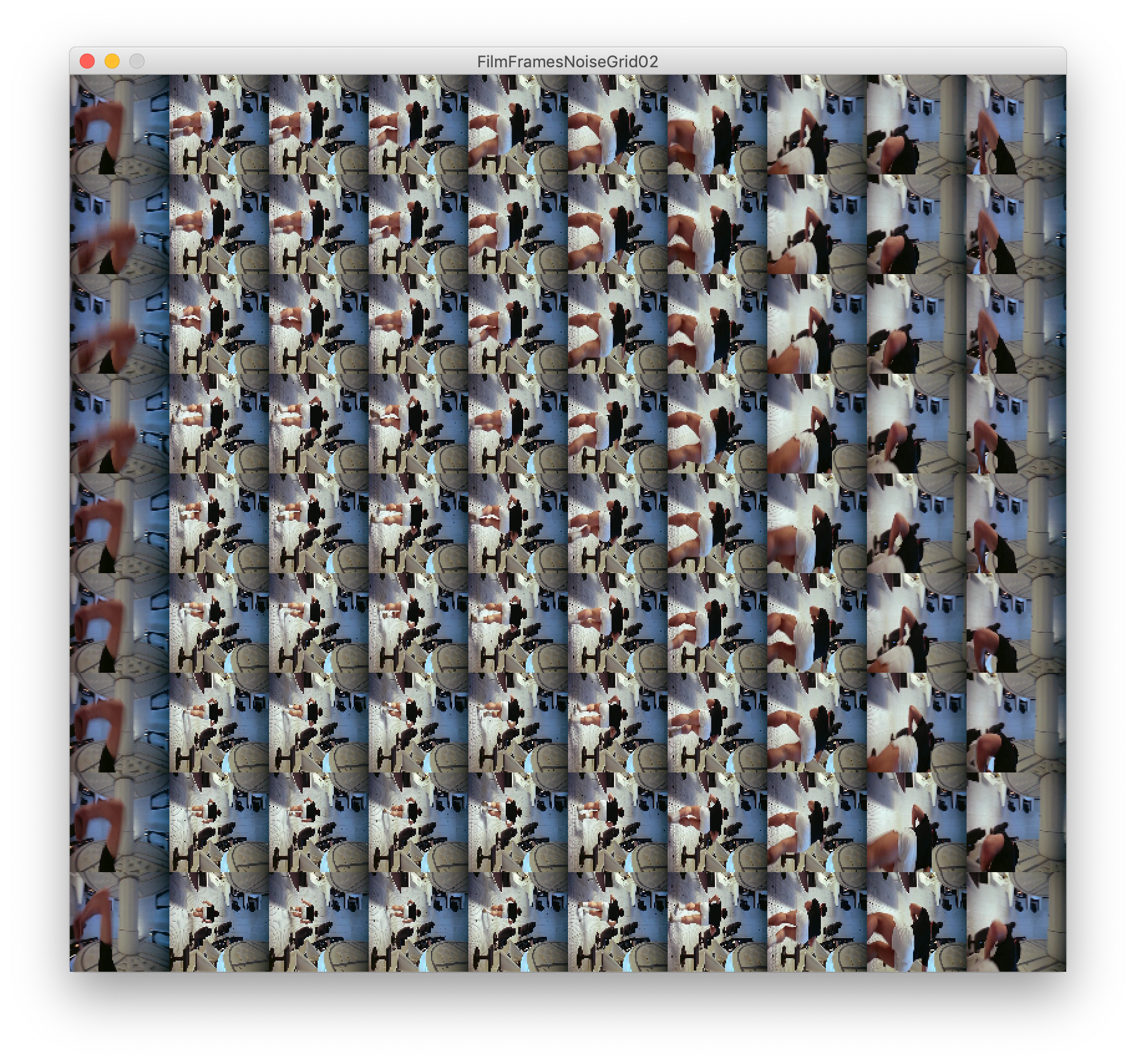
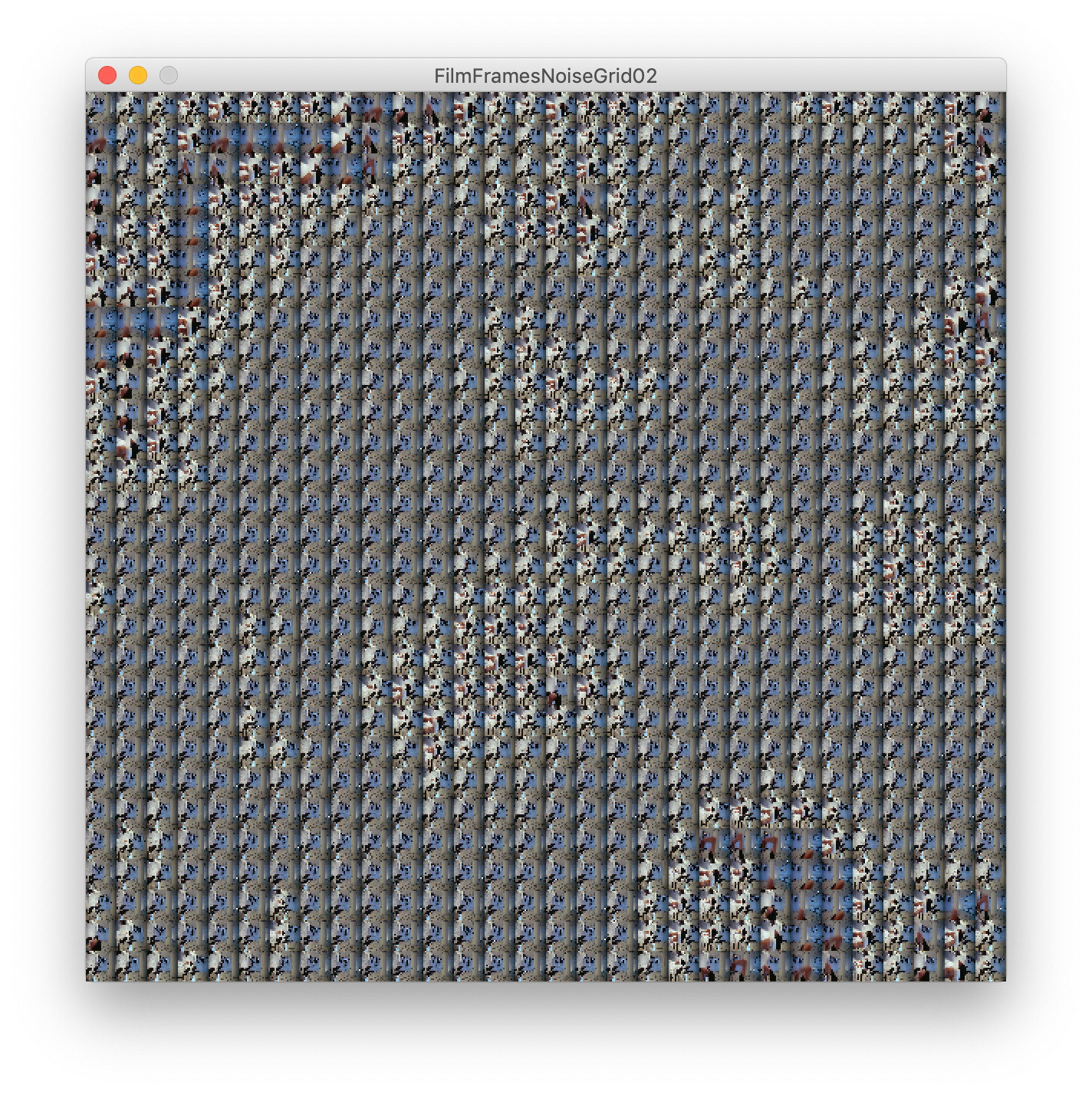
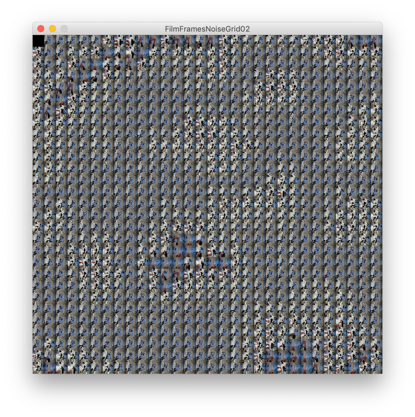
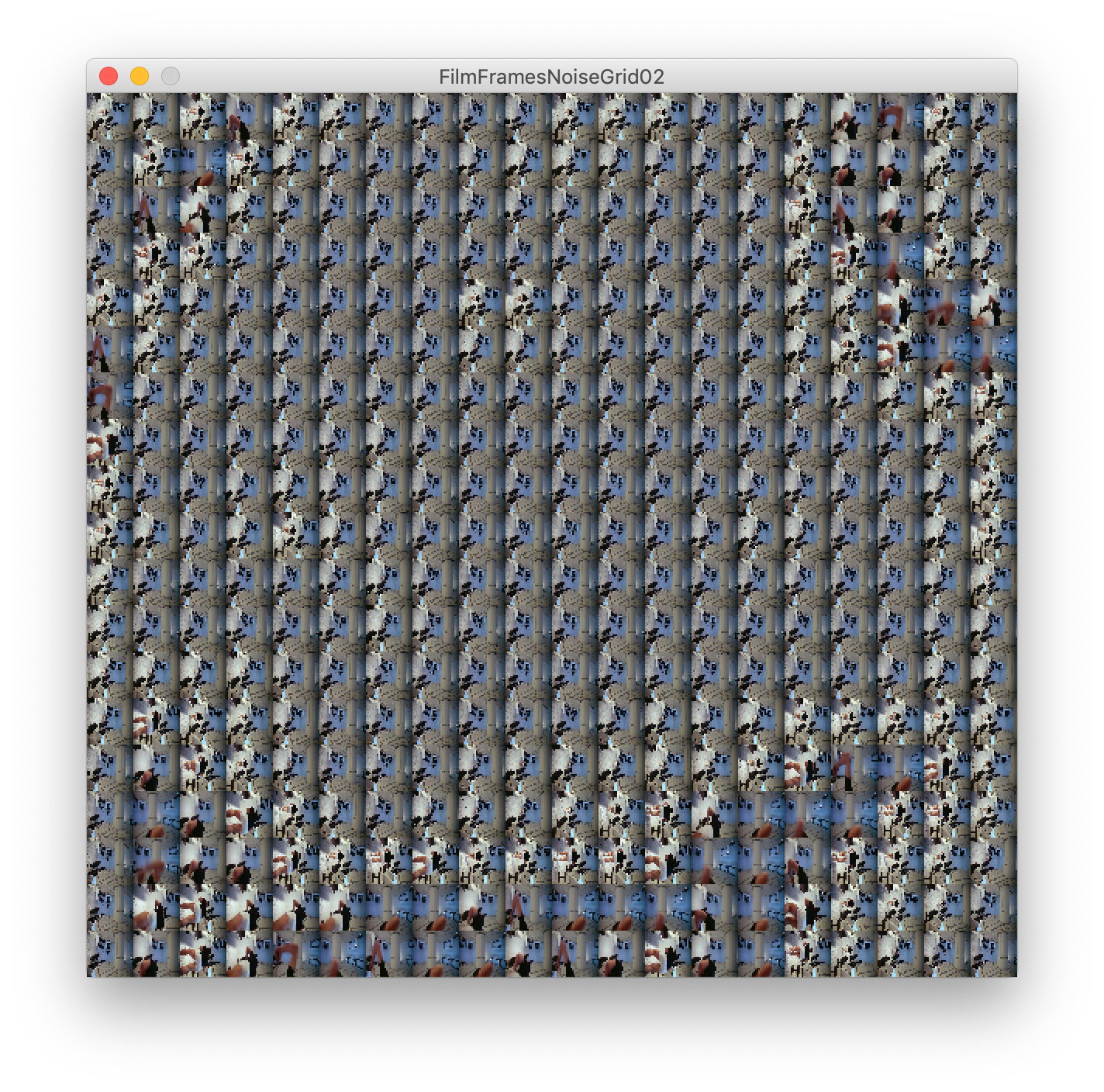
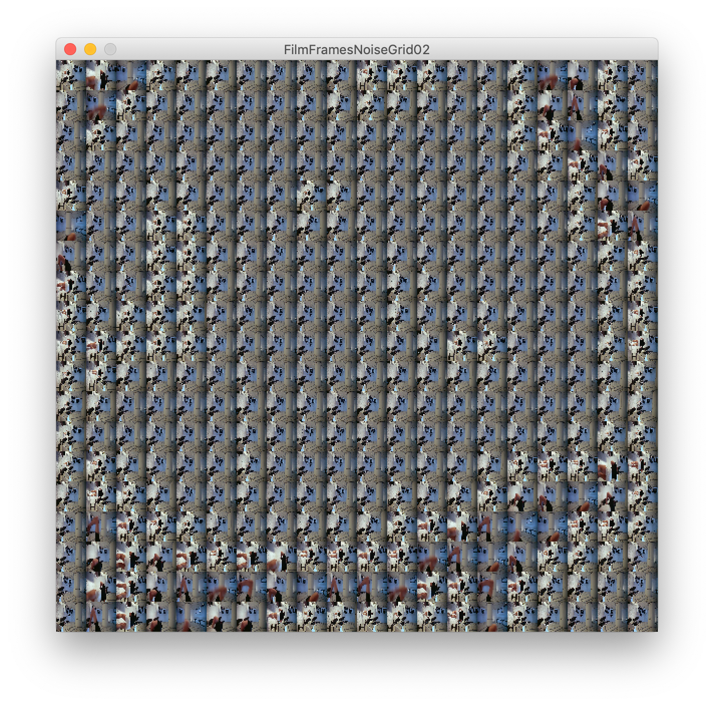
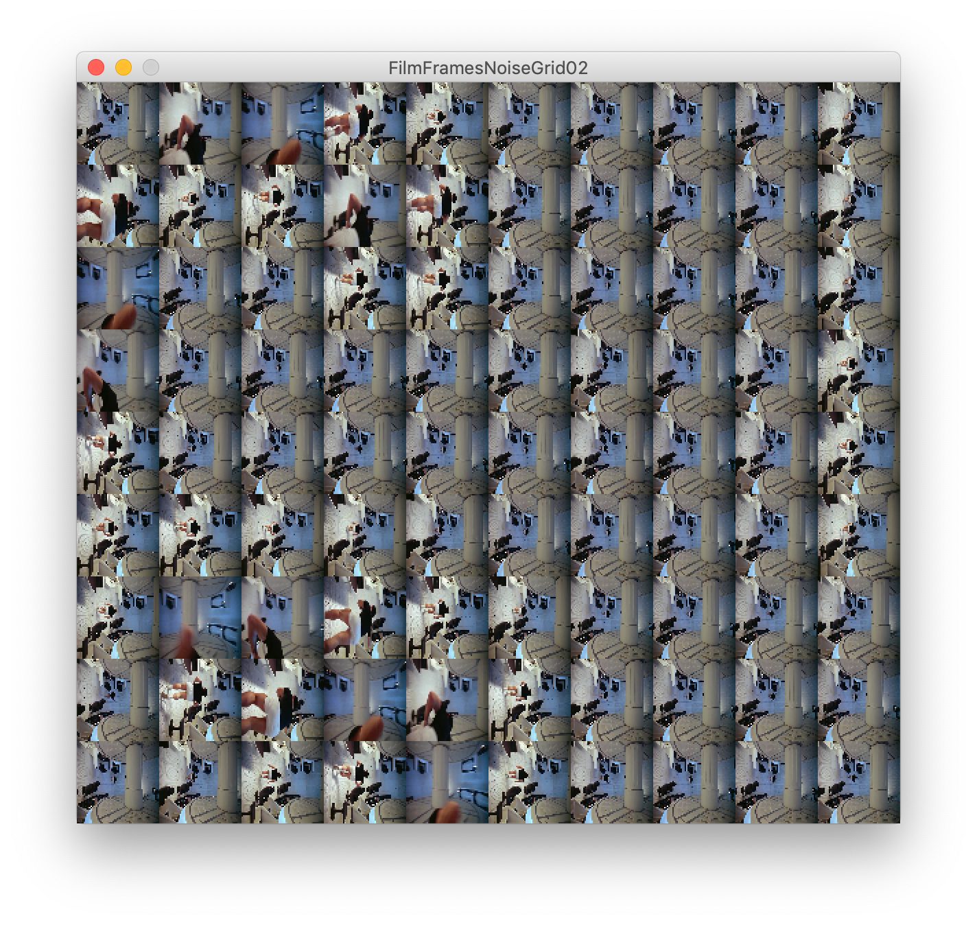
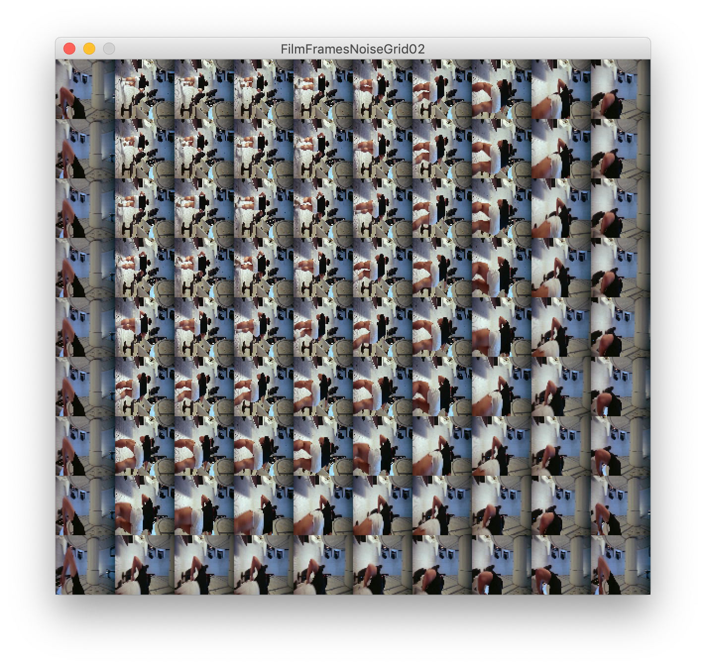
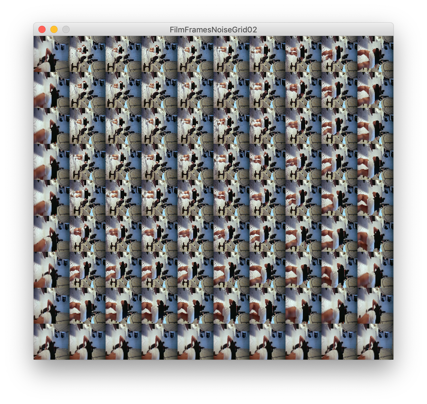
Below is a sketch output of perlin noise controlling the frames of a film. It's nothing complex, but it started the ball rolling on an idea for me. Allowing the noise function to drive these scenes alters their meanings. They become endless loops of the same actions.
The idea plays into the non-linear narrative I explored at the beginning of this project. The scenes below I chose to run through the sketch are all static shots from 2001 A Space Odyssey. They all show mundane actions within the film and by allowing the noise function to scrub through these scenes with no end we are left with an odd portrayal of the tasks within.
These acts of repetition and routine are highlighted and the mundane tasks of space travel become important. 2001's dialogue is rote and almost inconsequential. There are only 40 minutes of dialogue in the 2 hour, 19 minute duration and Kubrick described it as "a non-verbal experience".
The visual components of 2001 pushed new boundaries previously unexplored and changed the genre of science-fiction in cinema. Heavily weighted in its philosophical and thematic ideas it uses sound and imagery to involve the viewer entirely. But there is something enamouring about Kubrick's use of mundane conversations and actions throughout the first half.
By focussing on these scenes and repeating them in an oddly jointed but jarring fashion, we are left to contemplate the scene's composition and the movements countless times.
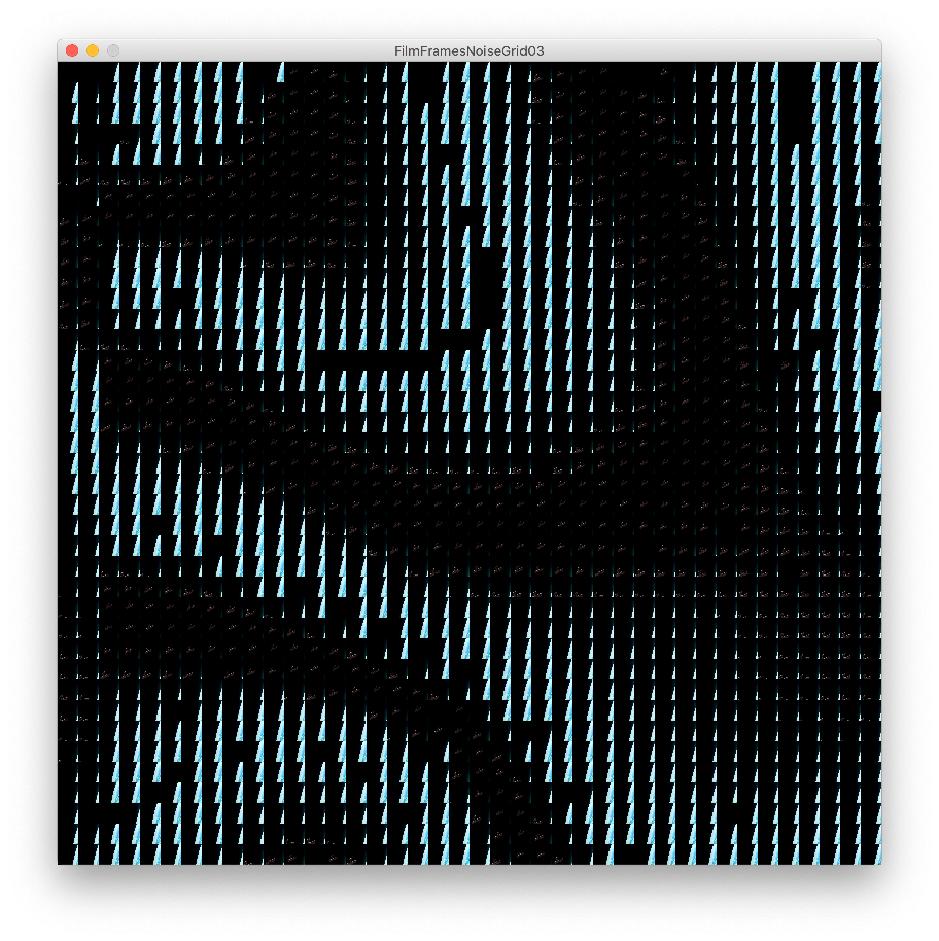
When running the processing sketch these scenes are never-ending and do not loop. By scrubbing through these static scenes we highlight the objects within. We hyper-focus on movement and actions. The figures within have no rest as they are constantly kinetic.
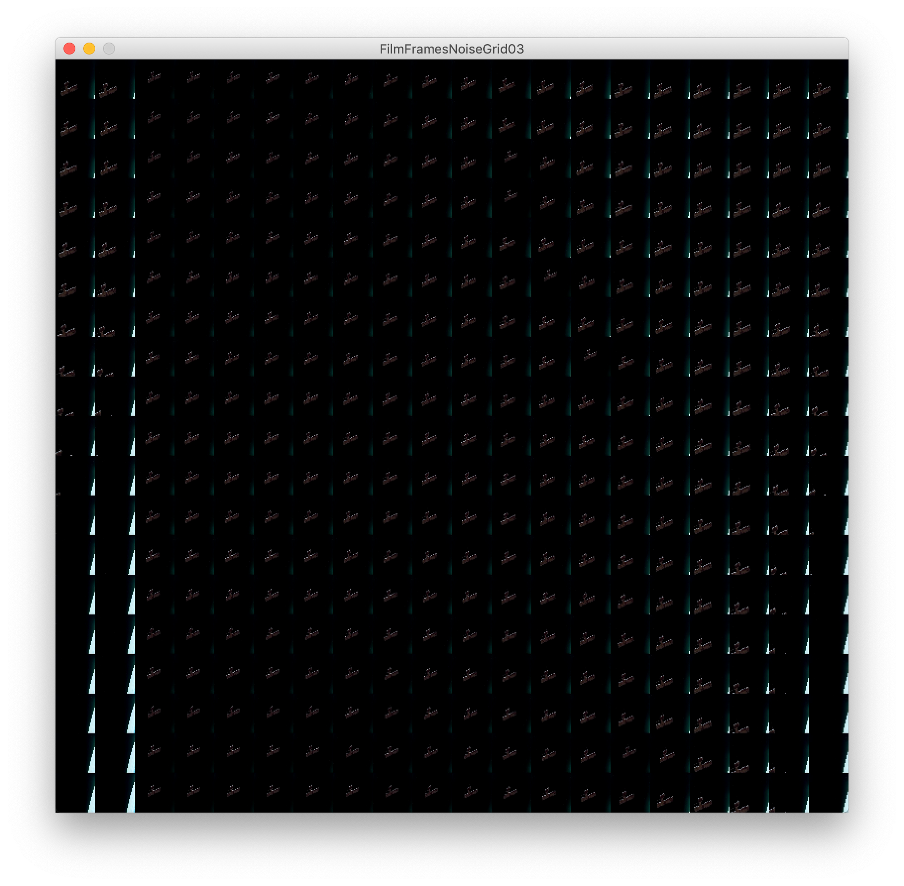
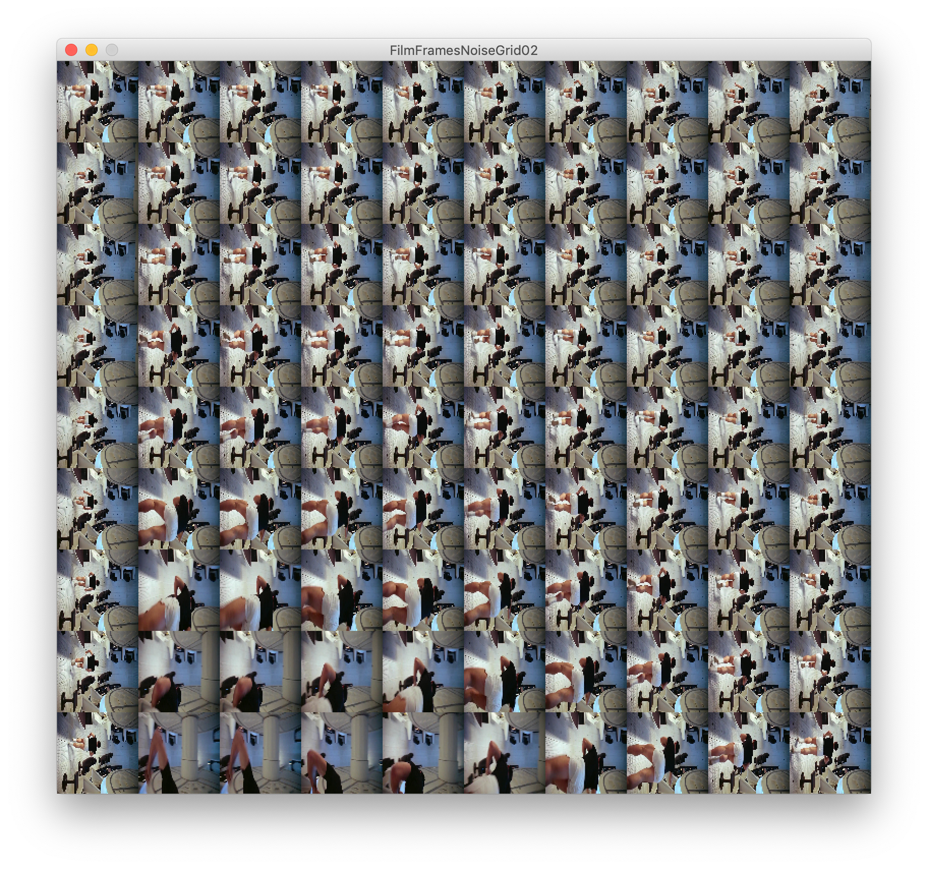
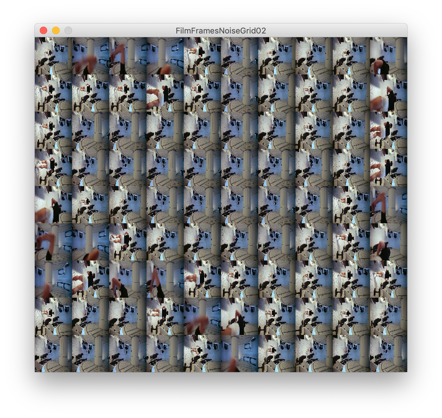
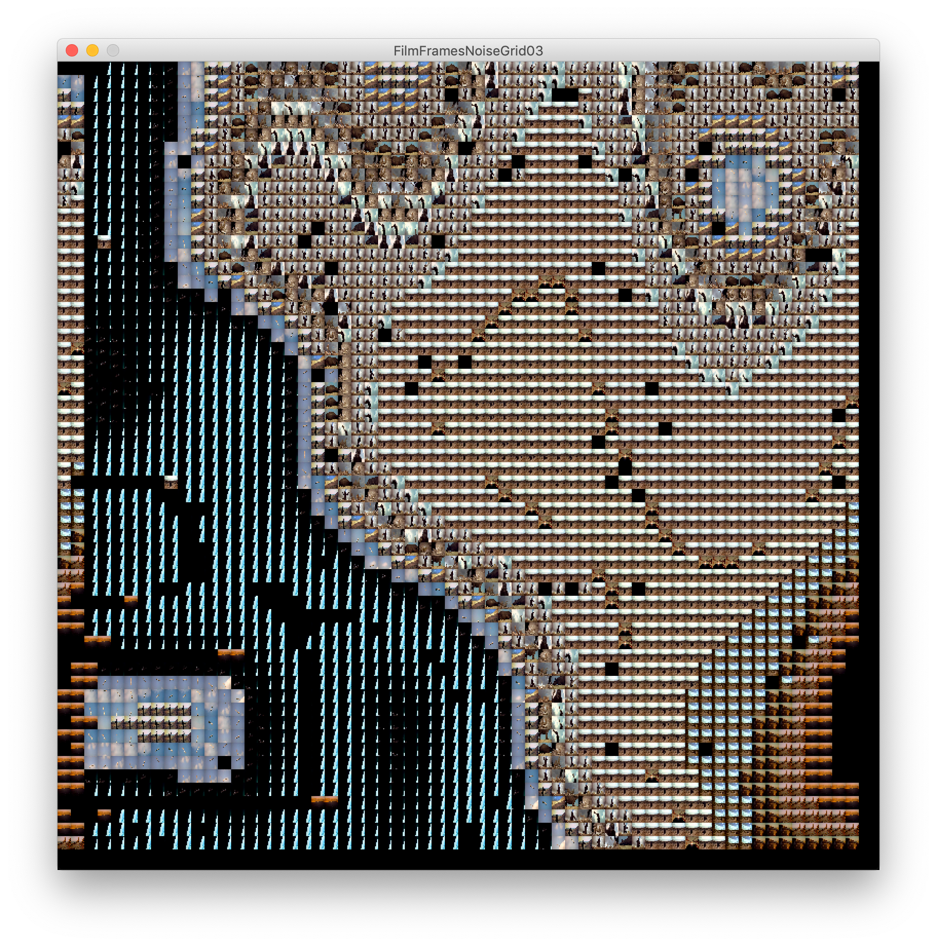
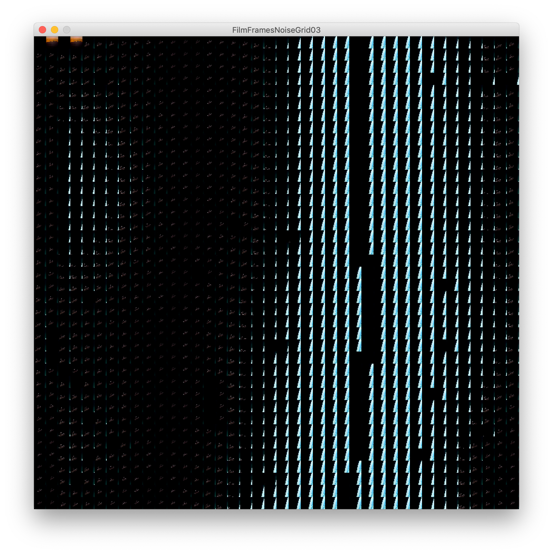
As seen in this p5 sketch here, I wondered if there was a way to recreate this idea with movie frames creating patterns with different contrasts and colours throughout these films.
It took time to get a working sketch as I was out of the habit of using the noise function within processing but eventually I was able to create some really interesting outputs that I was happy with.
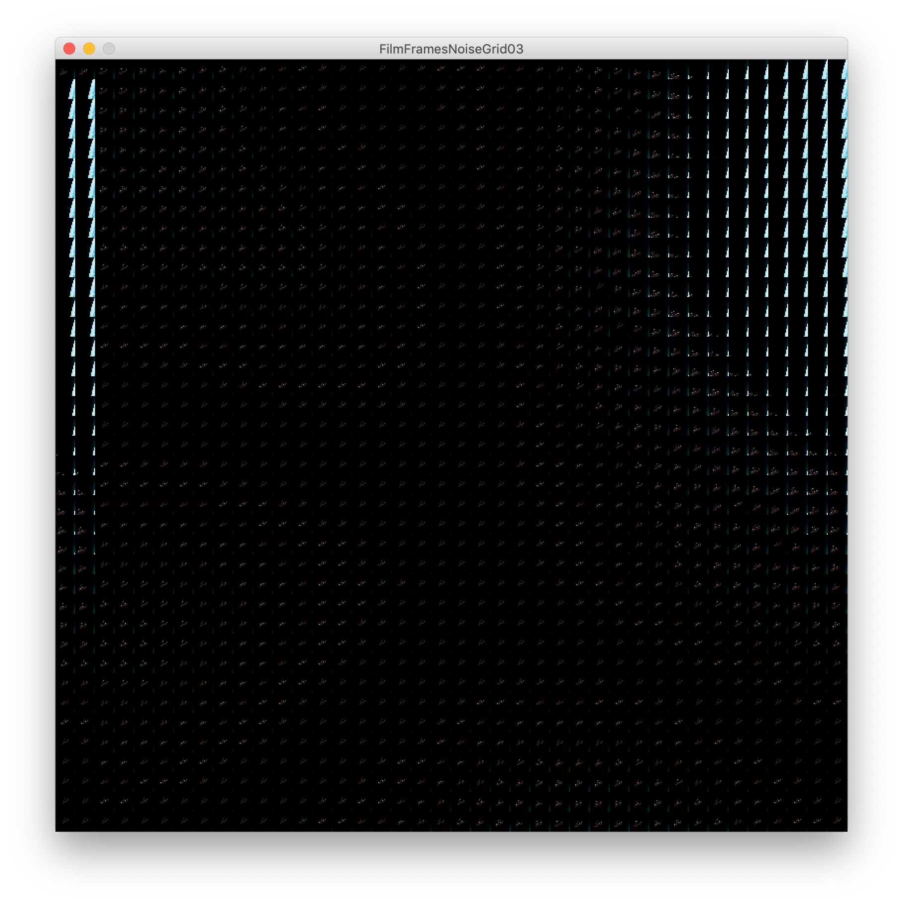
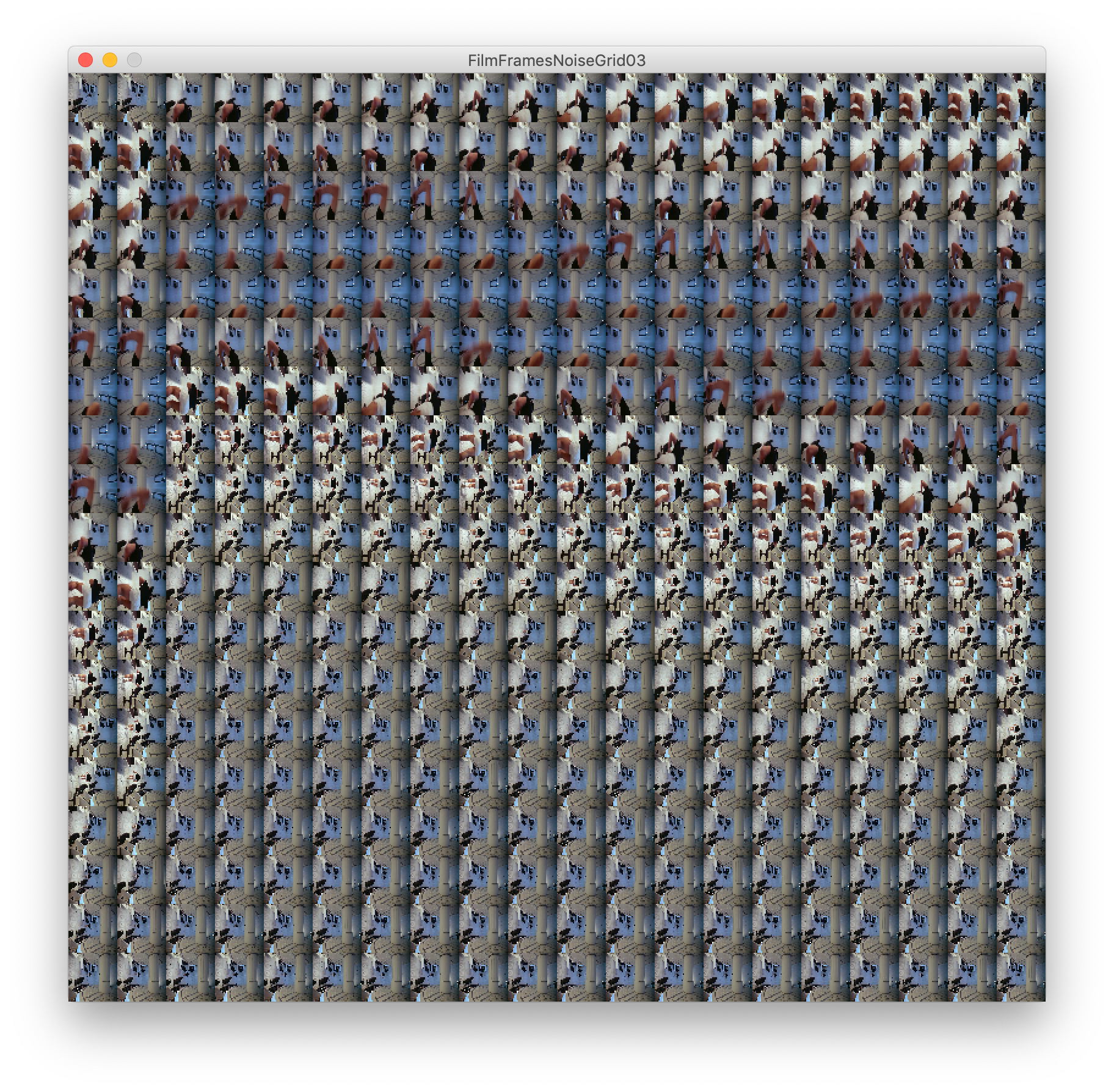
These are more visually driven than context-driven, but I think the idea of viewing these timestamps in a non-linear format is complex and unveils patterns within these scenes we wouldn't normally focus on.
We have an ability to absorb this information, interpret it and fill in gaps and when we view these grids we can easily see patterns, in contrast, colours, camera angles and so on within the scene.
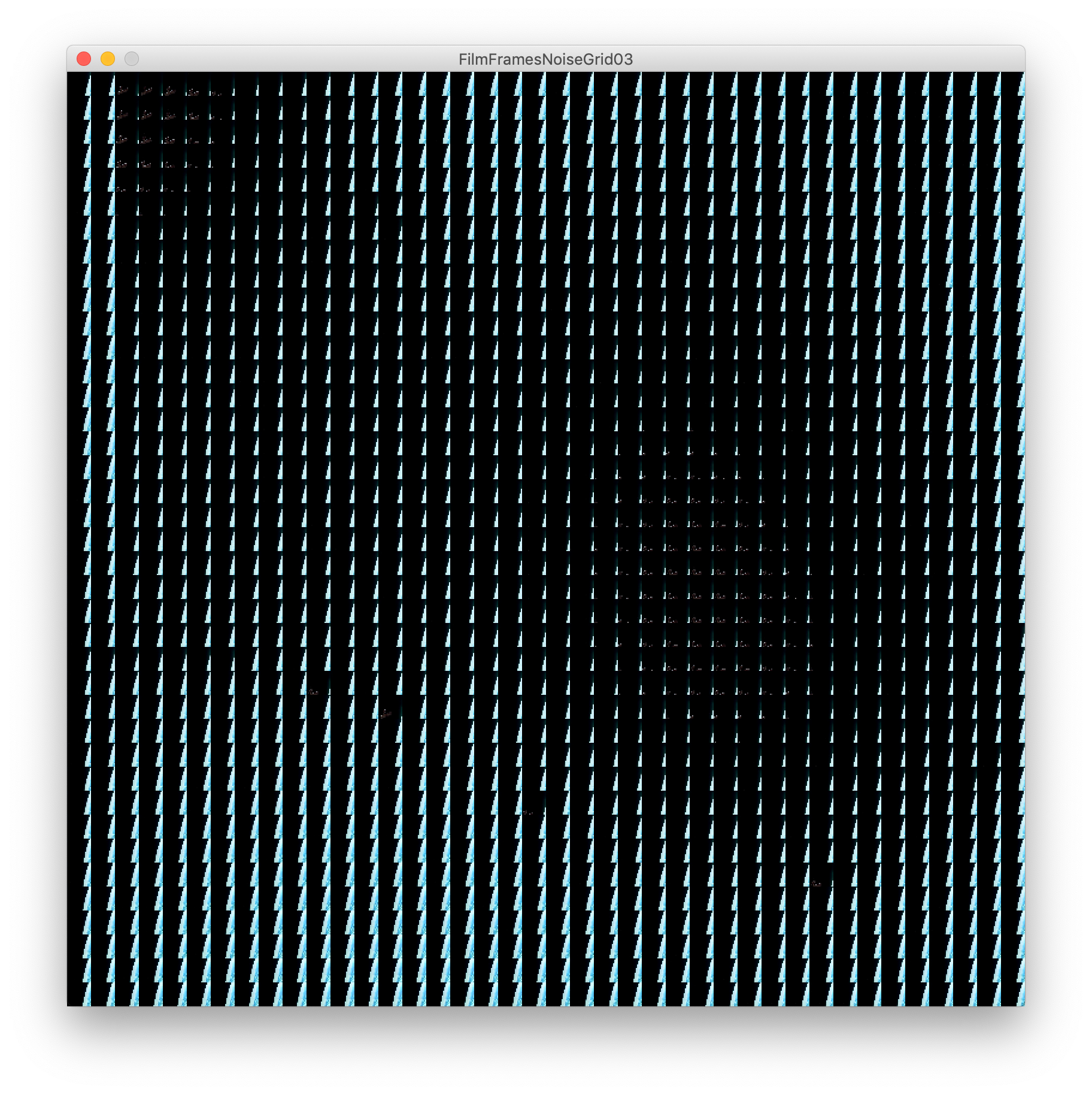

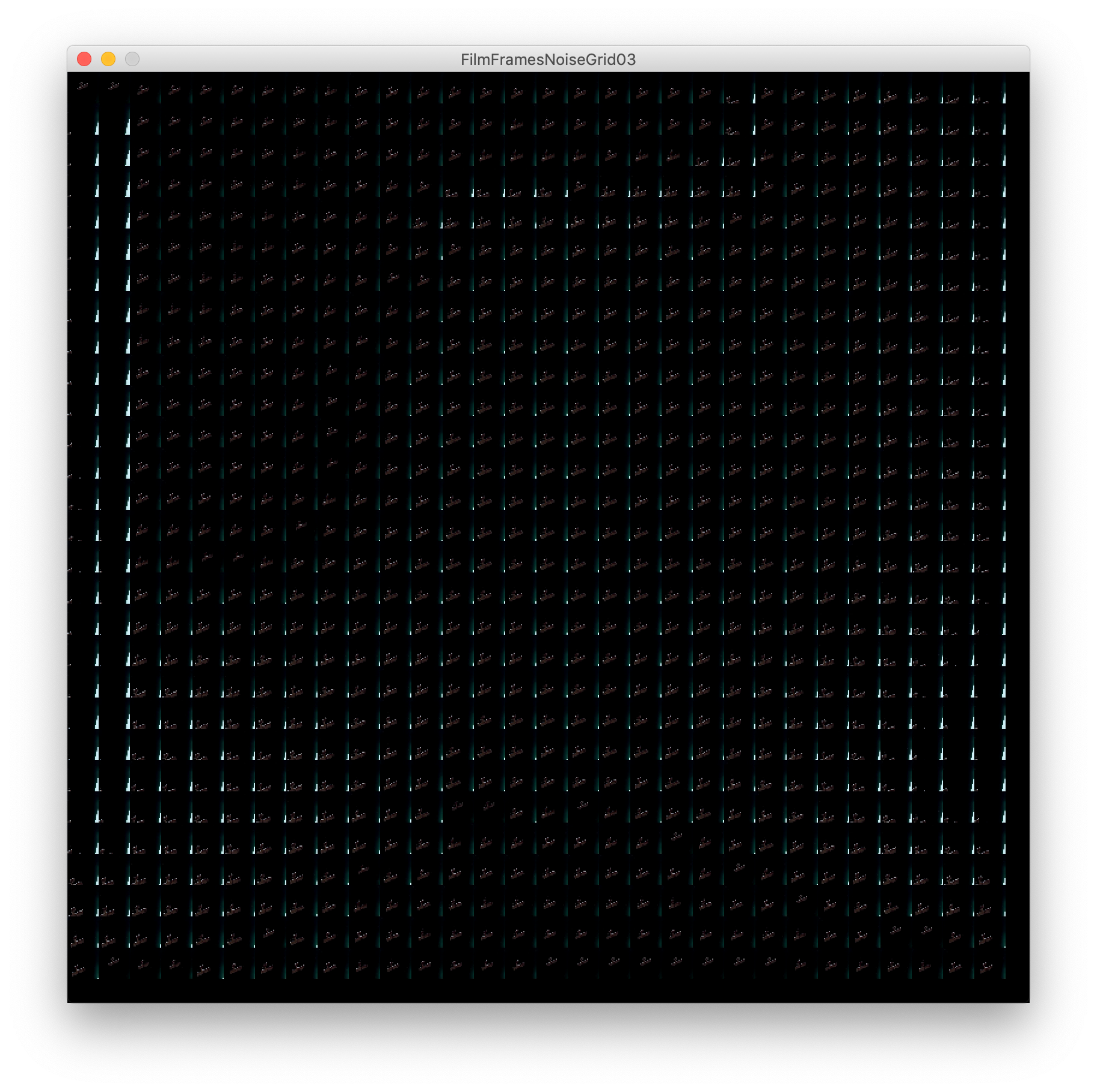

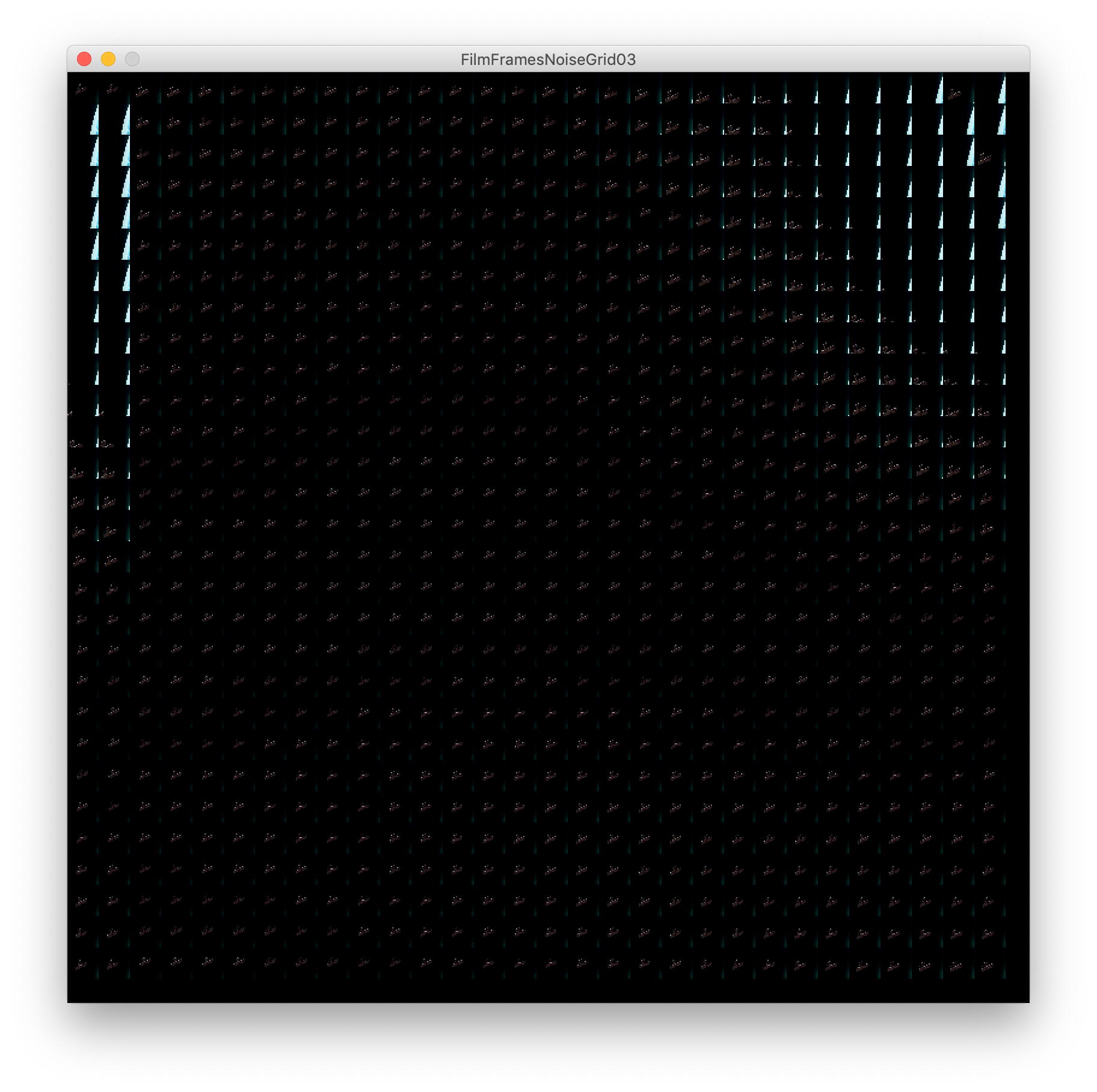
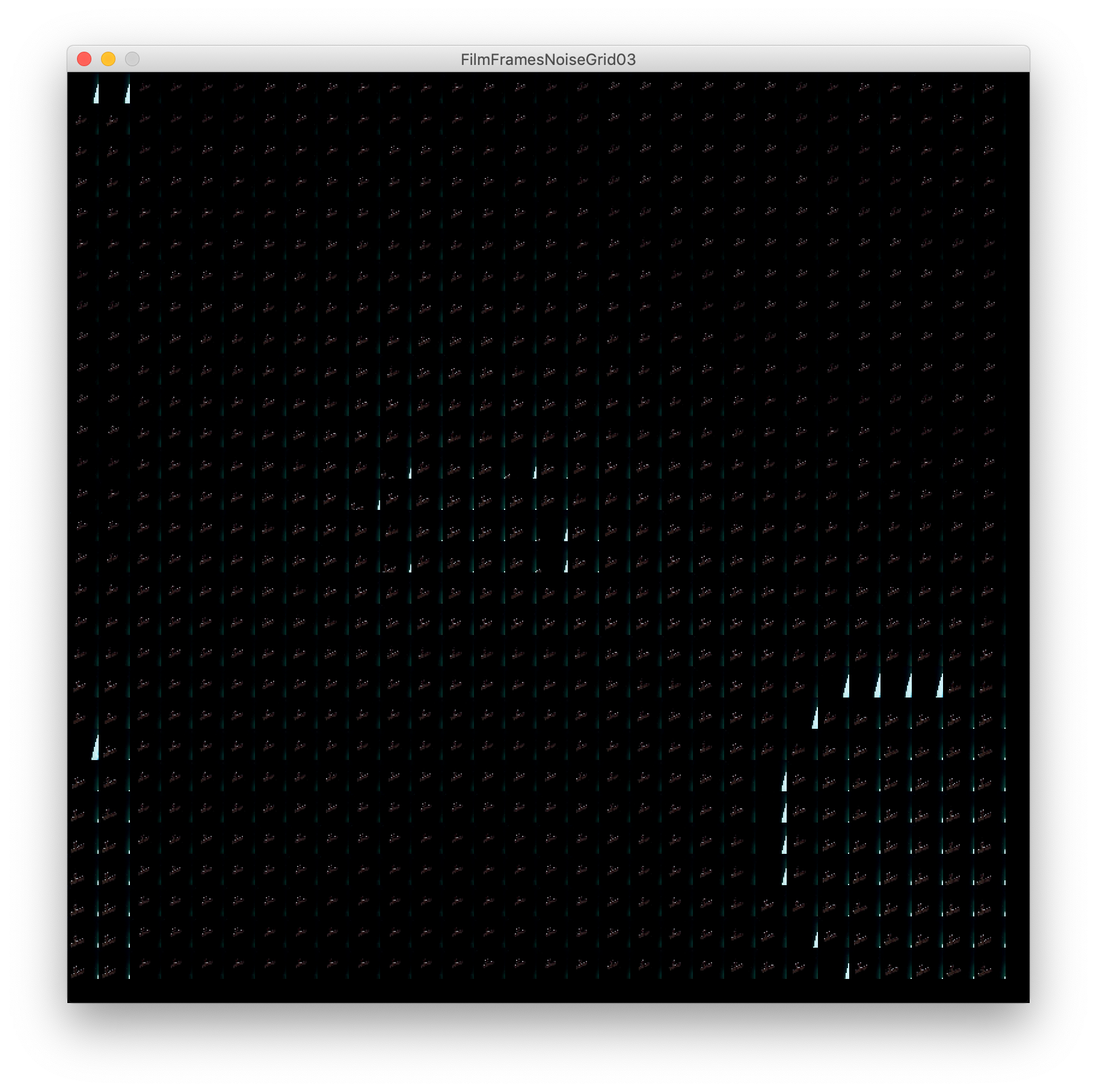
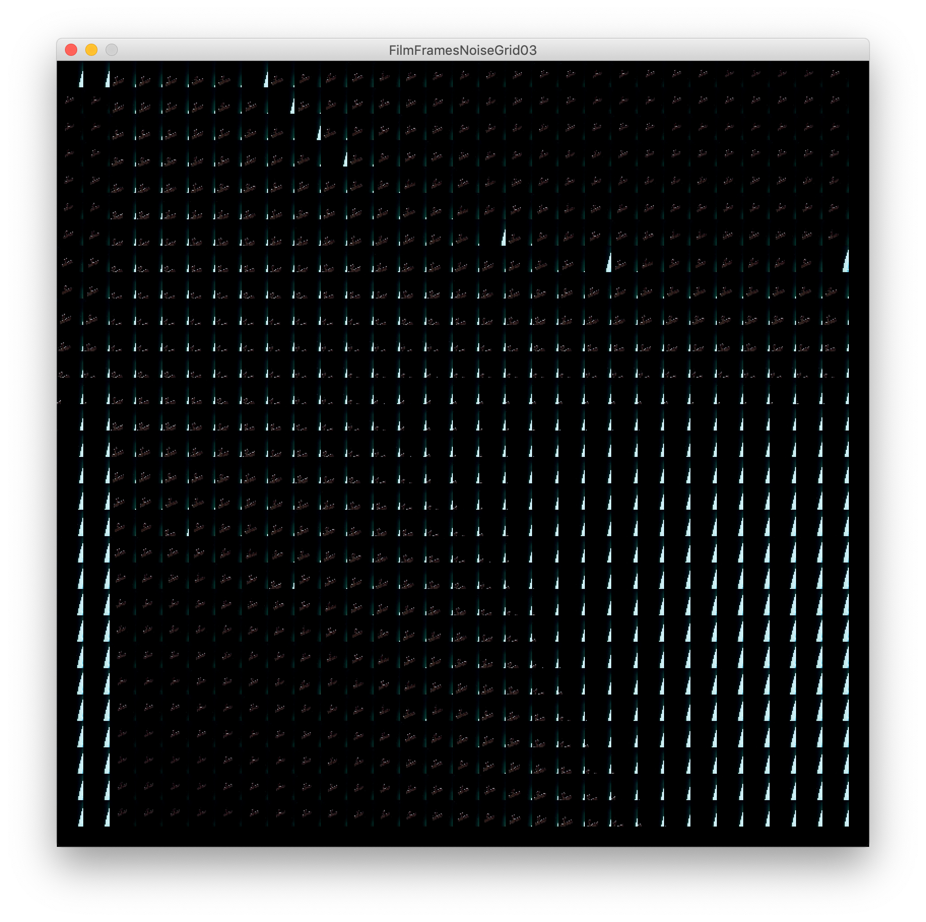
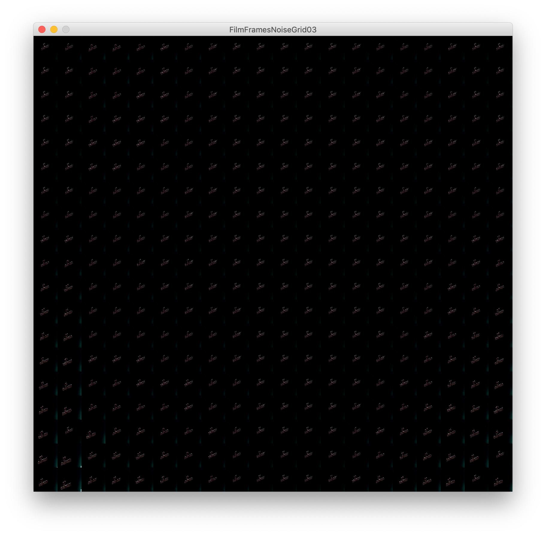
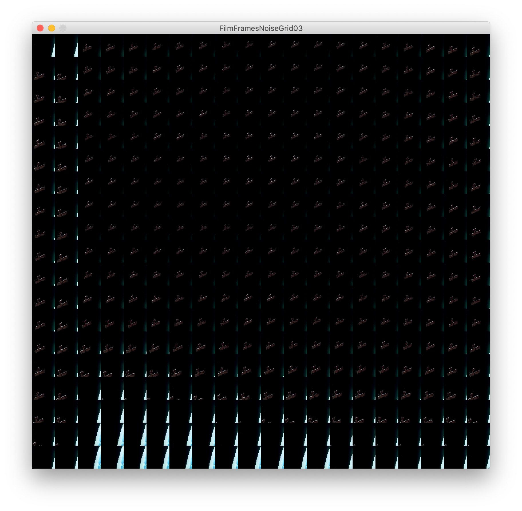
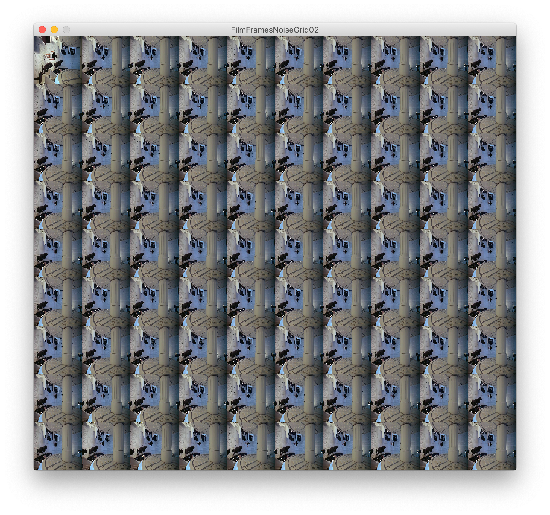
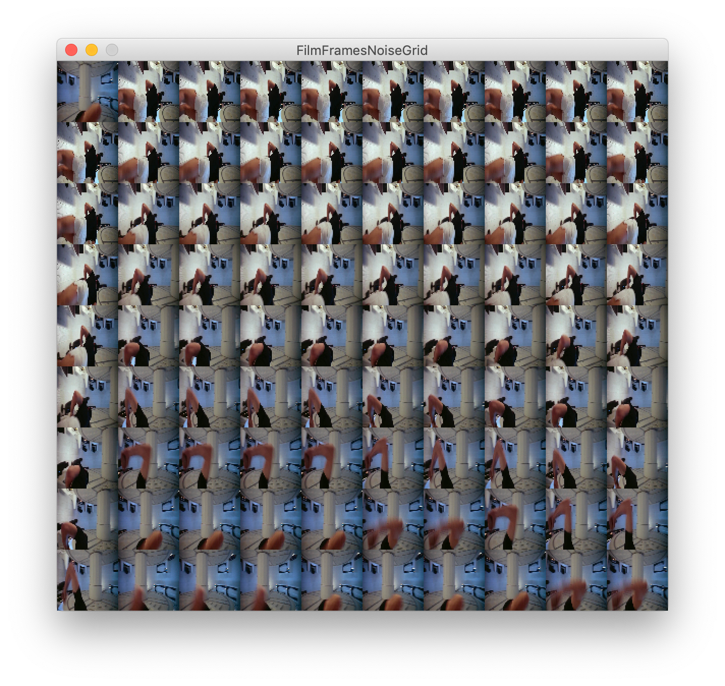
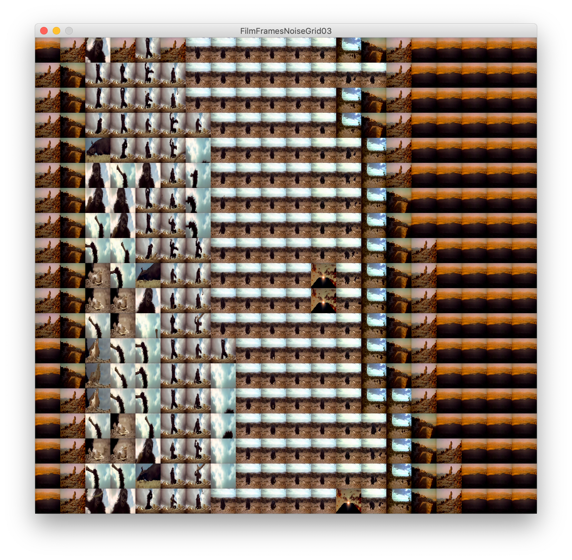
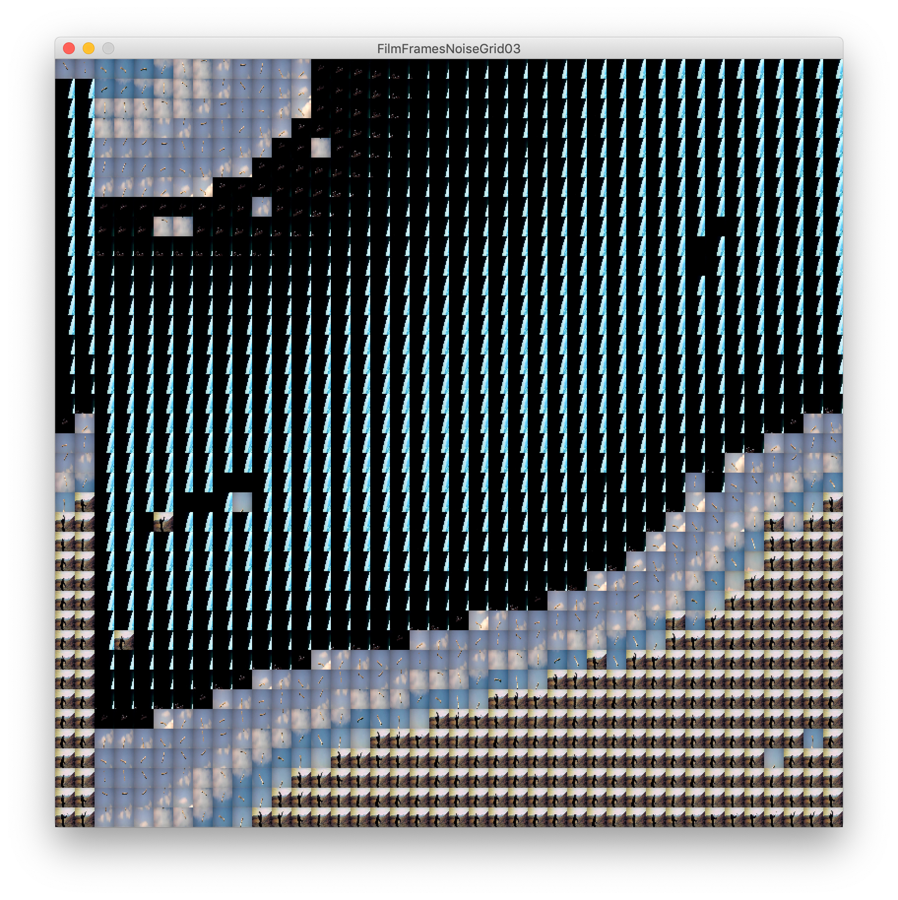
The scene above is again a short scene from 2001 A Space Odyssey featuring a panning shot of a planet. Scenes like this are ideal for showing the patterns and timestamps within the grid very well. We see a defined contrast between each frame that is driven by a noise function.
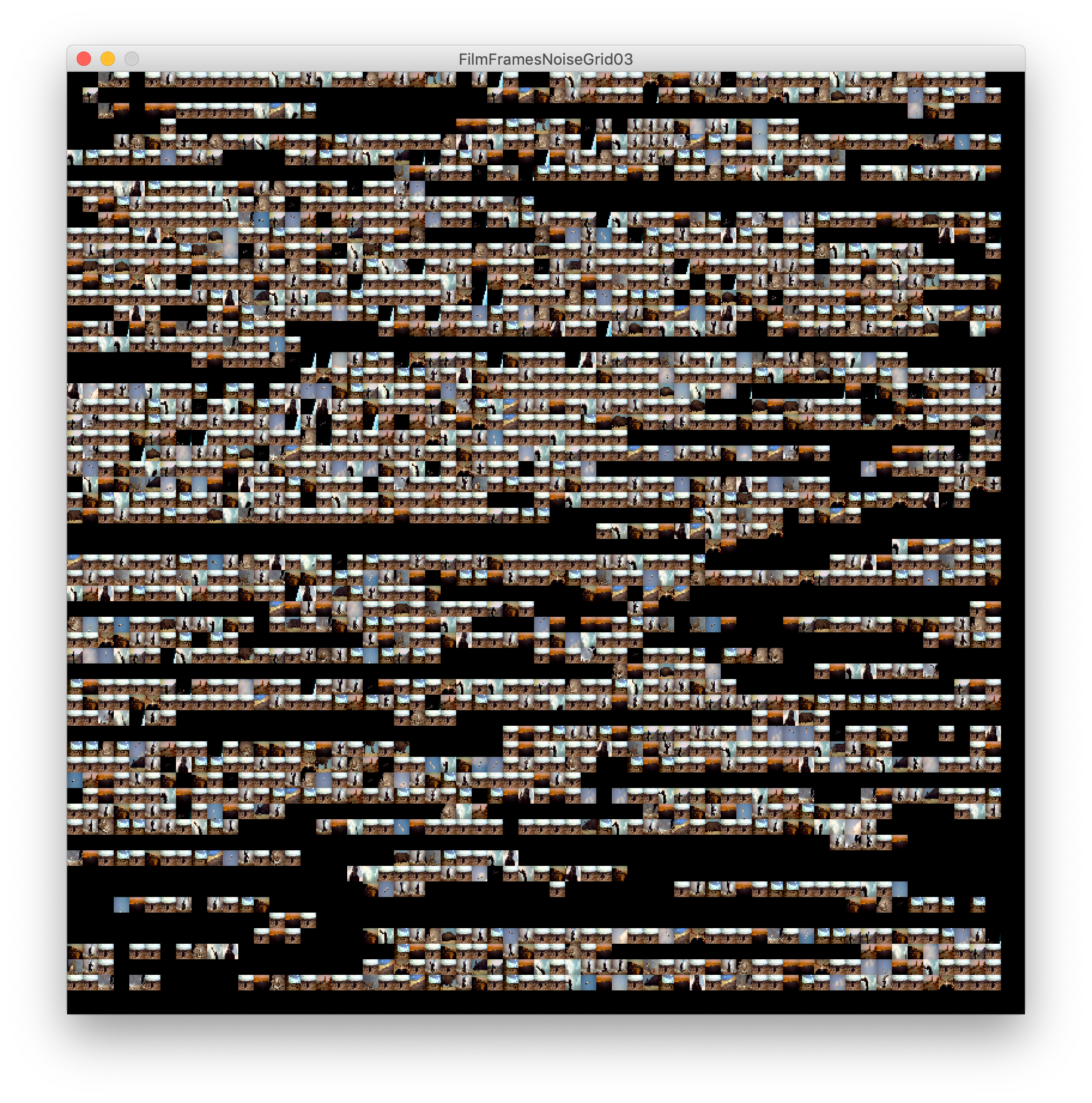
There was a slight lagging problem but I eventually got the sketch working enough with a video input to be able to save images.
Viewing a film in this manner becomes a tapestry of non-linear time. This playful output is a good start to considering the importance of time within these select pieces of media.
I was excited about this branch in my workings. After having a few failed attempts at getting the ball rolling with my work, I enjoyed this exciting output.
I knew I had become stuck in my head throughout previous documentation and now I had to make sure I highlight my theories and drive behind this work.
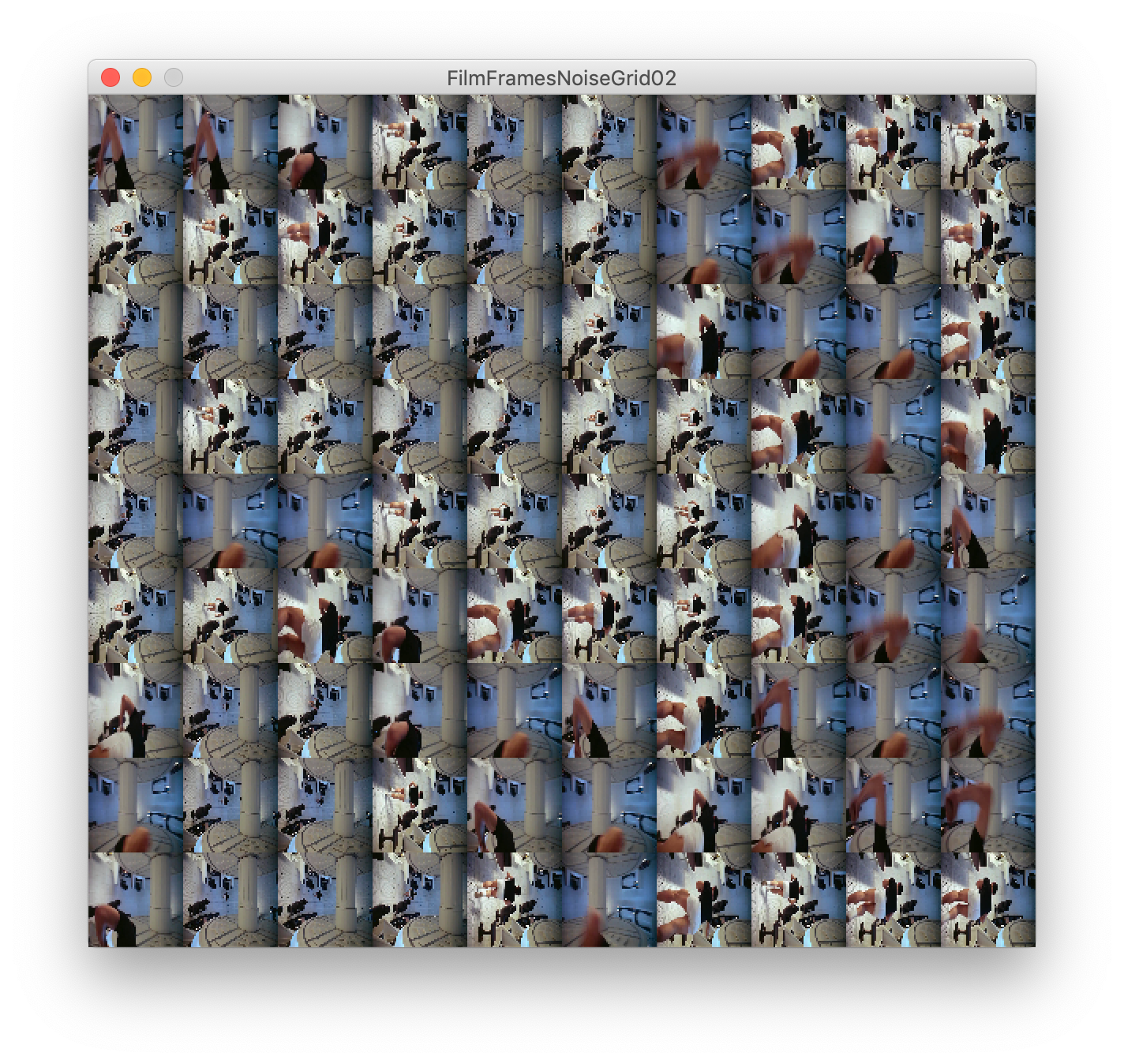
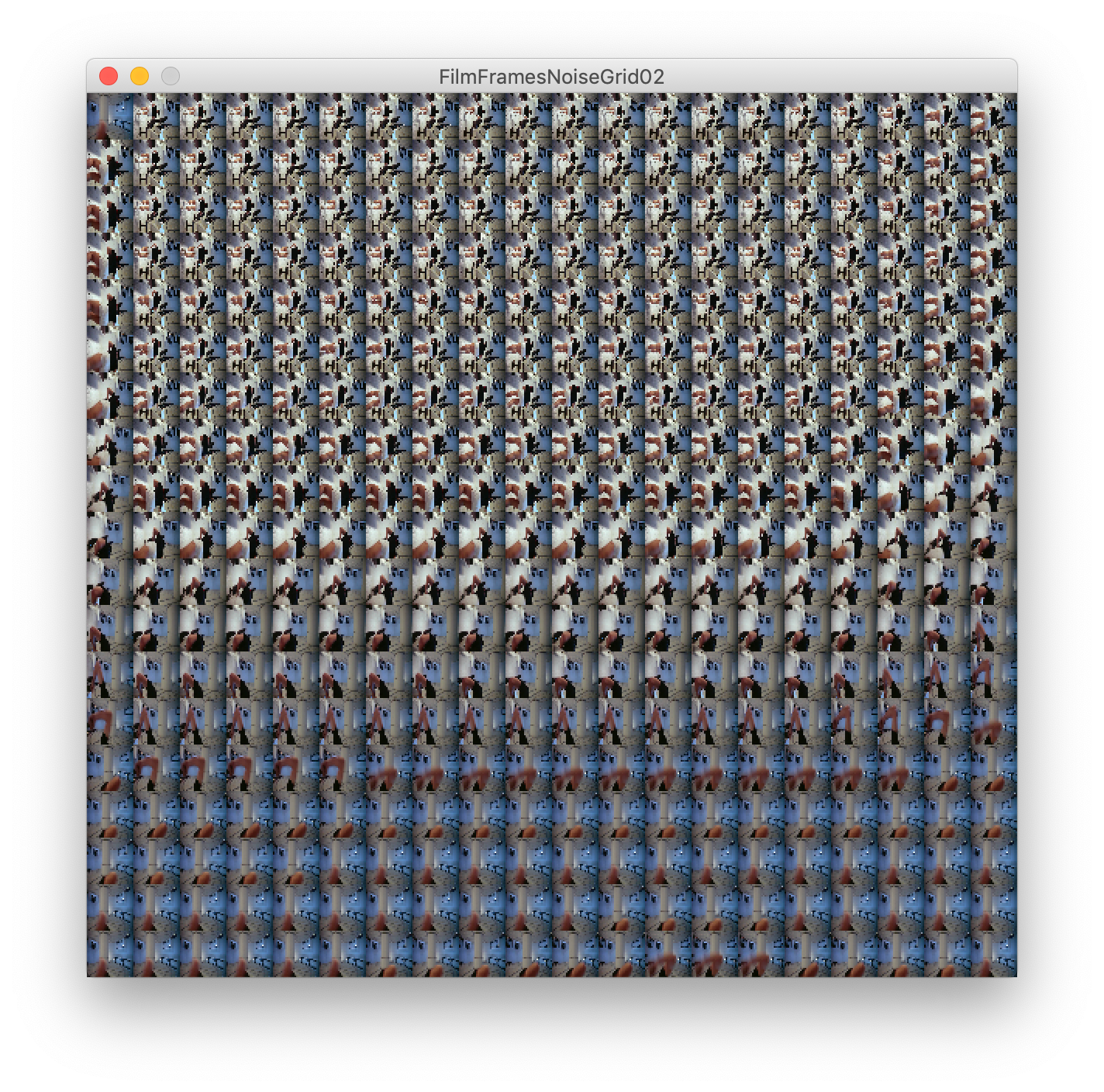
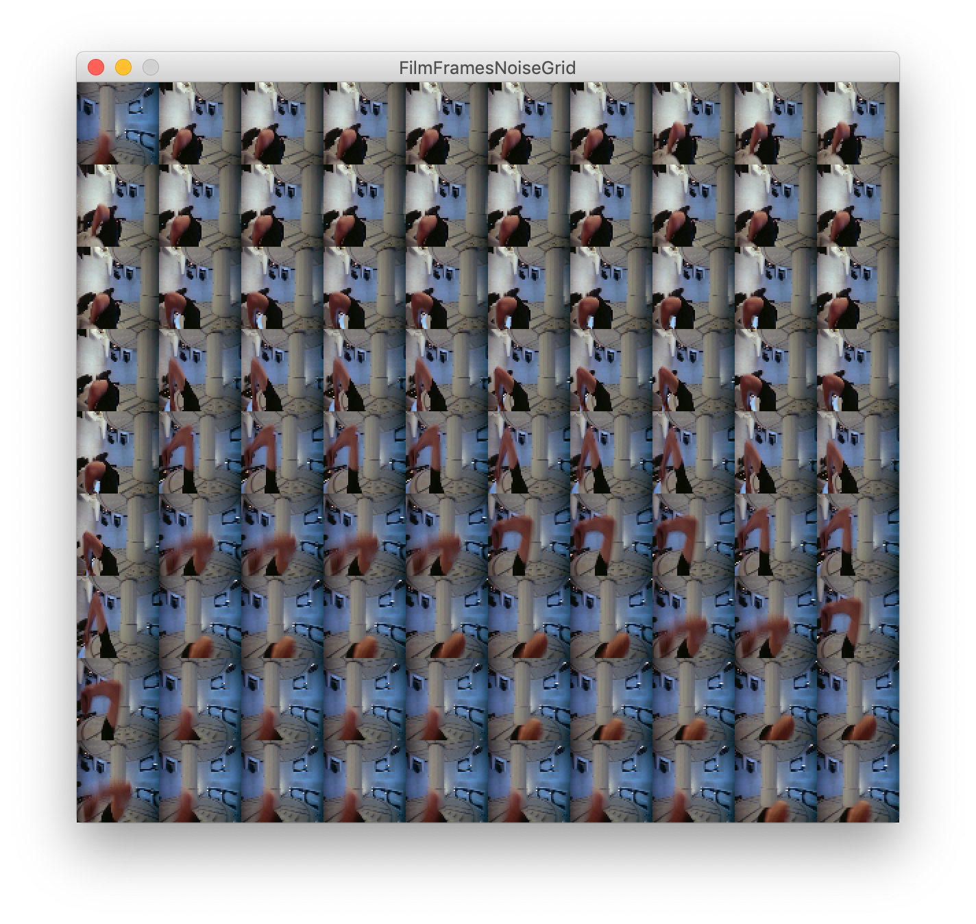
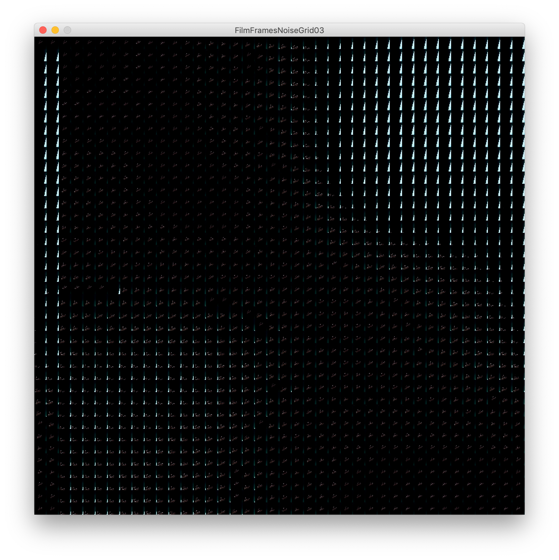
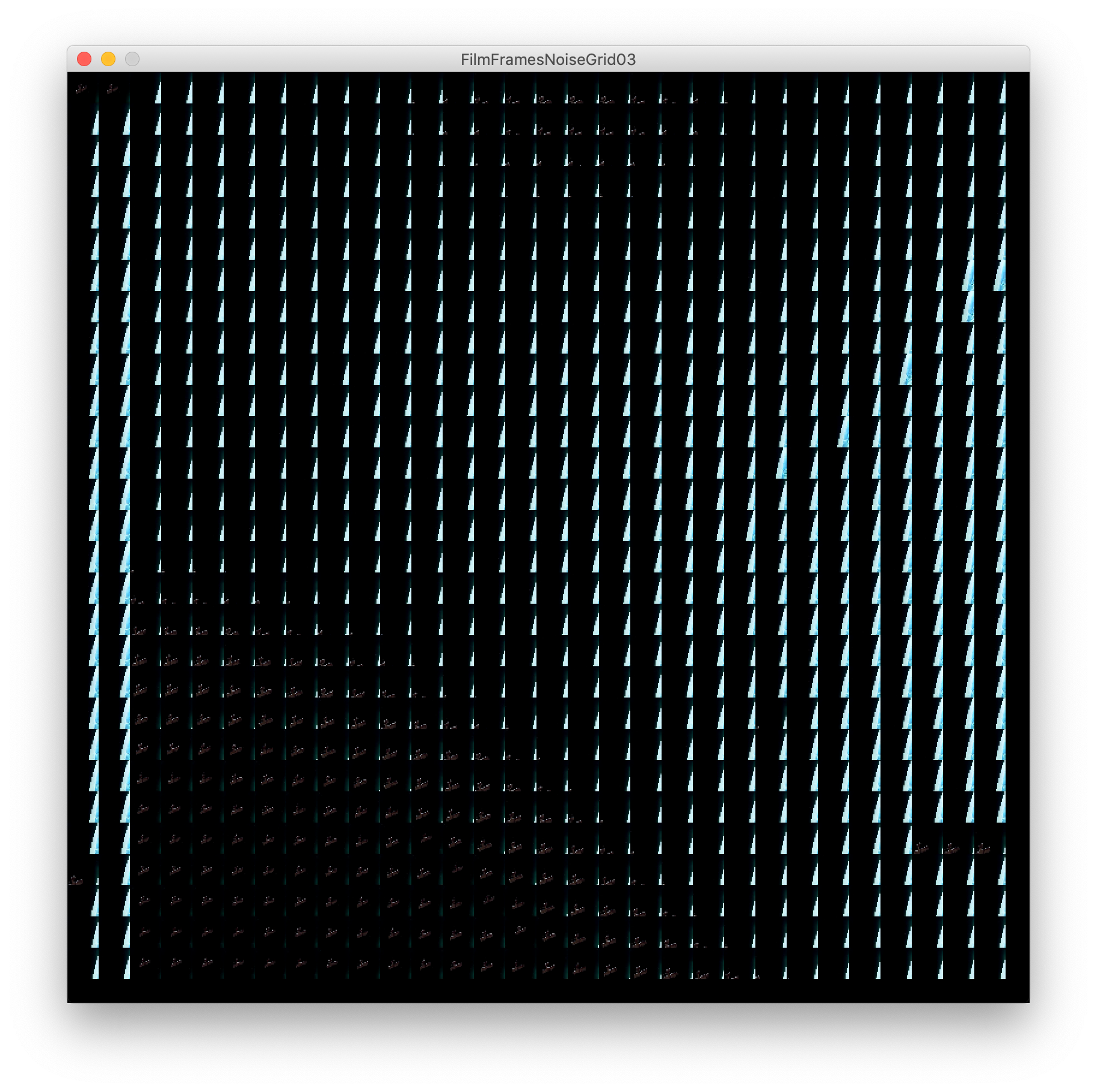
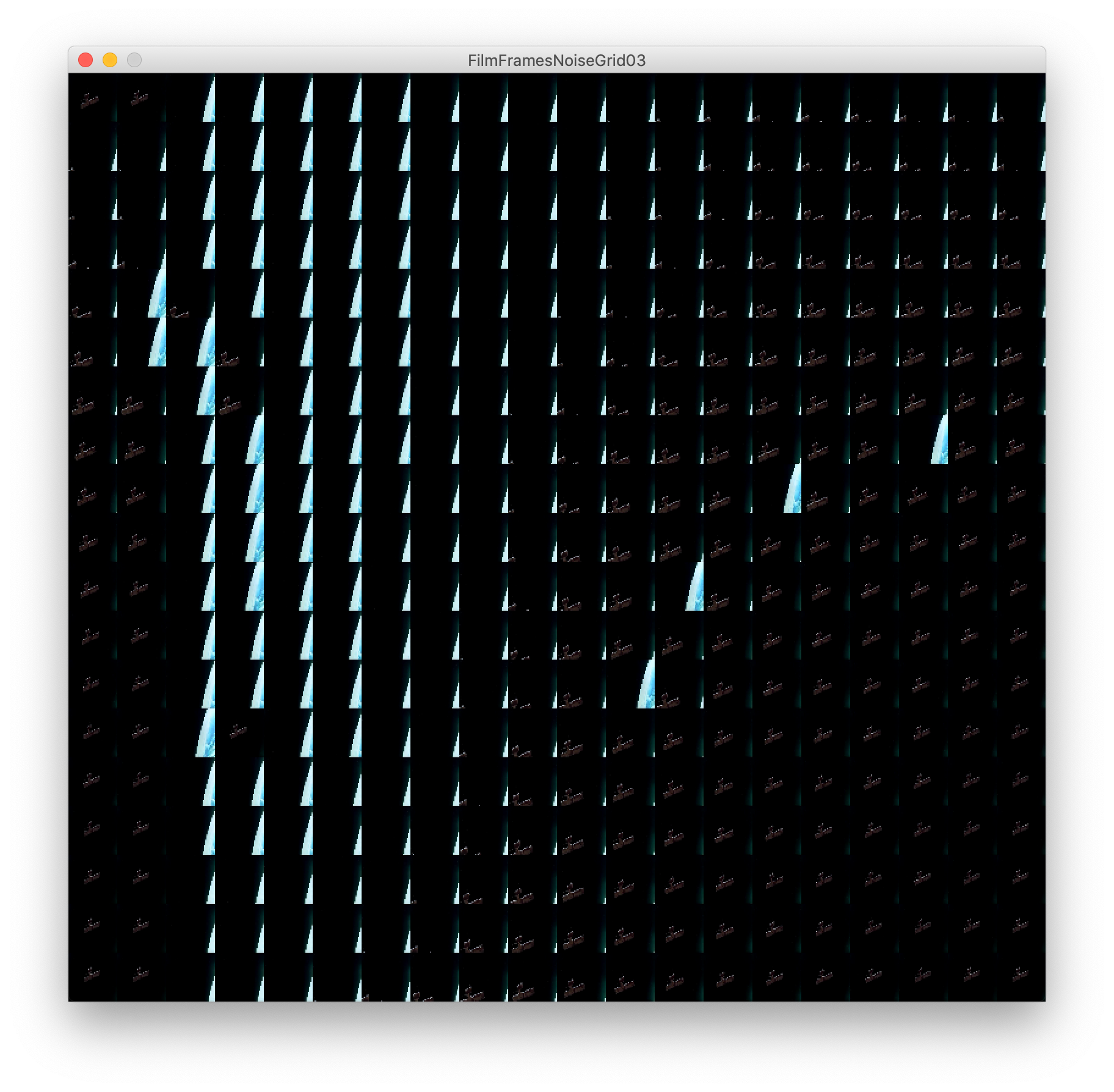
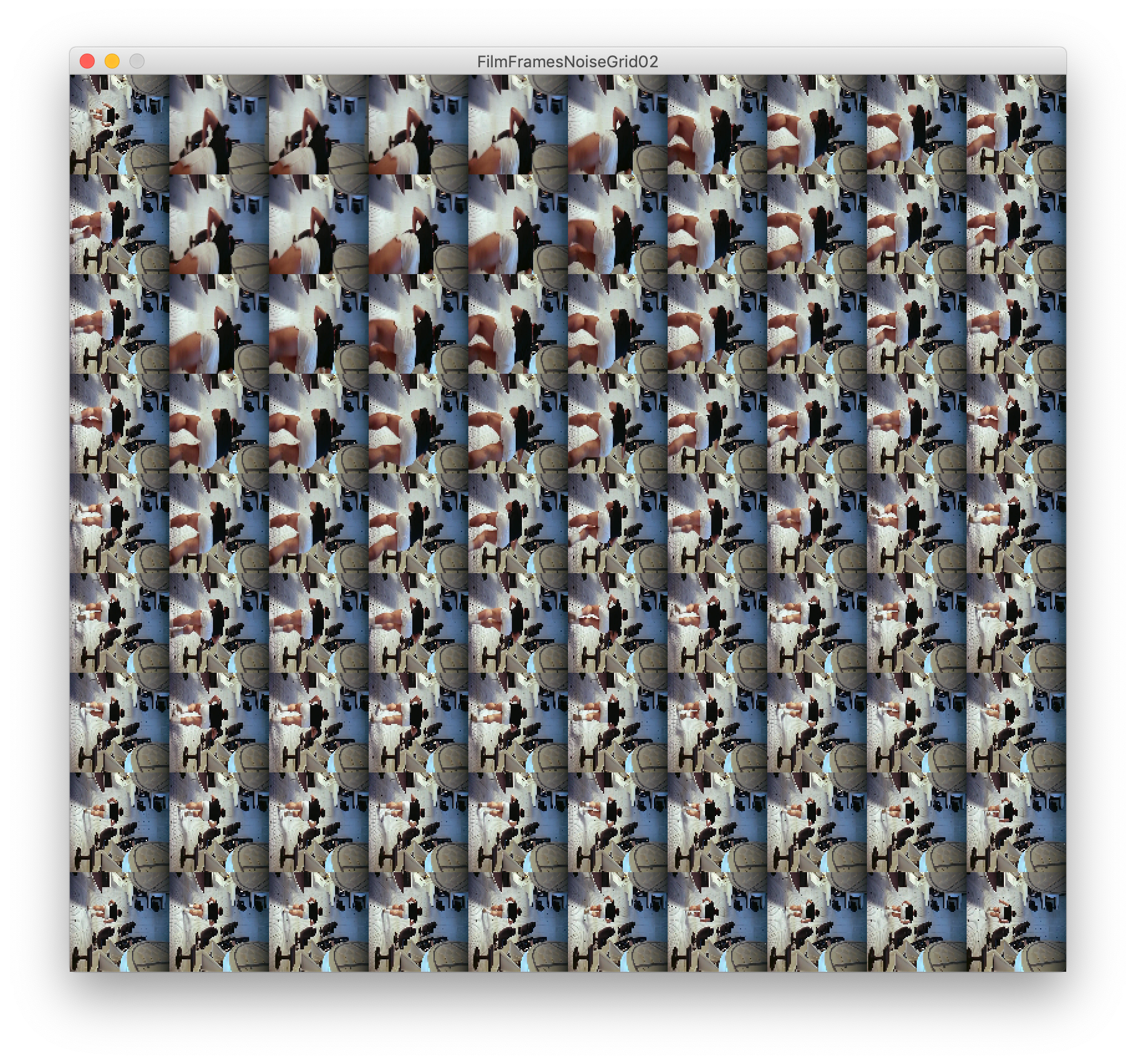
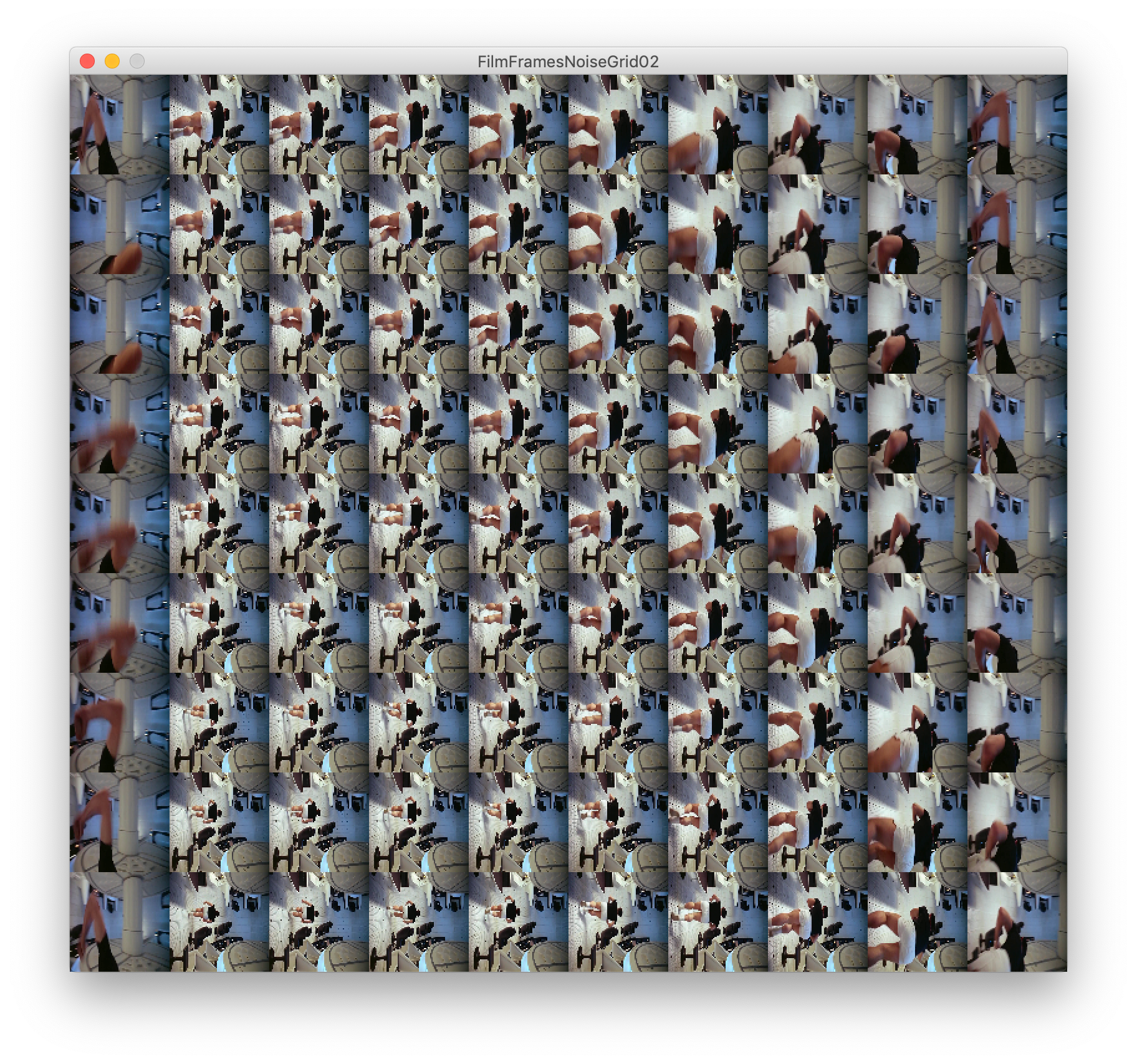
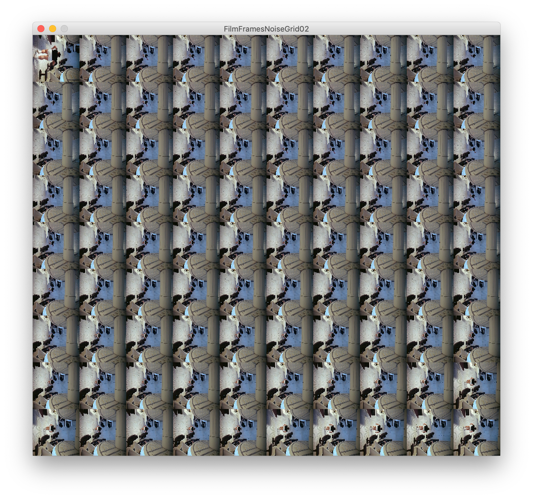
Below is a good example of the same processing code using a longer piece of footage. There are more jarring changes and less of a flow to the grids. We can see where scenes change clearer and they begin to look more like a map of frames.
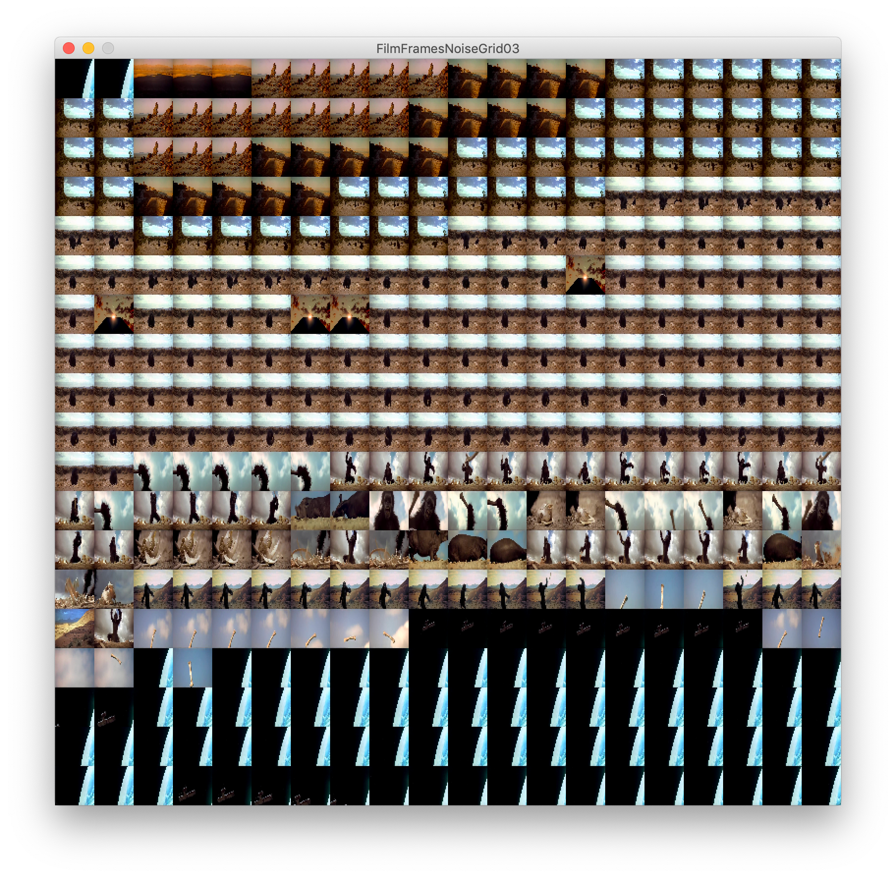
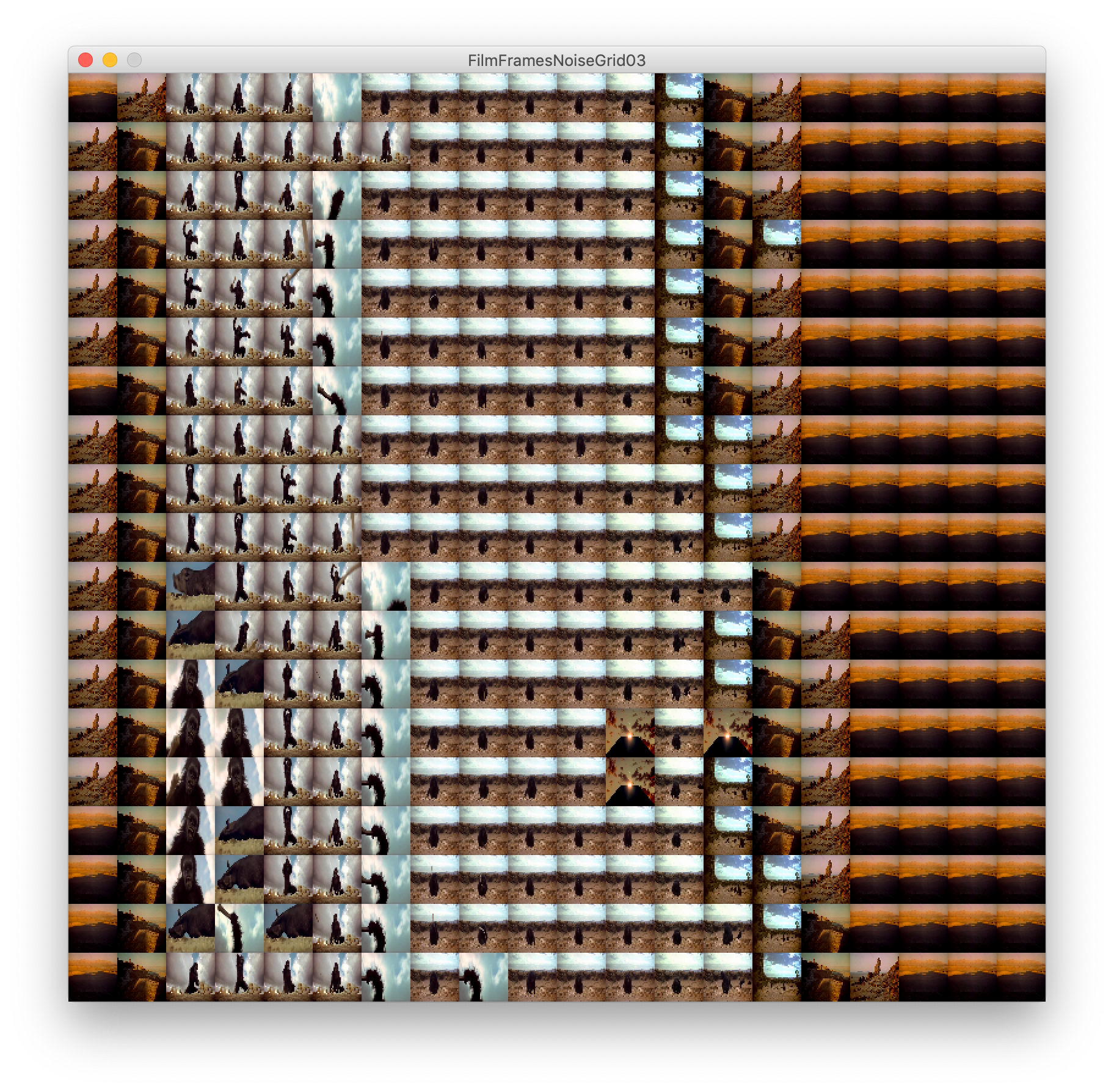
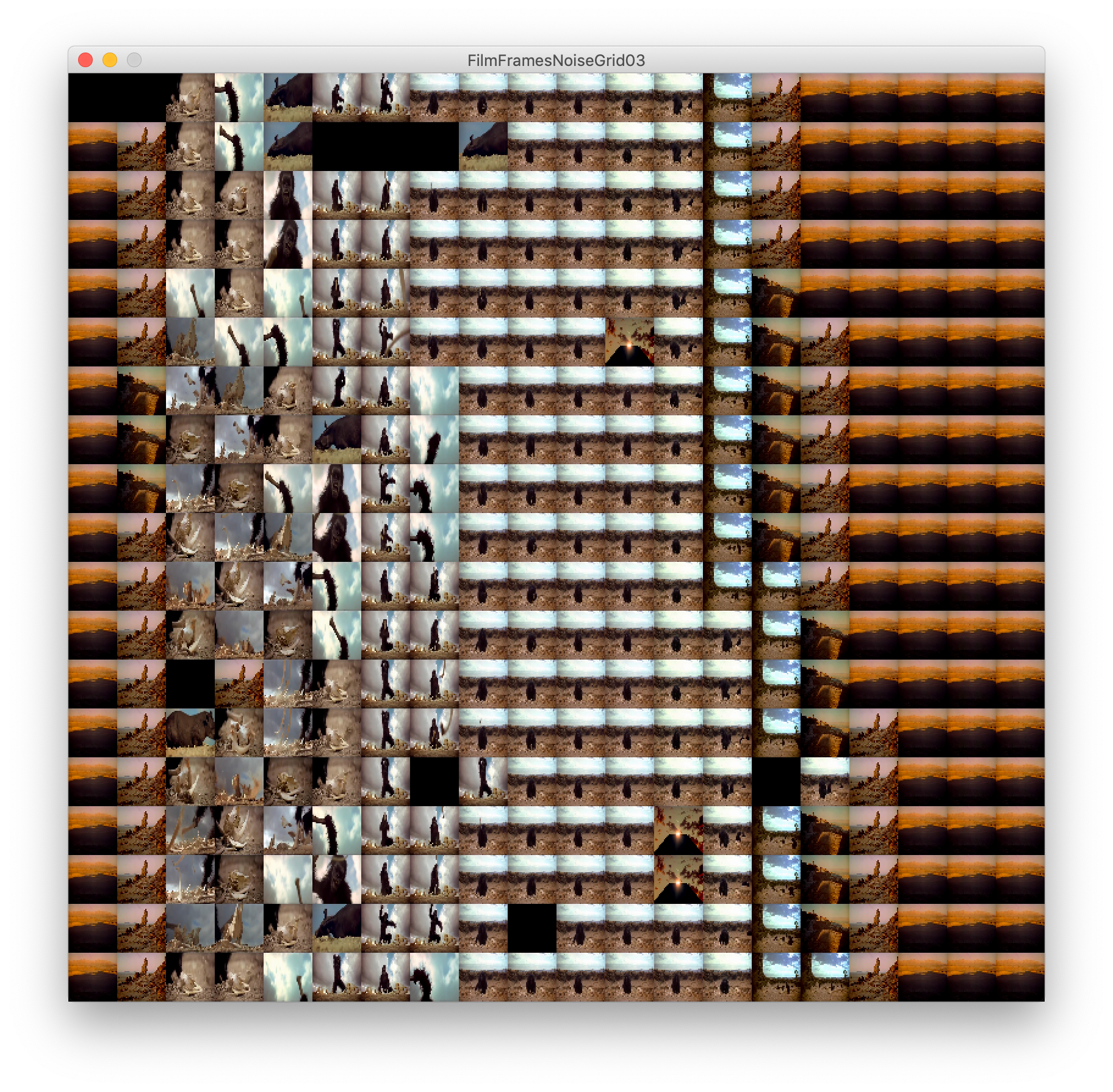
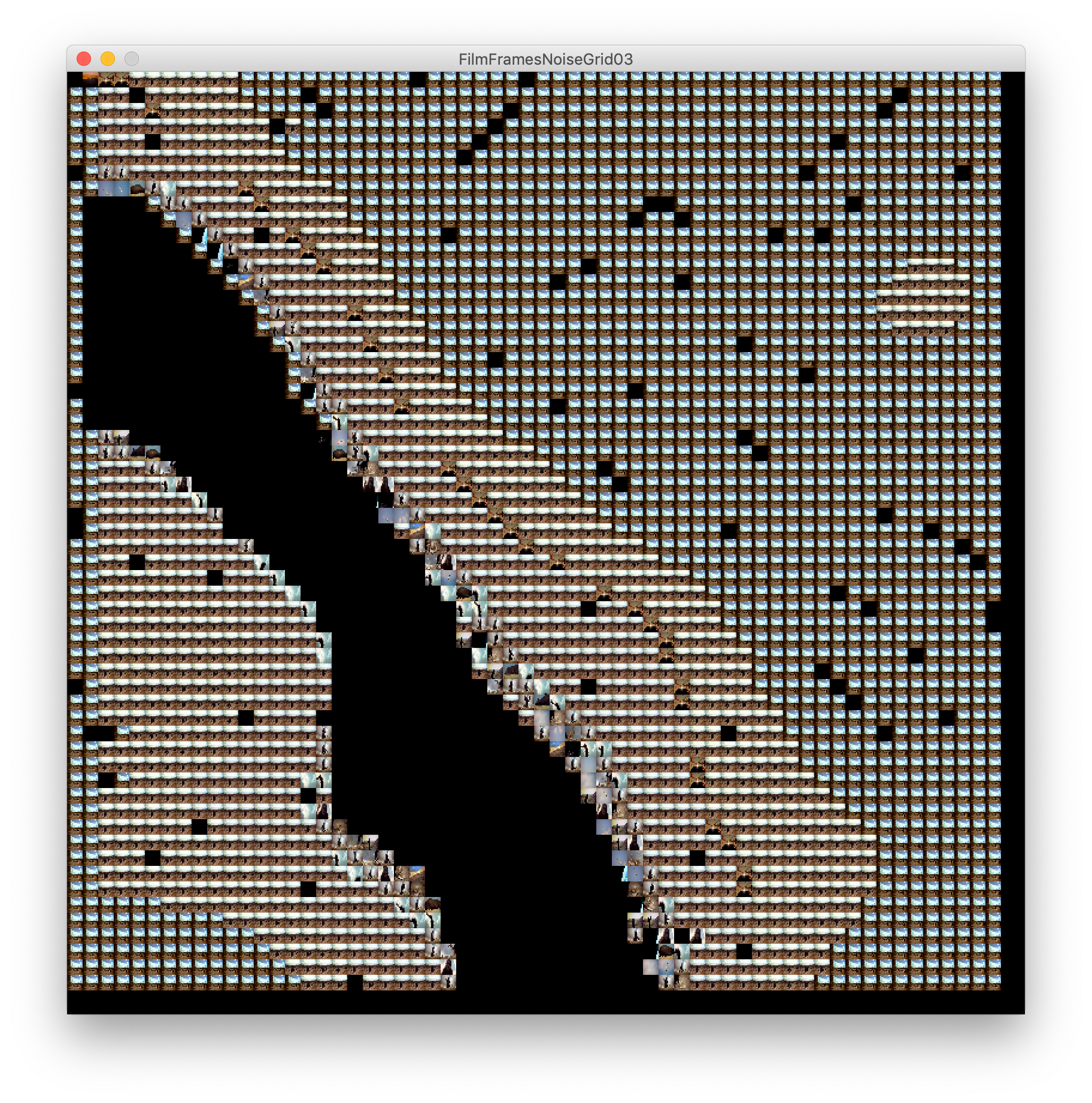
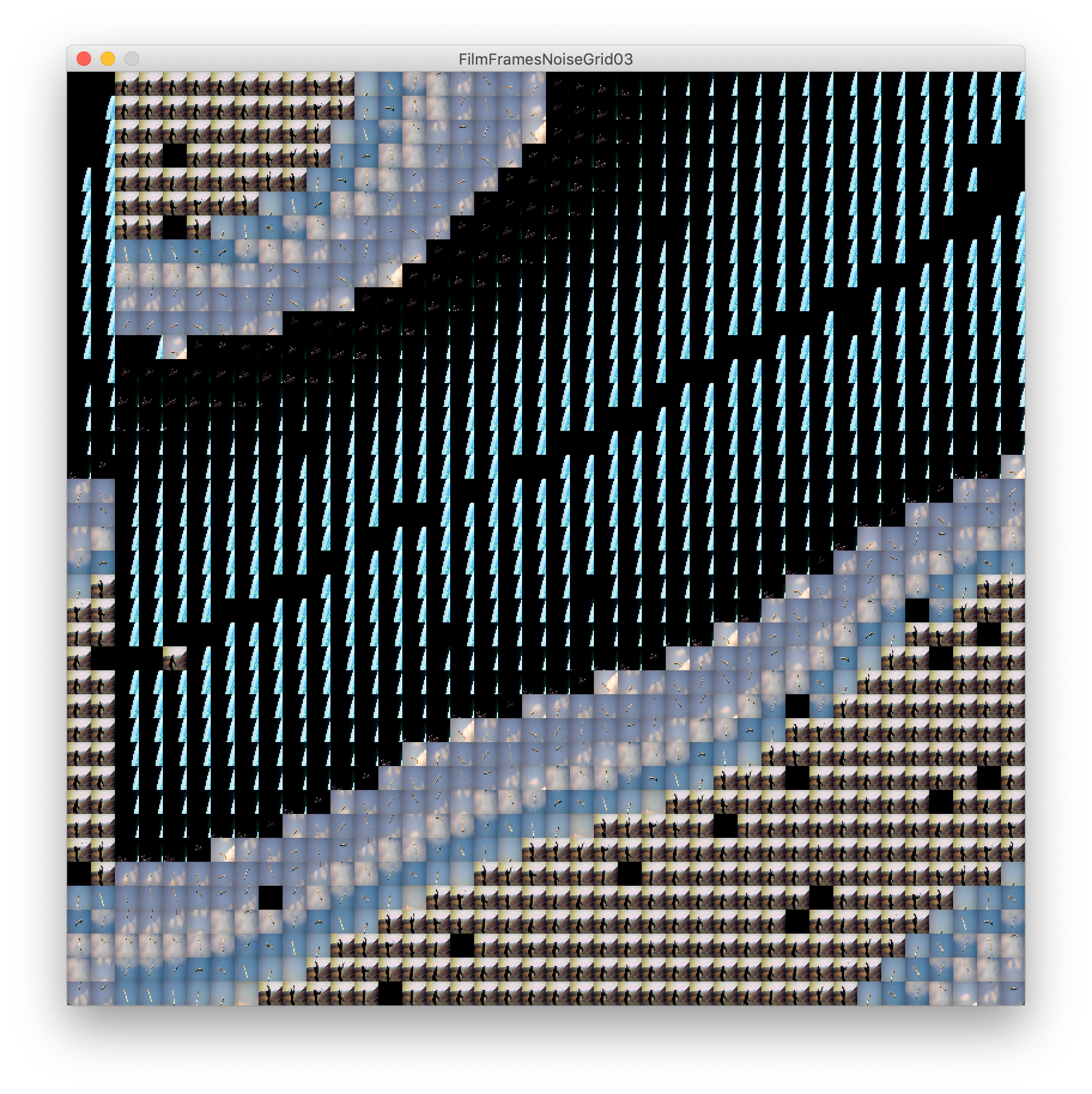

After a few experiments with this bit of code, I realised the potential this work had in furthering my exploration of film as data and the power to change these familiar works into something new.
Artists such as Christian Marclay, Douglas Gordon and Jim Campbell have all been known to have an interest in similar ideas of taking a familiar piece of media, including all that comes along with it, and manipulating it to communicate something more.
-----------------------------