Here I began to think more in depth of colour as data - and how to display this data.
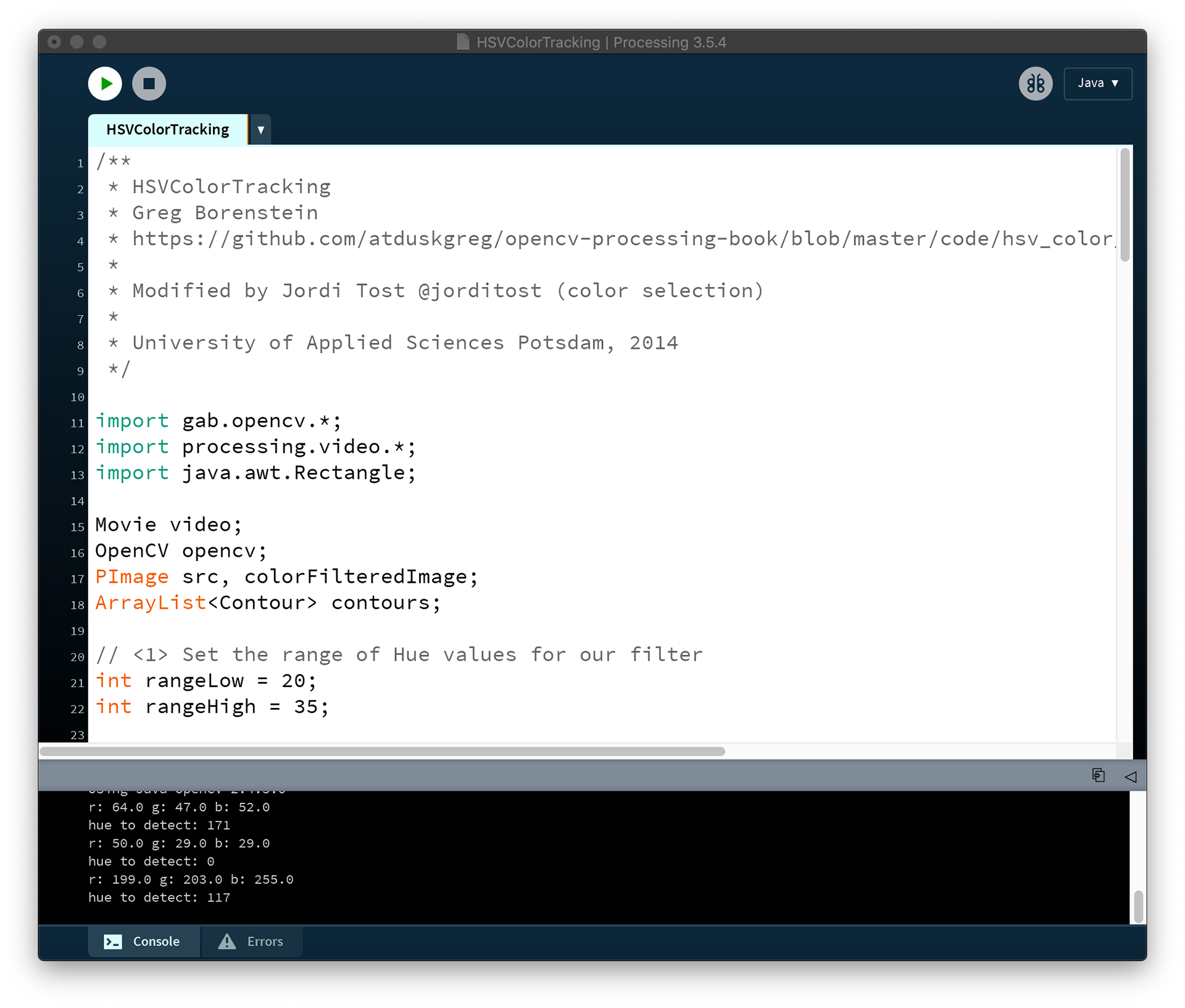
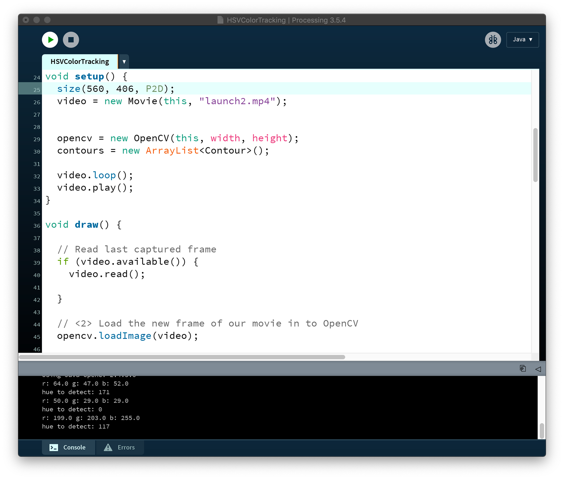
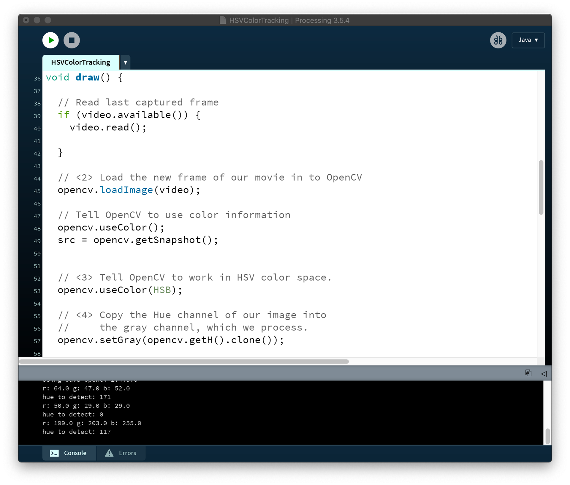
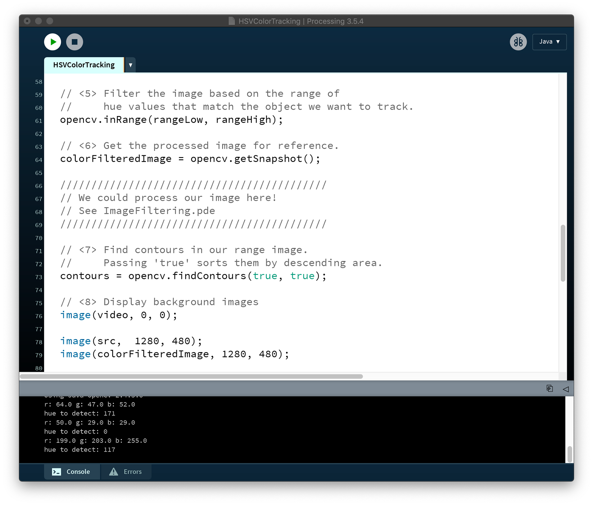
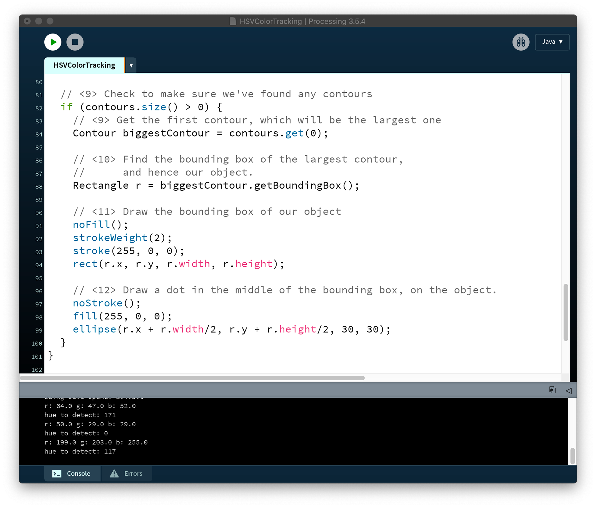
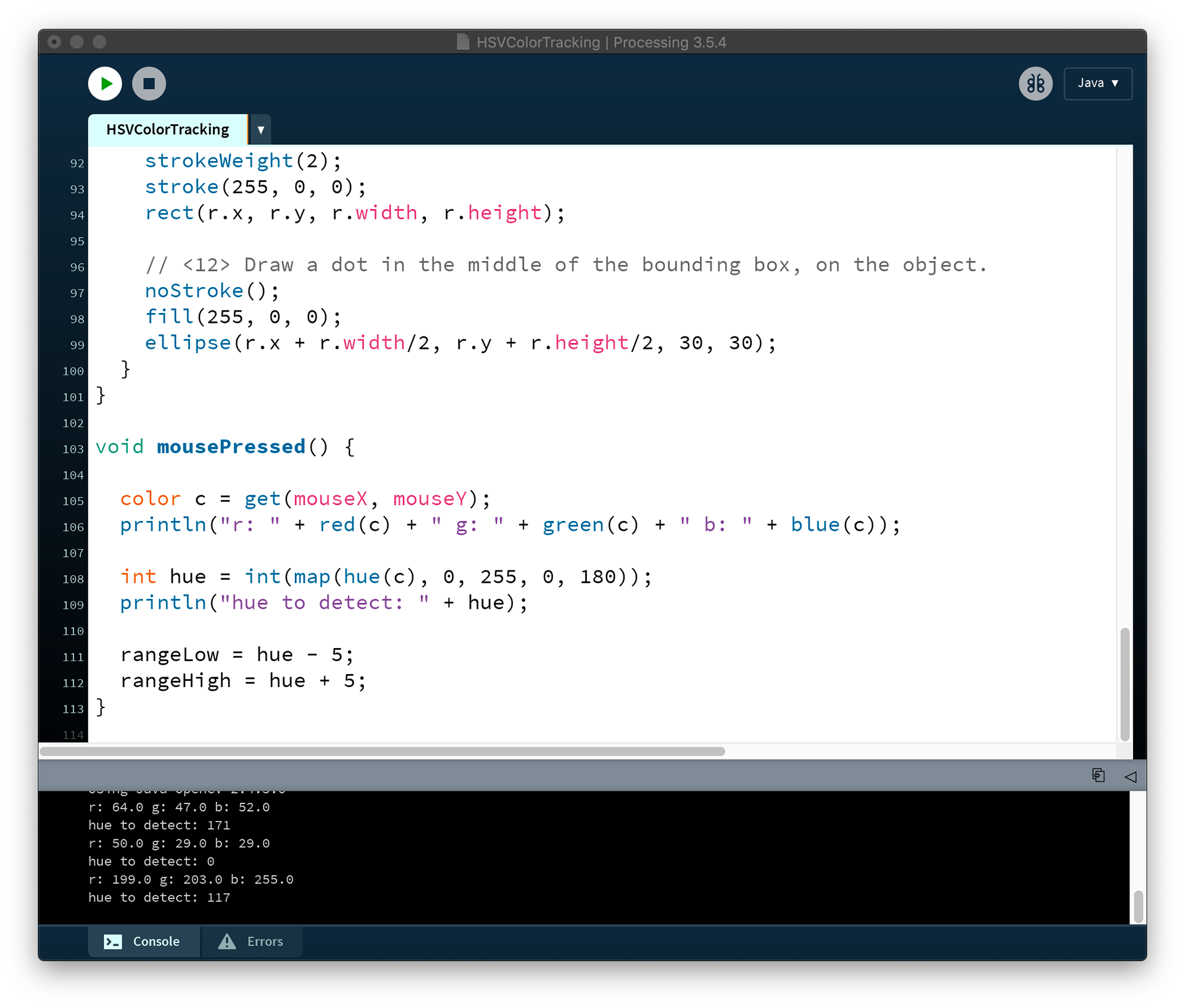
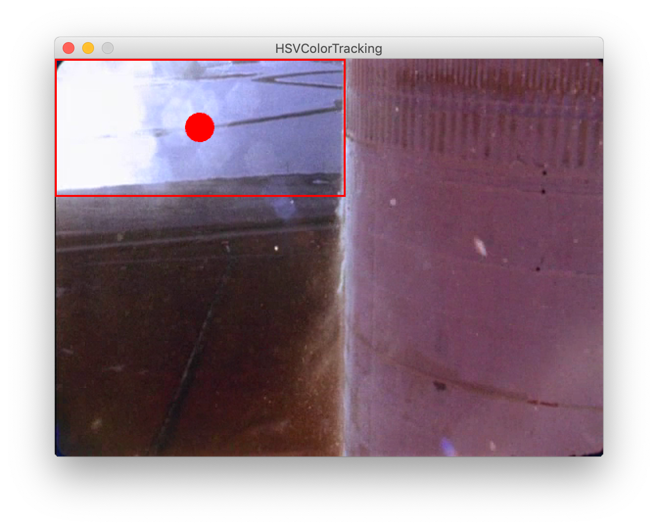
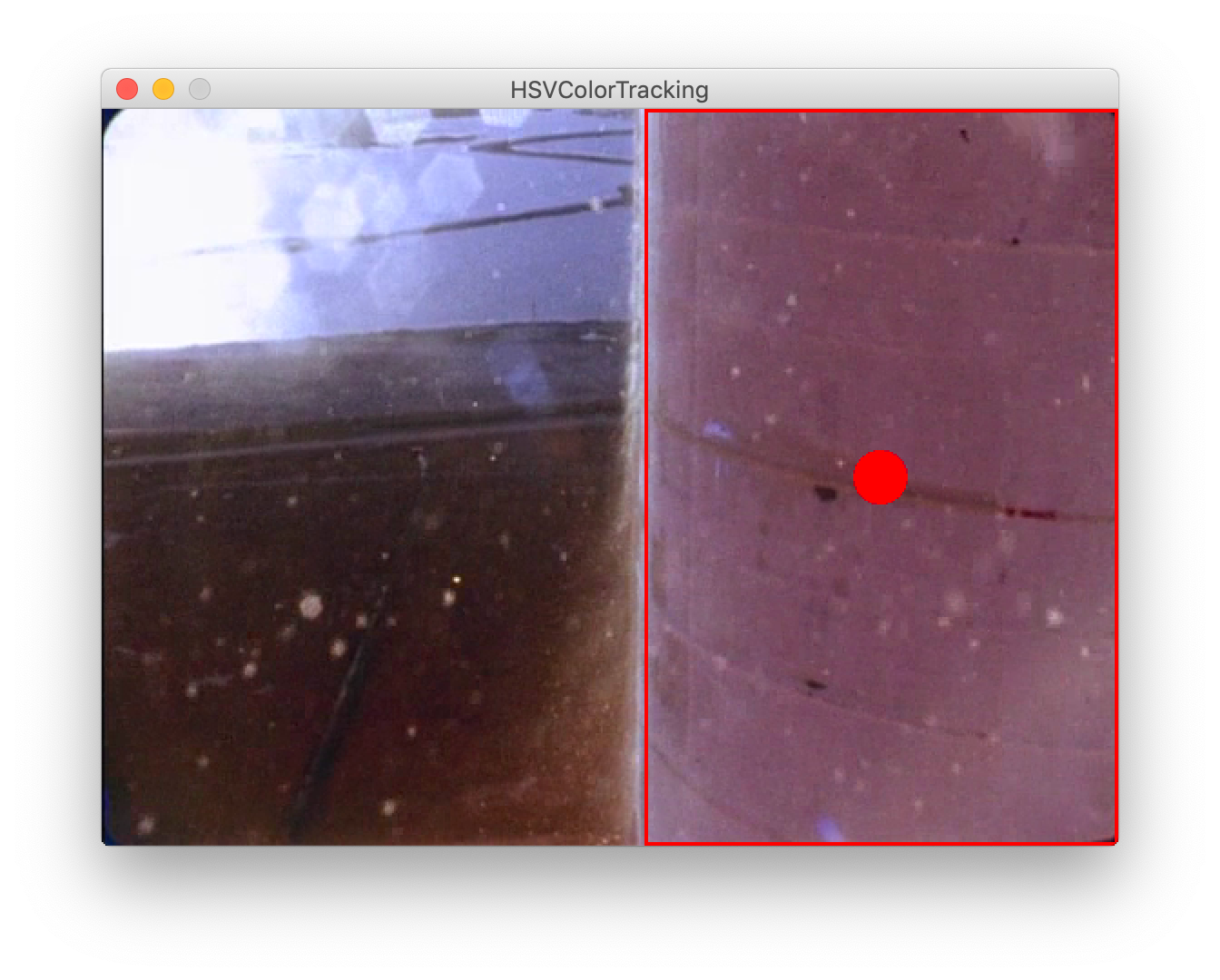
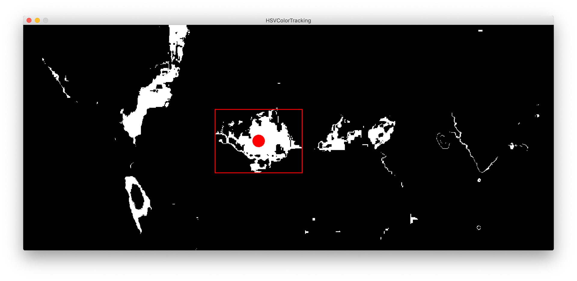
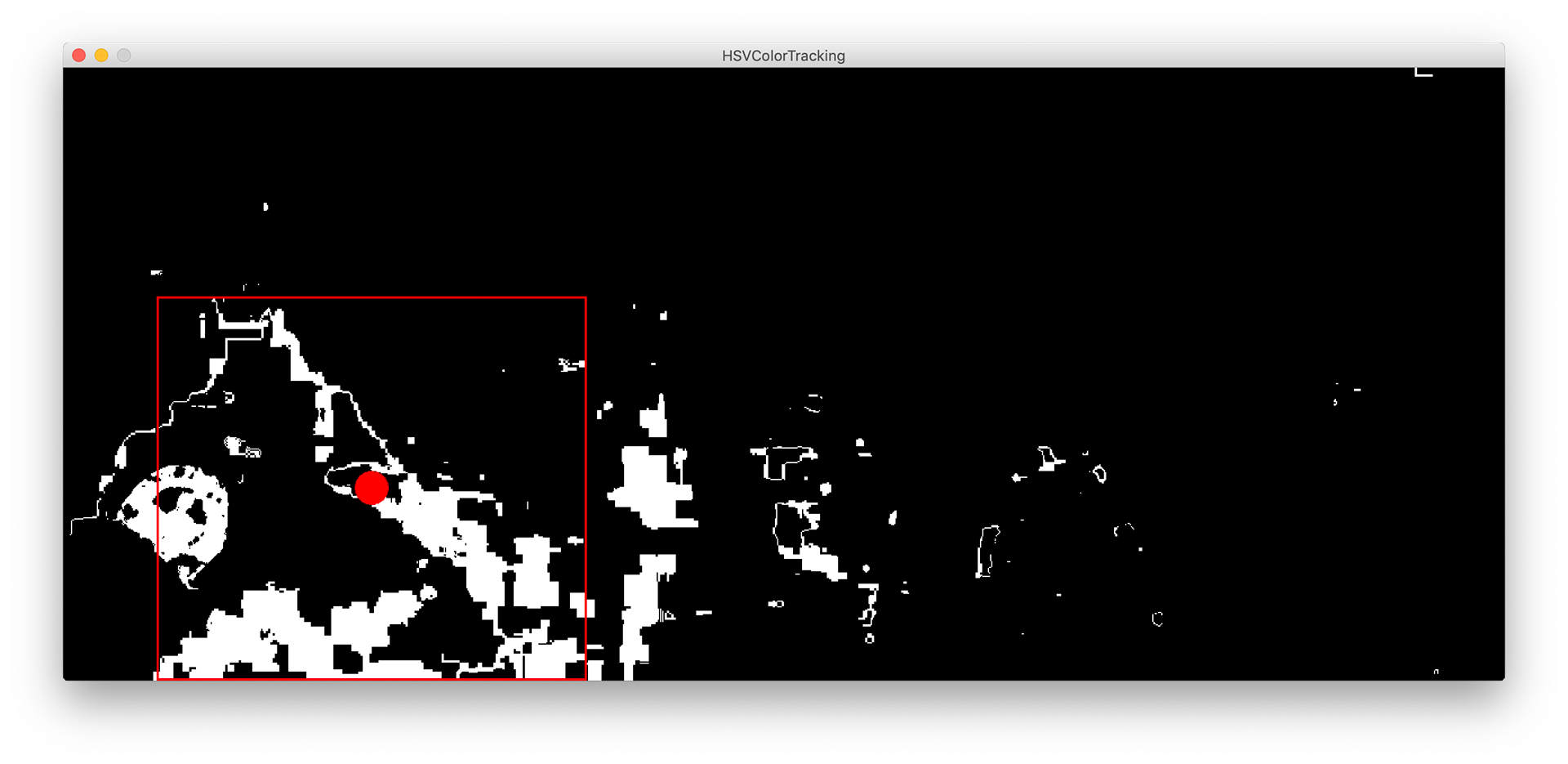
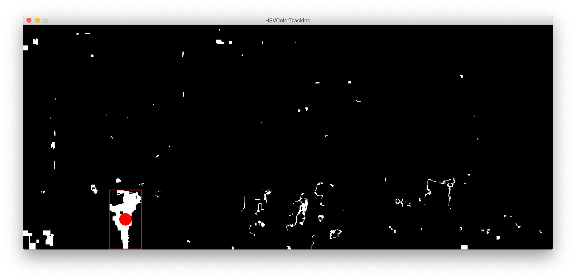
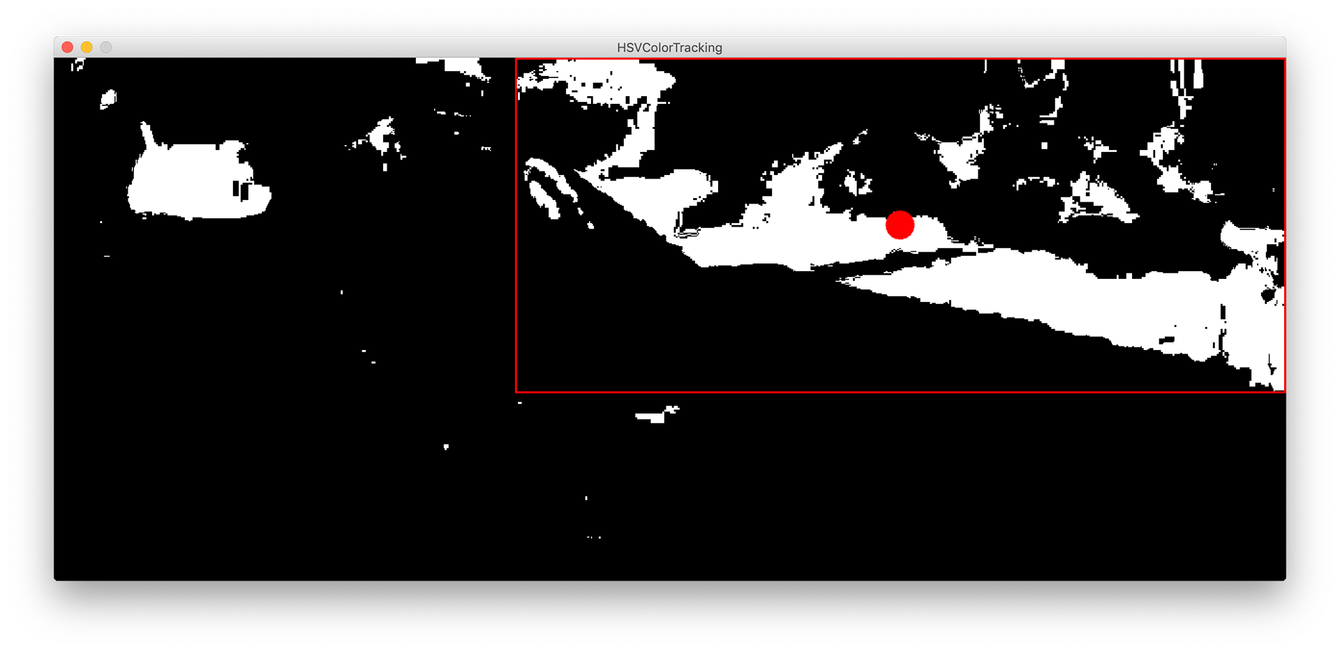
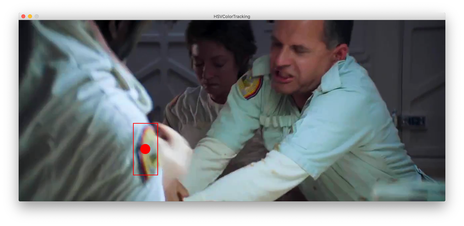
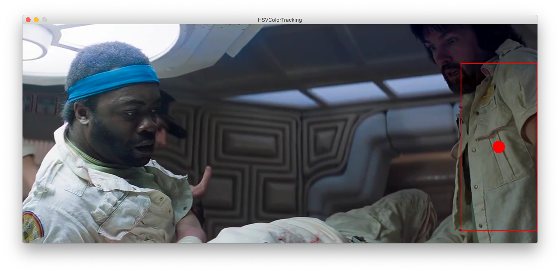
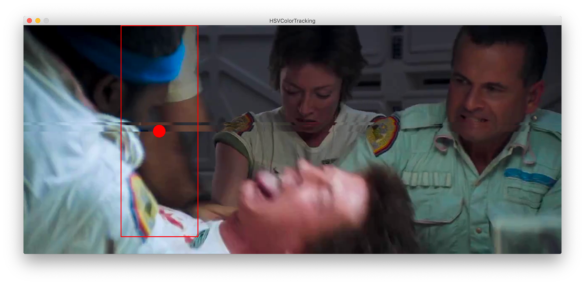
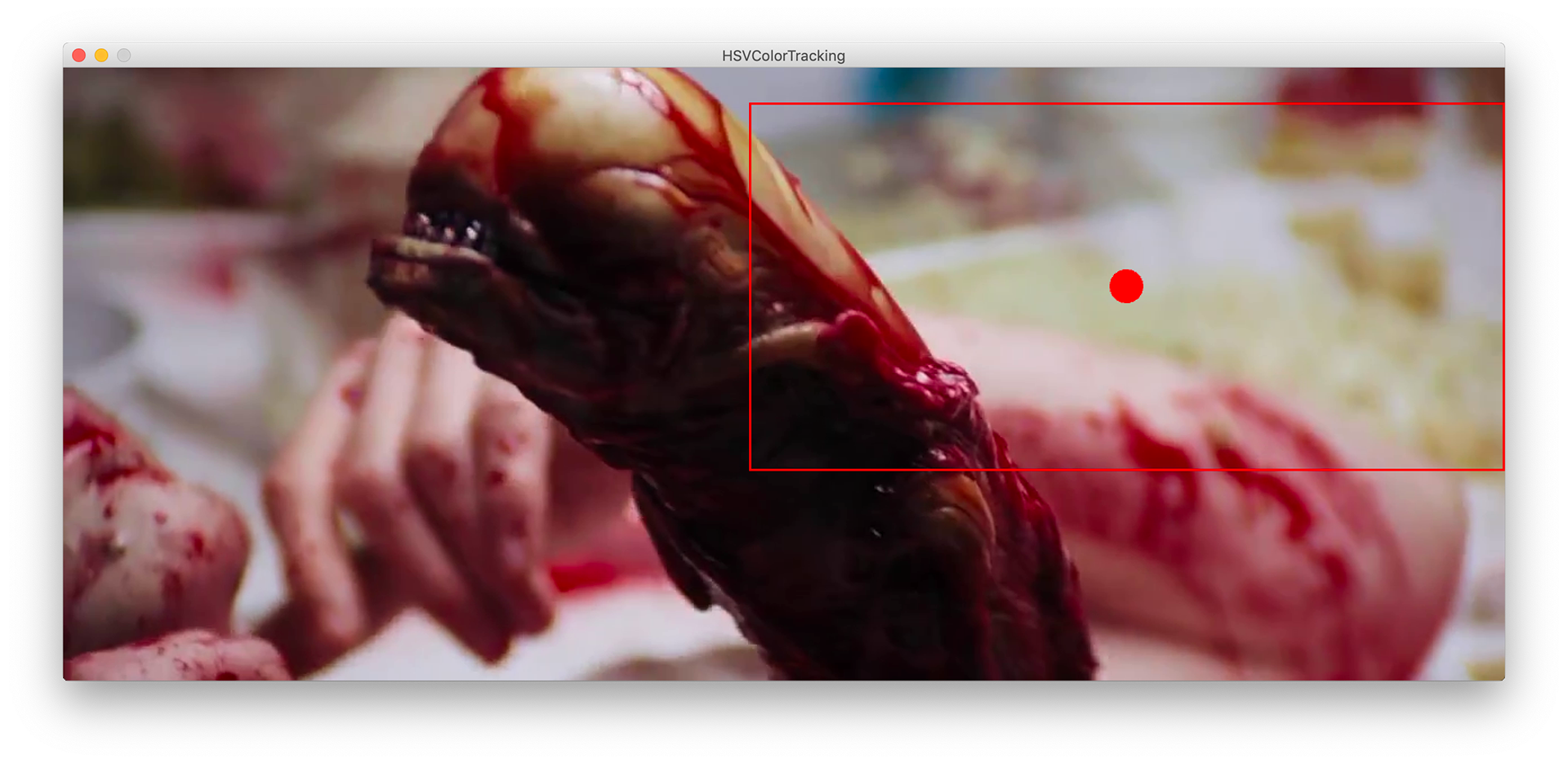
I wanted to take a dive into OpenCv's HSVColorTracking example on processing and see what kind of things I could gain from these outlooks.
By focussing on these colour schemes we begin to build this database of visual information that can effect the entire feeling of a film. The idea of tracking a colour interested me and creating an example of these colours tracked through the films I had already analysed seemed like a good starting zone.
Below is a few examples of the sketch working with video rather than capture(webcam).

These outcomes were interesting but not quite what I wanted to achieve. I began considering colour as numbers - so raw data. These RGB levels can be stored and manipulated and can lead to this data set of colours from films.
My particular focus was on the colour red and other warmer tones - they play a significant part in the films I had been exploring.
red communicates many emotions from danger through adoration.
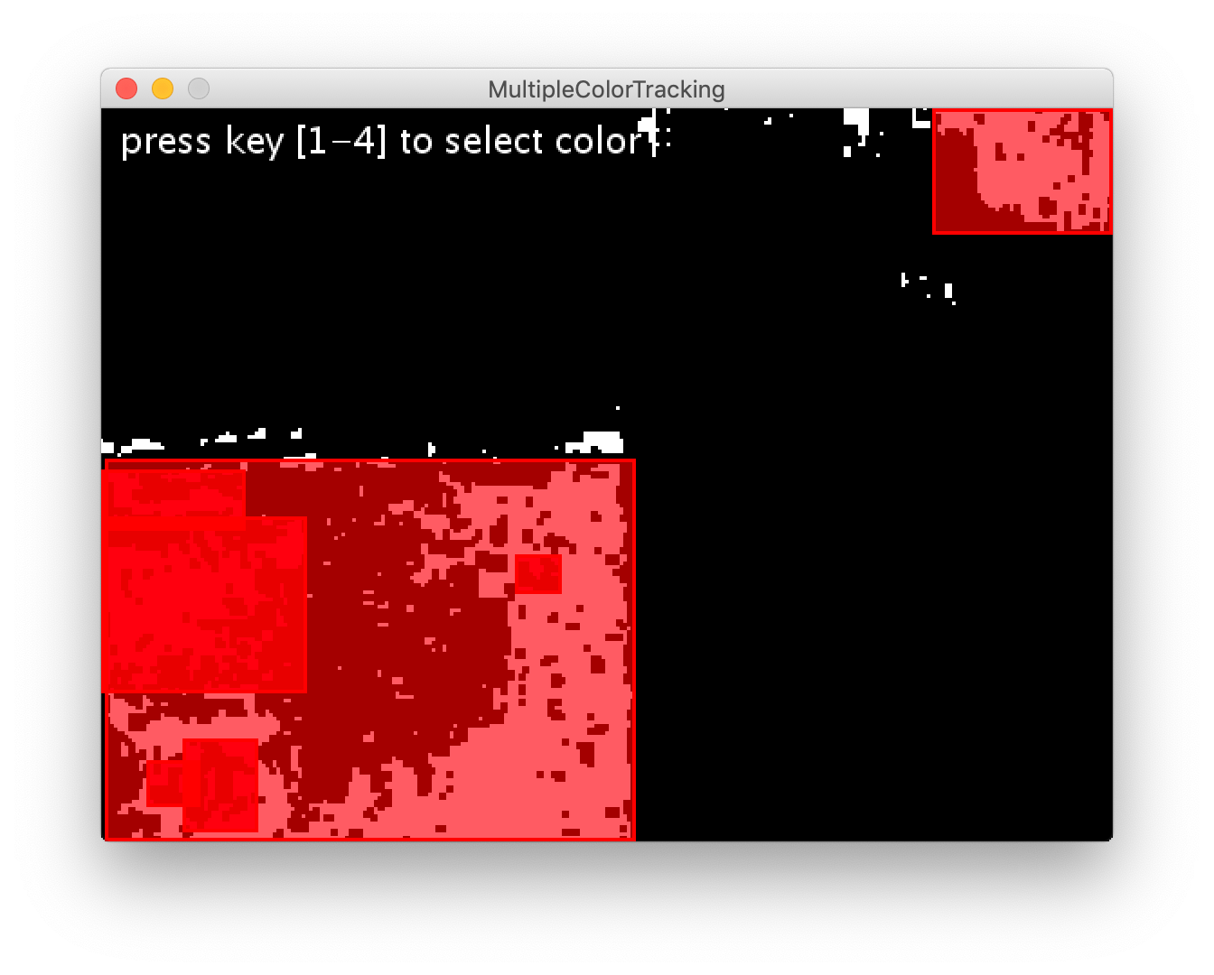
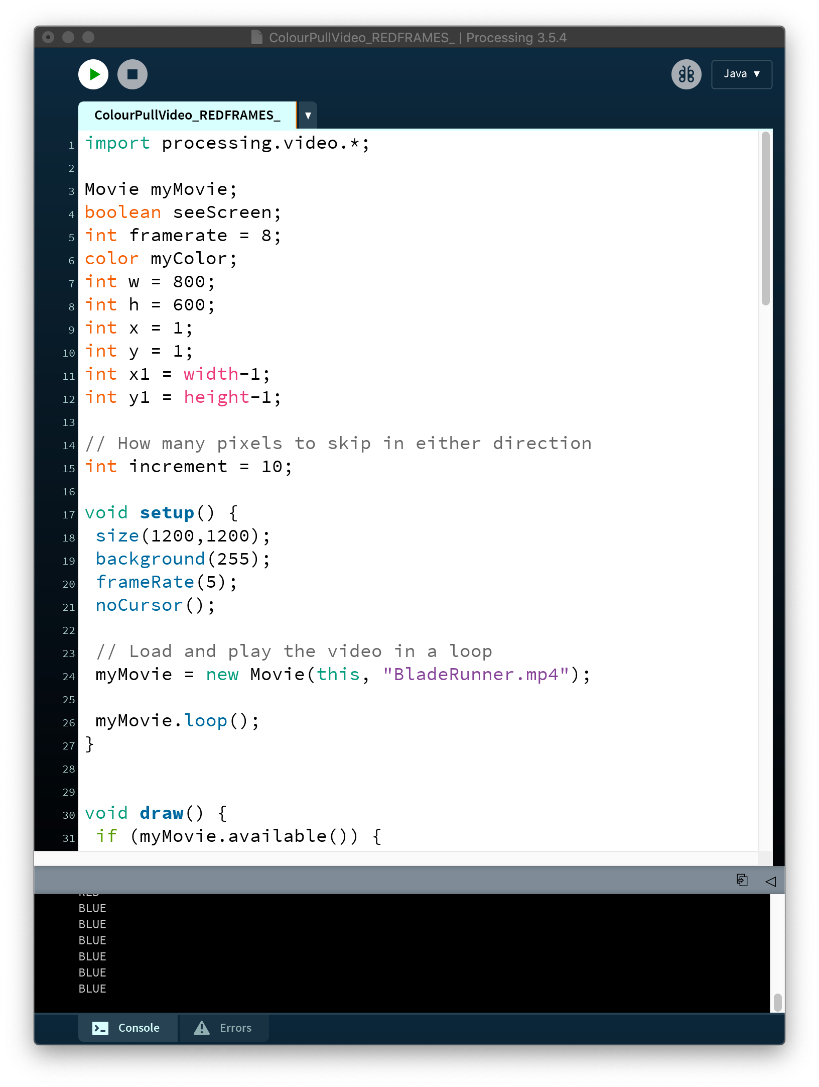
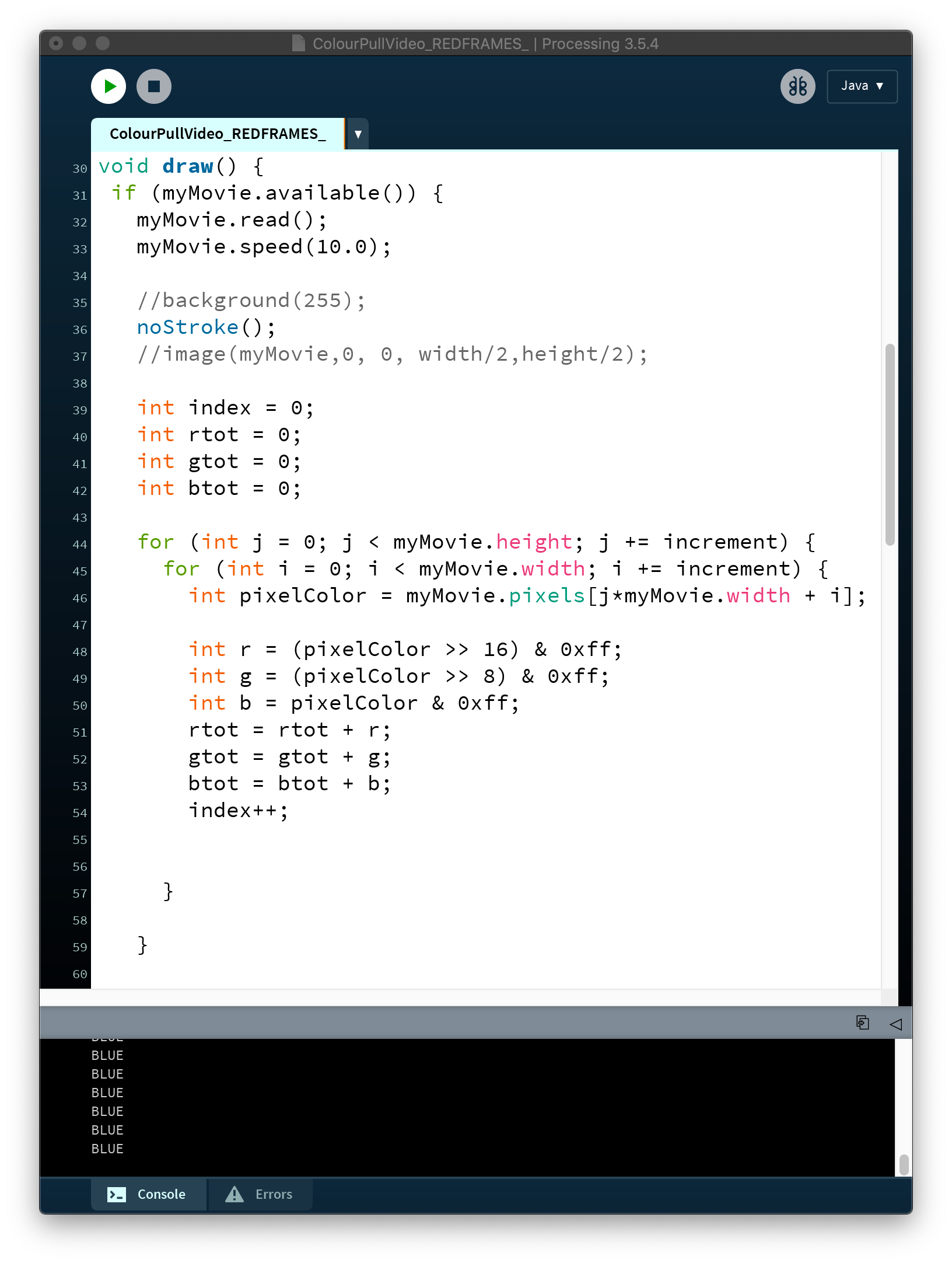
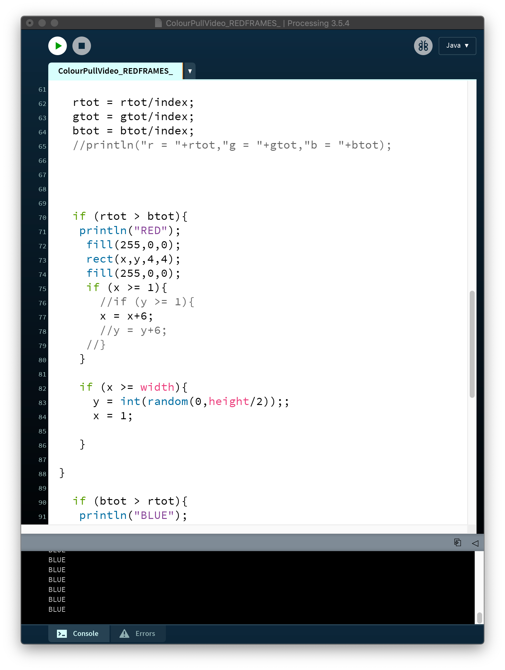
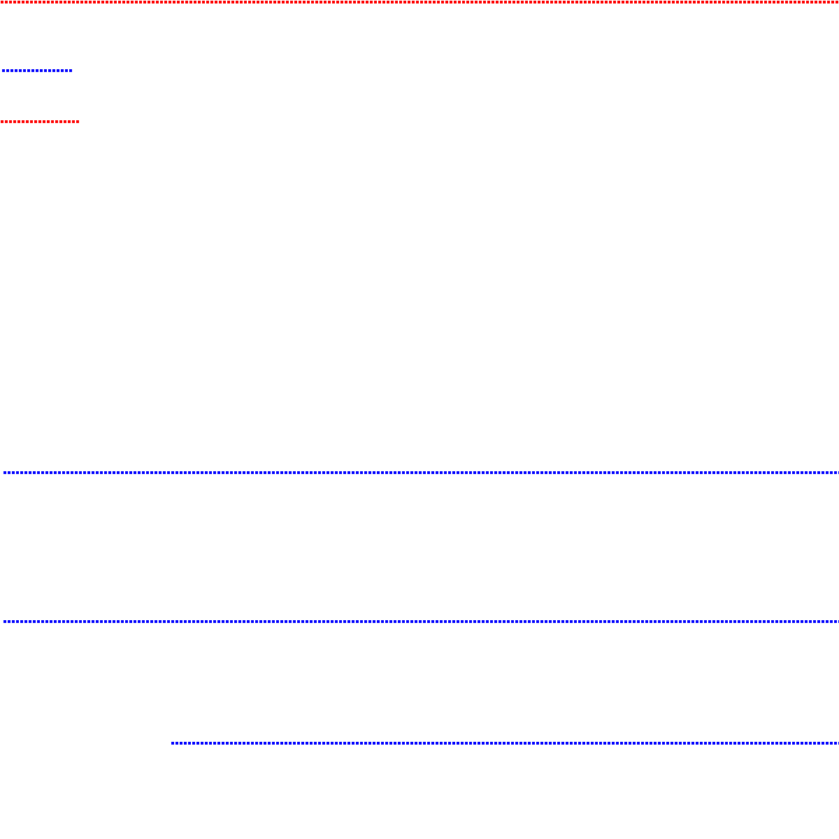
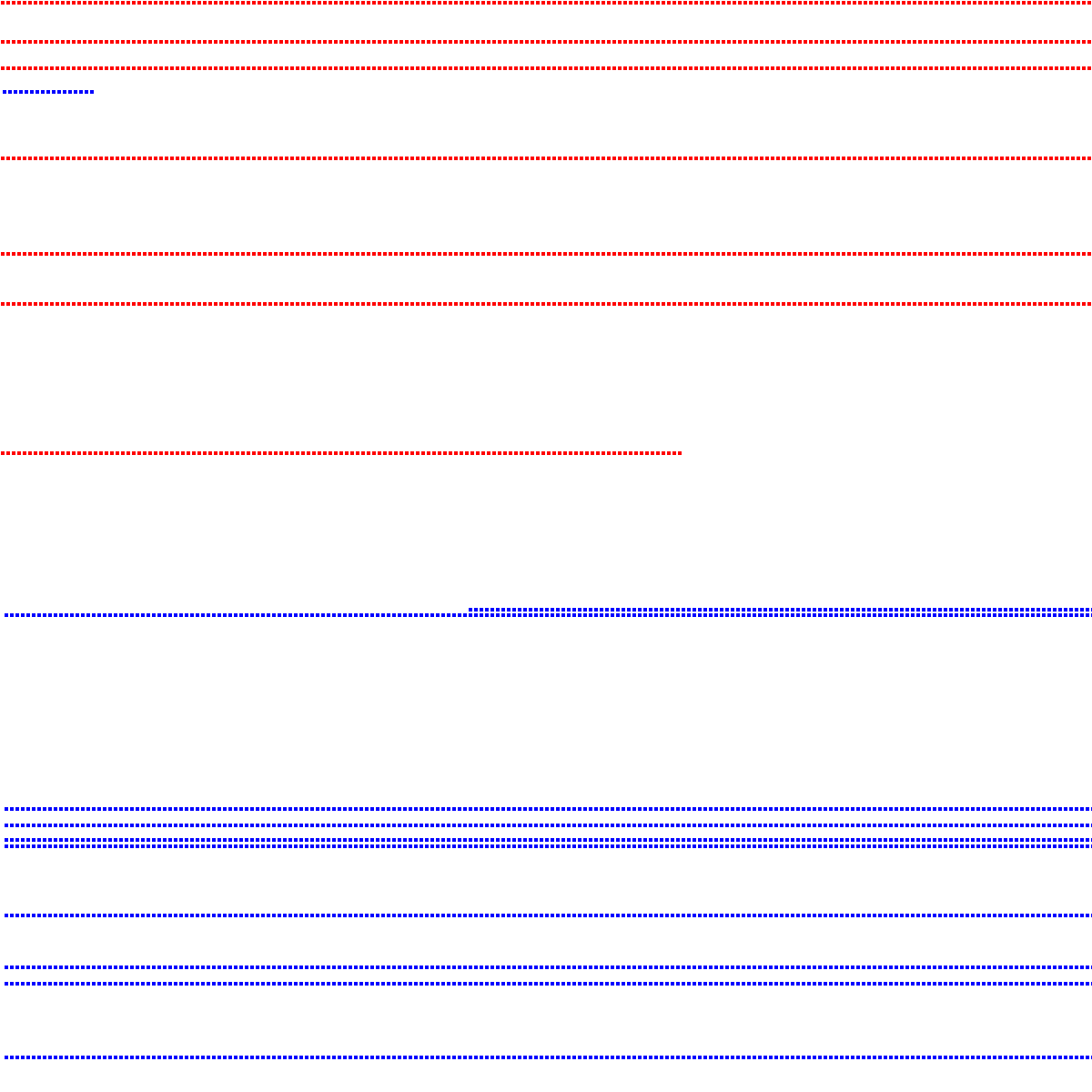
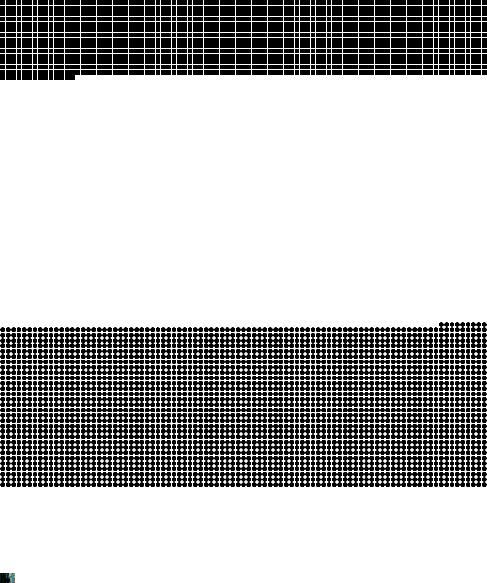
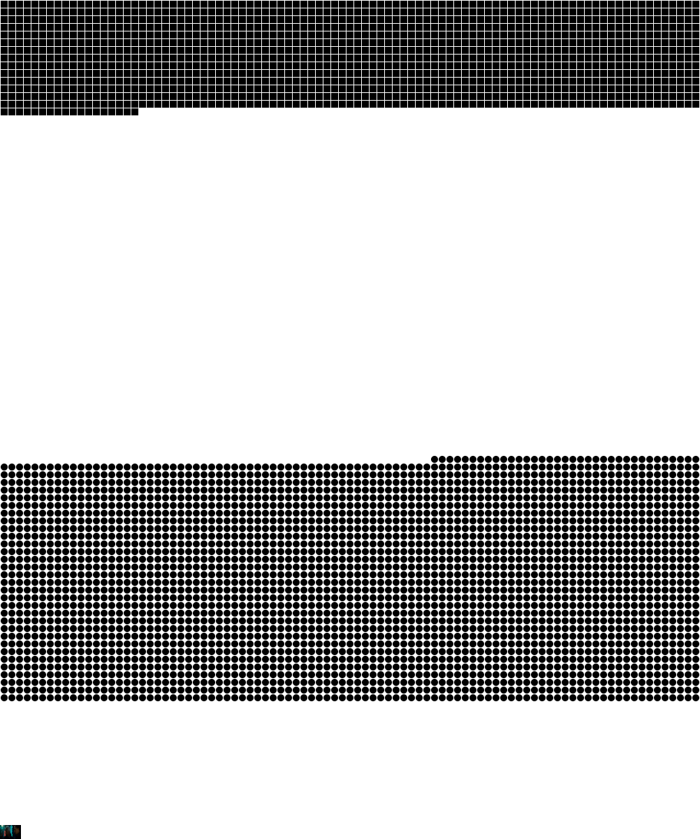
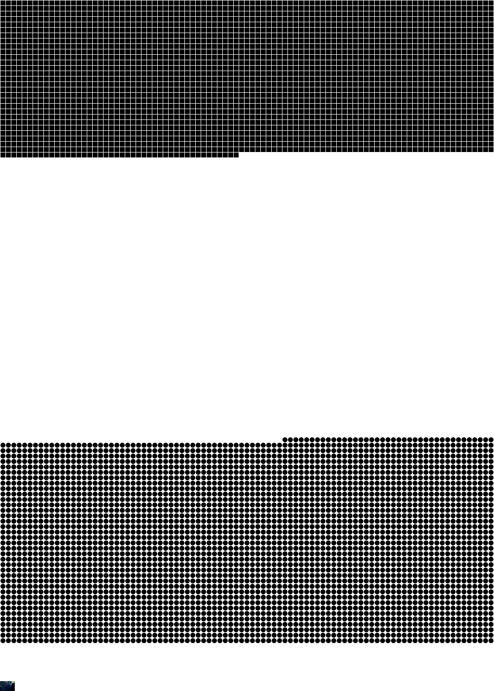
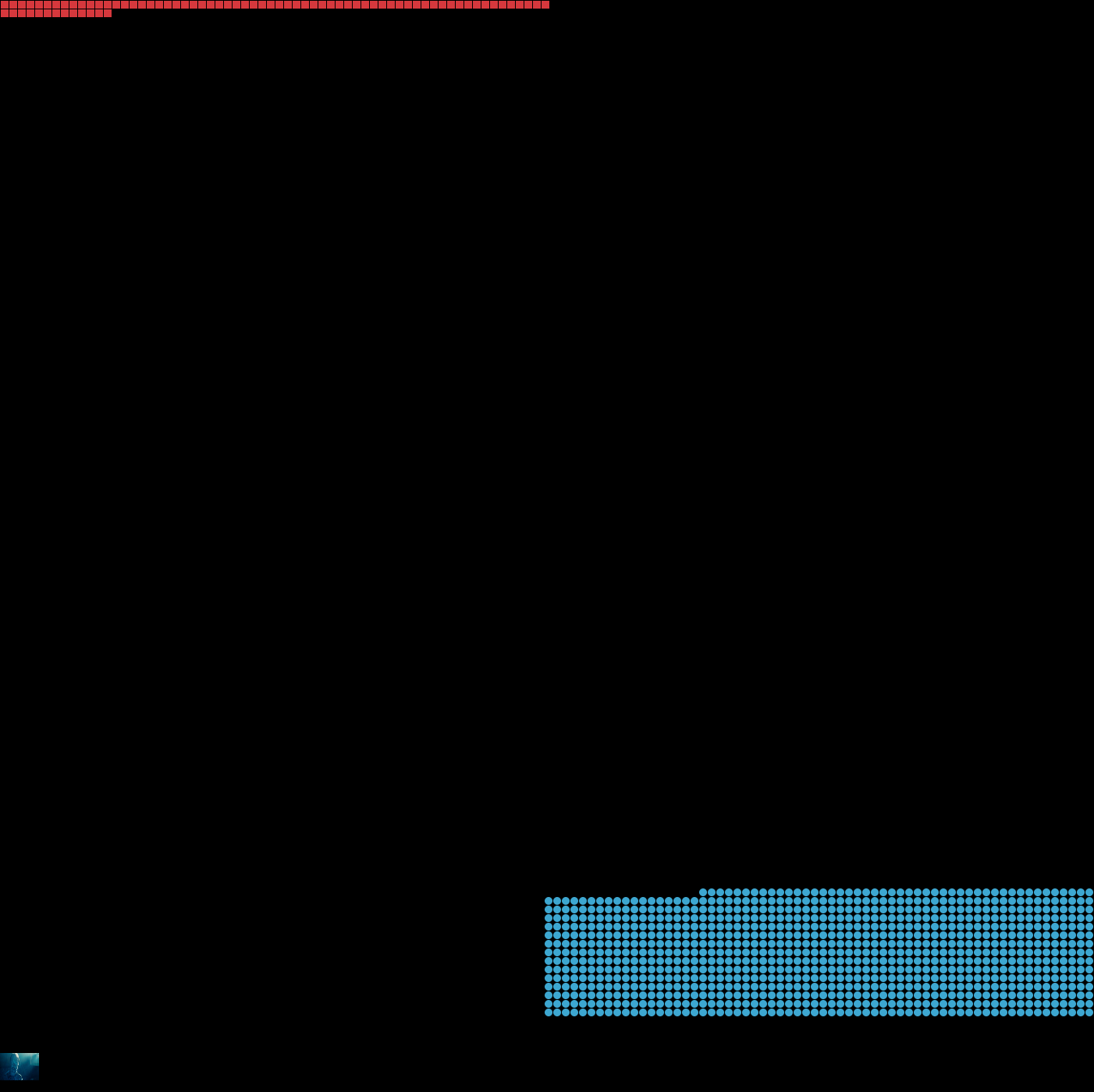
This Is where I began to format my own piece of code from my last colour coding work. I wanted to create a sketch that differentiated the blue and red values and reacted one way when red was a more prominent value than it would act if blue was the more prominent colour.
I began experimenting with how to achieve this and wrote a basic if statement to do this bit of work.
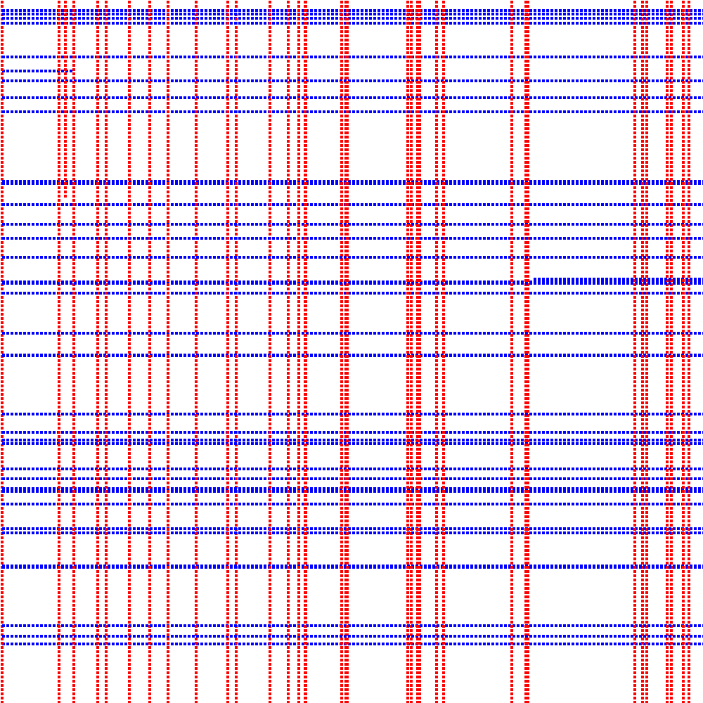
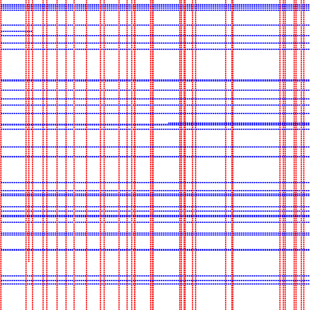
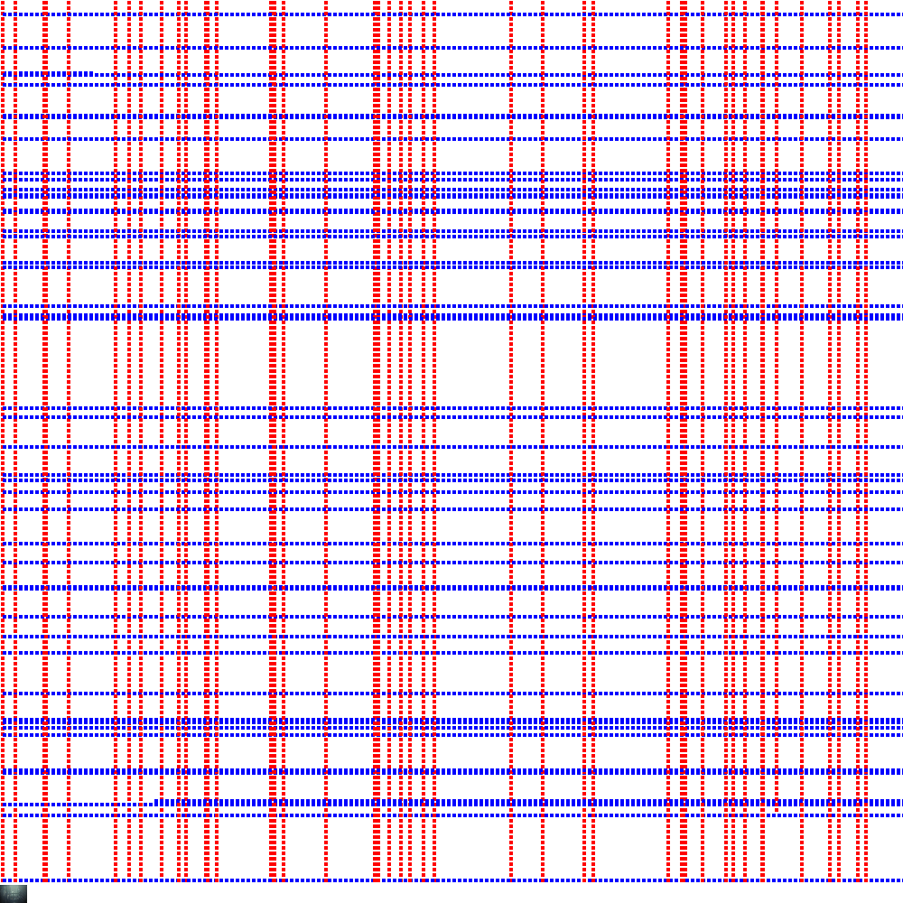
I enjoyed these pieces which react as the film takes place - they act as a log of data for the images our brain is processing.
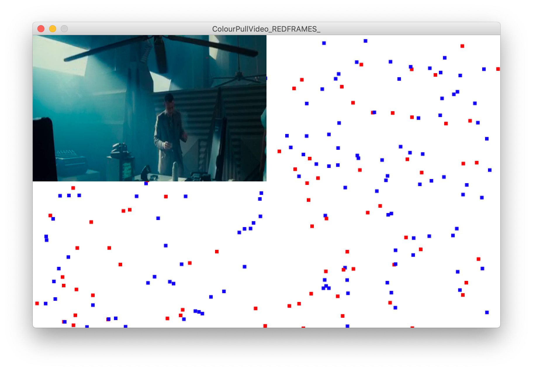
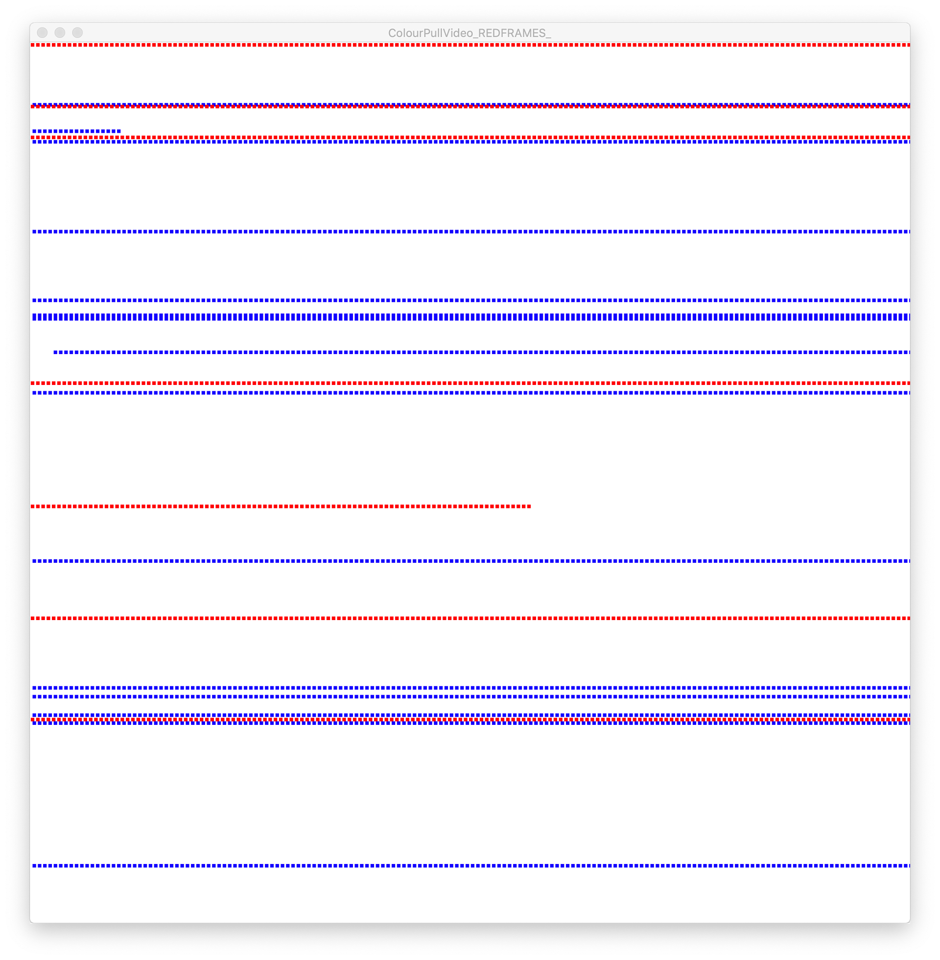
Experimenting with the style of this piece as well as its functionality was essential as I wanted these logs to be a clean and clear depiction of the data visualised.
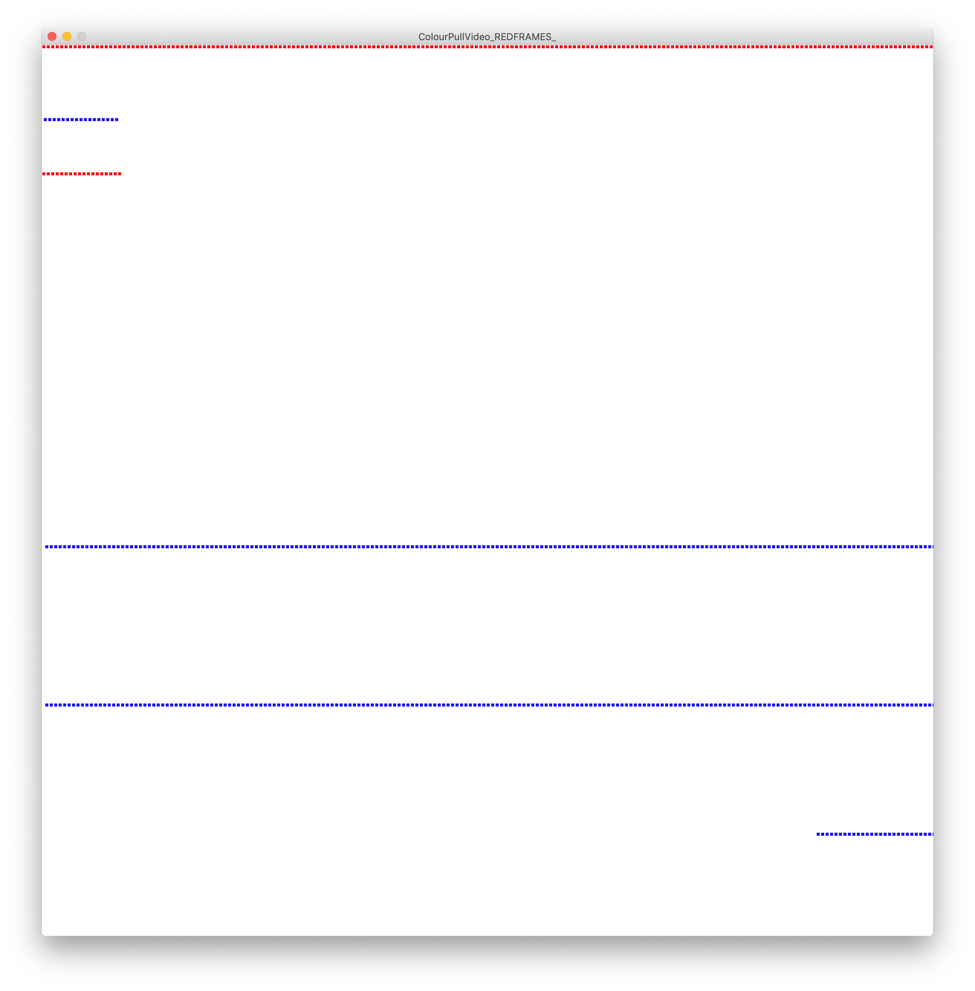
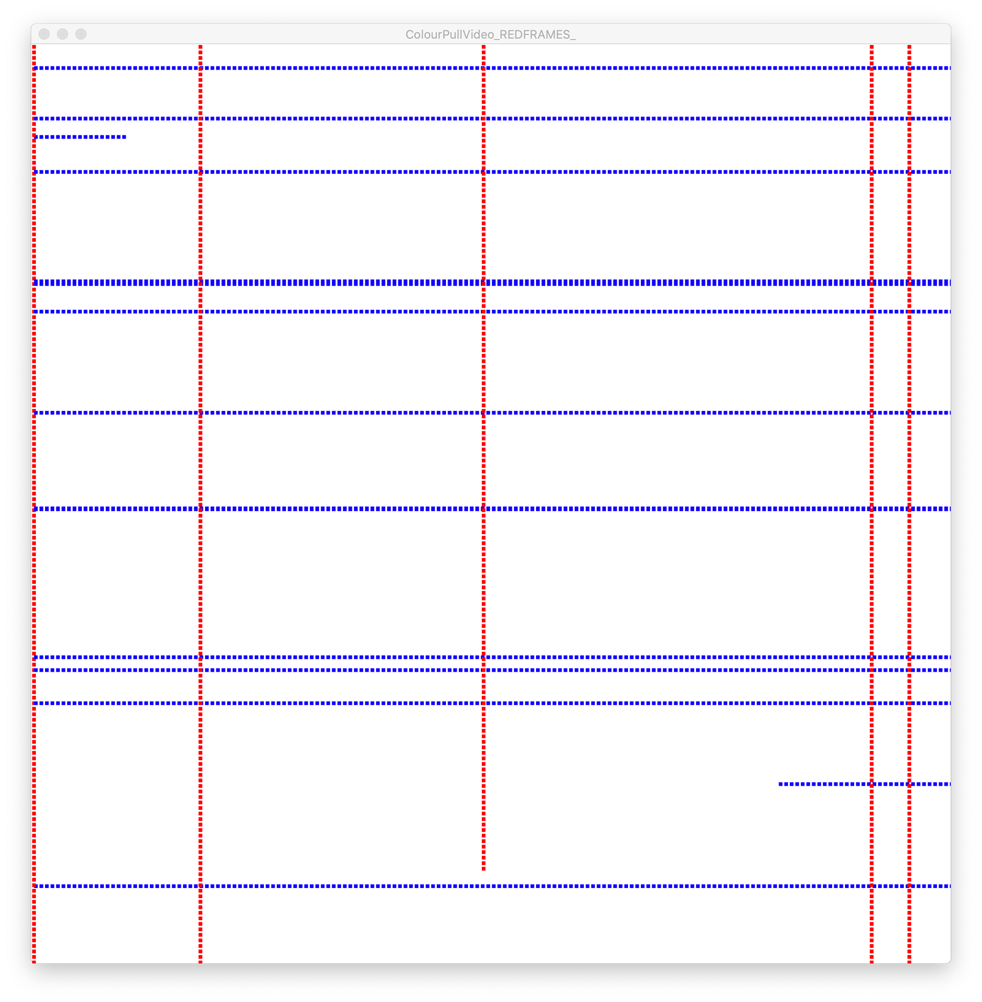
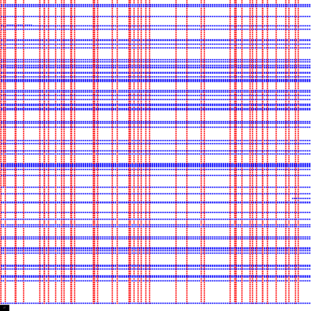
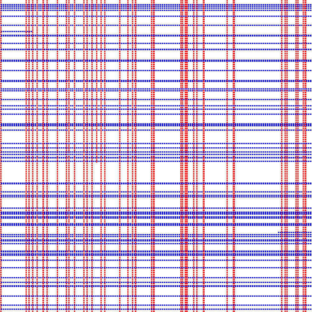
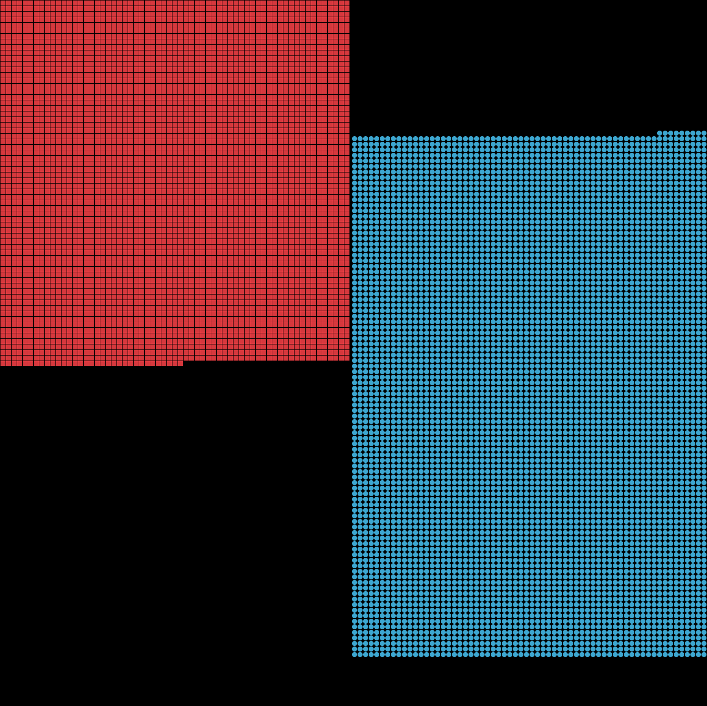
I didn't really like the tartan effect that was going on so decided to change the format and direction each colour would run to differentiate the two from one another.
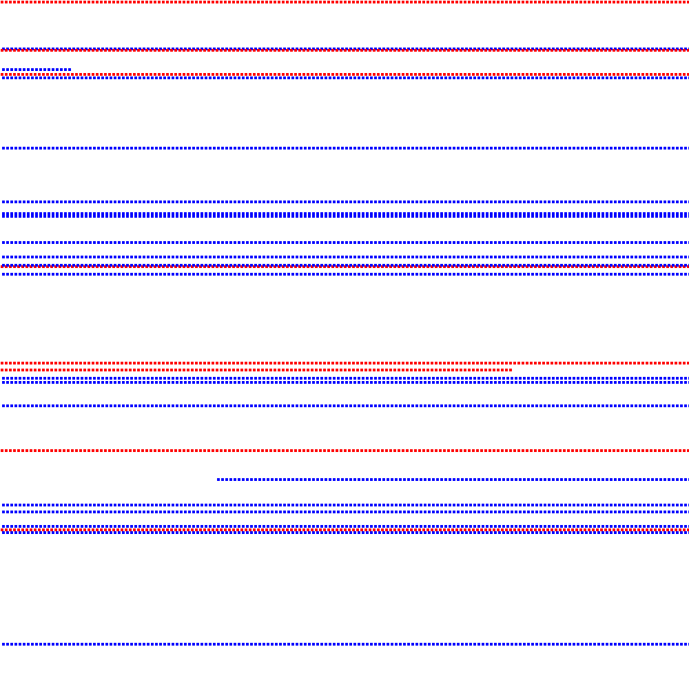

I then contemplated these works being void of colour and referring to shape more than anything but after testing I wasn't too happy with the outcome.
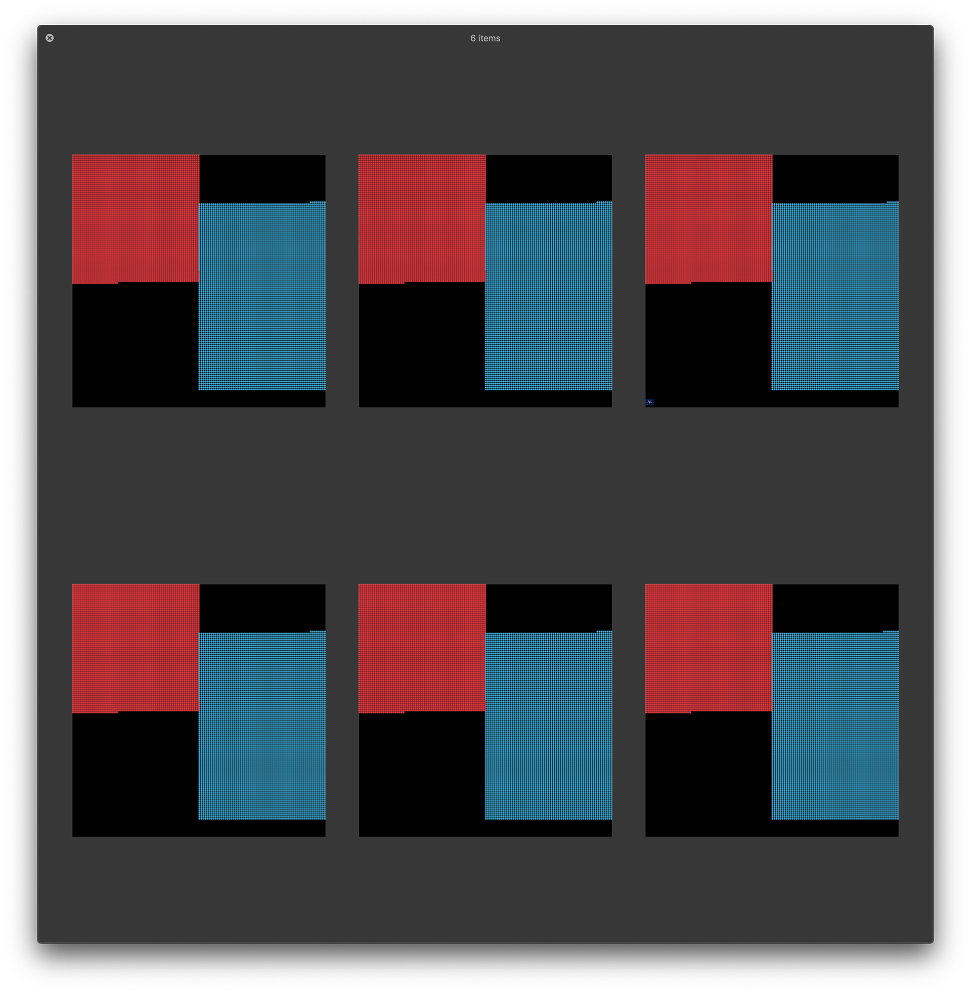
I thought about grid systems here and the art that can be made with them on creative coding which is why I explored this area of the design further. I liked the symbolism of colour through the different shapes.
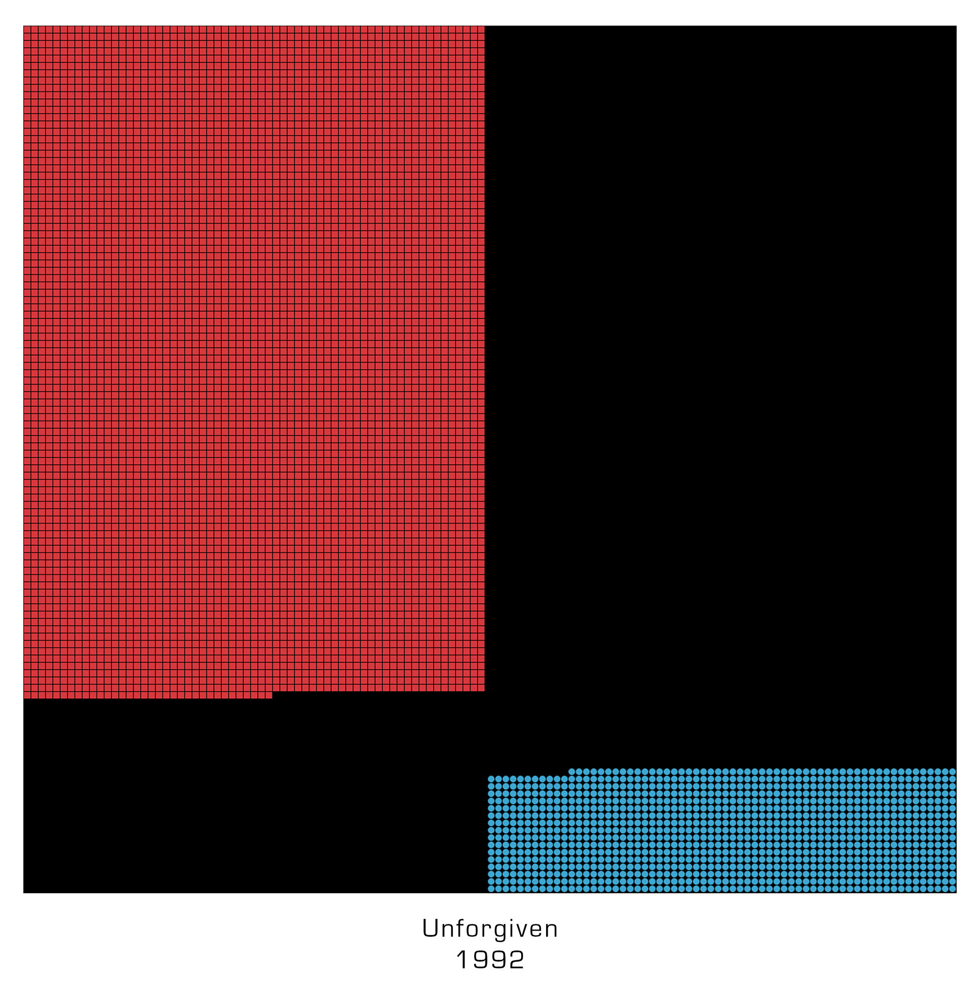
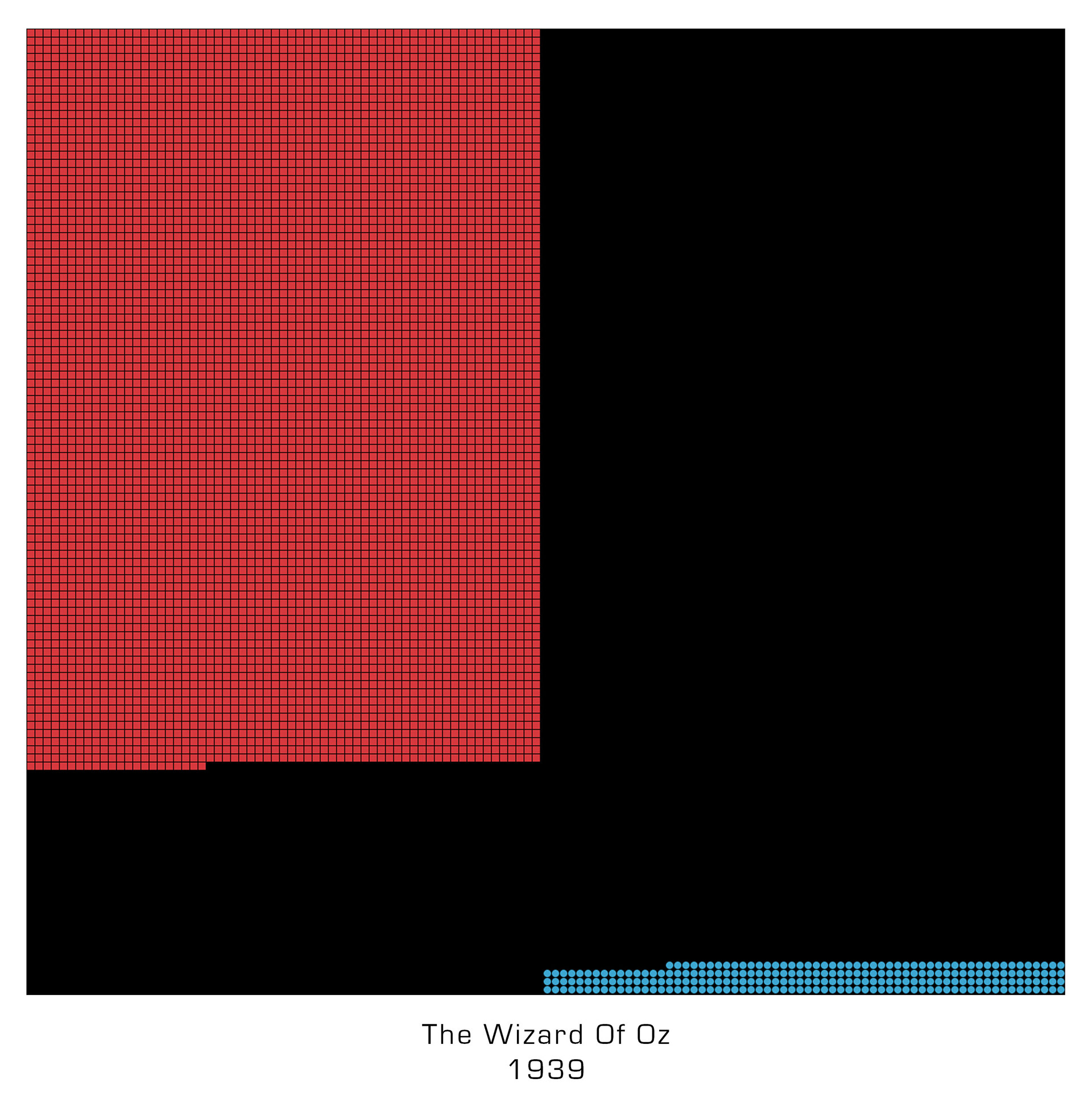
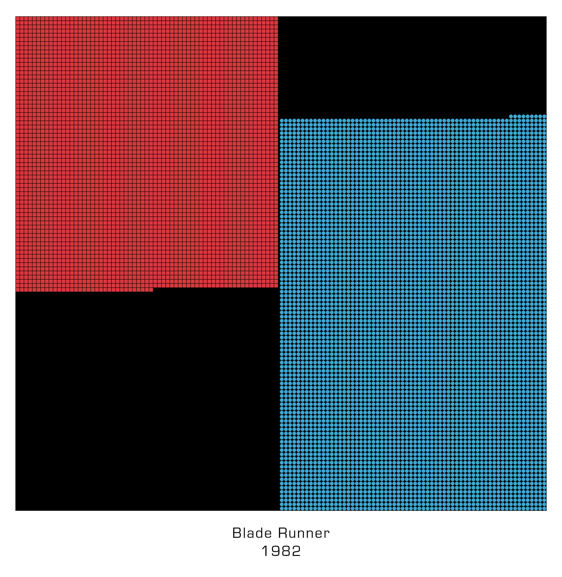
Below is a few examples of Blade Runner ran through the sketch and the blue to red balance throughout the film. It's interesting to see this information in this form of grids and how our brains don't process this information in a similar way. A computer can see the slightest tones of colour where we do not but we also se varies of colour different and can understand colour of the focal point unlike this sketch.
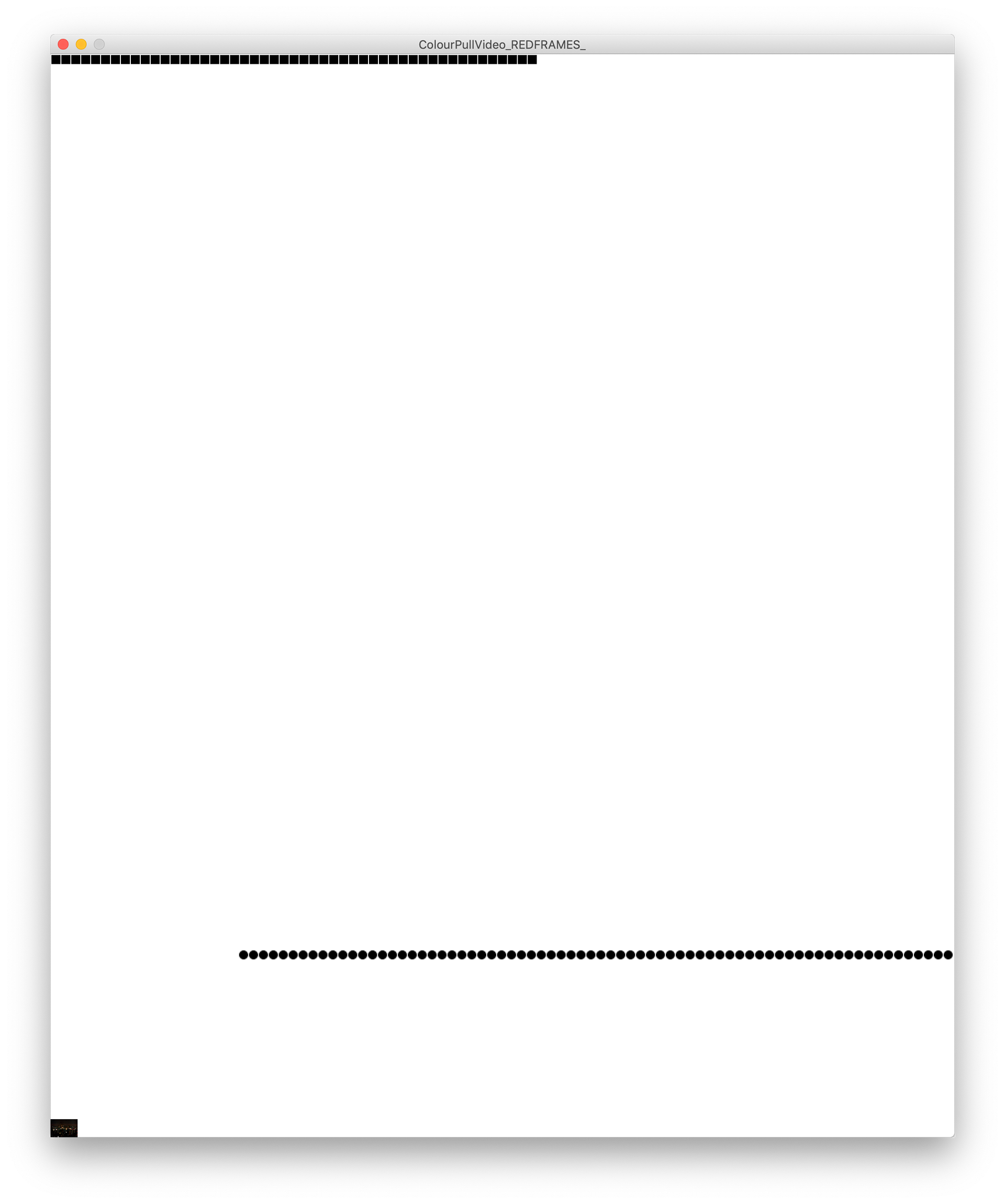
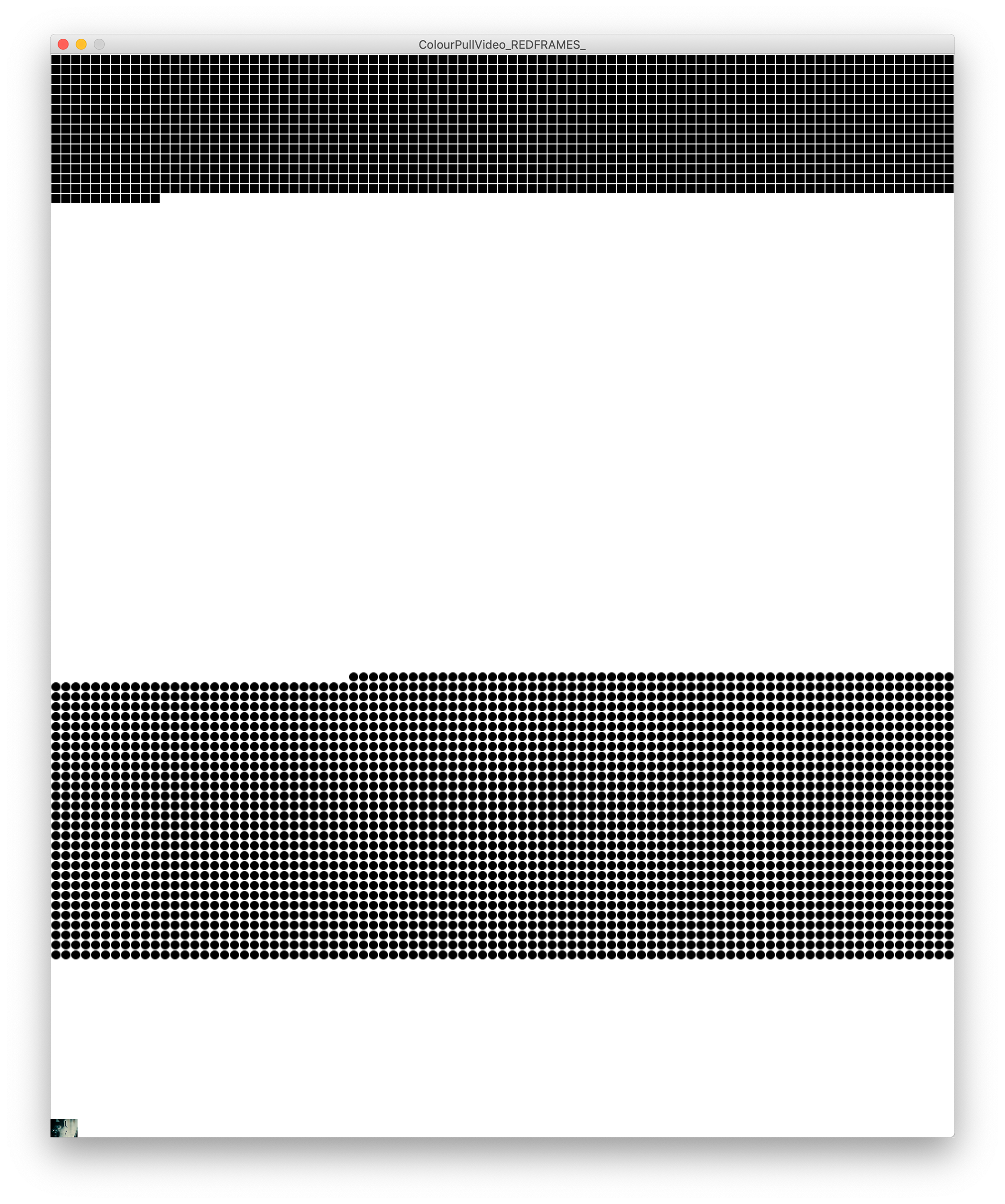
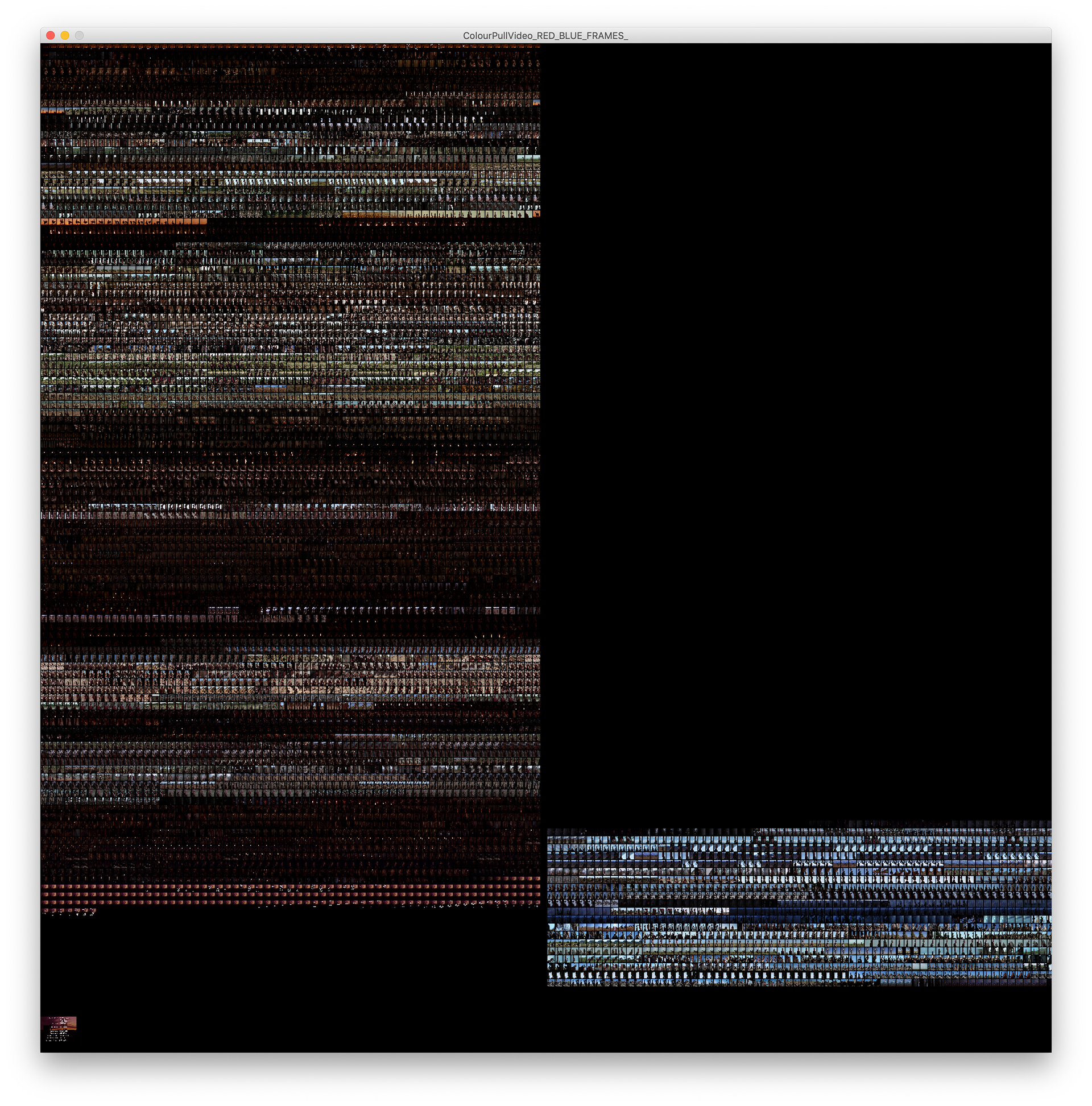
Below is a homage and small branch of this sketch in the stye of Brendan Dawes' Cinema Redux - Cinema Redux allows us to experience these films all at once in a linear structure and alters our appreciation of these films.
I thought it would be interesting to take this layout but use the colour differentiator to sort the frames into sections based on their average colour.
Below is an example of this with Unforgiven (1992) ran through the sketch.
Below are some final poster mockups of this branch of work. I was overall happy with these experiments and in the future I would like to explore more avenues of data visualisation with film.
These are a nice little outcome of the warm and cold tone differences throughout different films.